What Is a Landing Page?
A landing page is a webpage designed to persuade users to take a specific action. For example, signing up for a newsletter, purchasing a product, or registering for an event.
Users often arrive at landing pages via a pay-per-click advertising campaign. But they may also find your landing page through your homepage, social media posts, organic search results, and email campaigns.
Both landing pages and your homepage are often the first experiences visitors have with your website. But they serve different purposes.
Let’s go over what makes them distinct.
Homepage vs. Landing Page
A homepage contains general information about your company.
It has navigation linking to other pages on your site. And usually has multiple calls to action (CTAs). Like ones encouraging visitors to browse the blog, explore products and services, and sign up for a newsletter.
A landing page is a standalone page with a single CTA that encourages users to take a specific action. Such as purchasing a promoted product, filling out a form, or downloading a resource.
And landing pages don’t have much (or any) navigation to other parts of your site.
In short, landing pages are where you turn visitors into leads. Or leads into customers.
Take a look at this landing page template as an example.
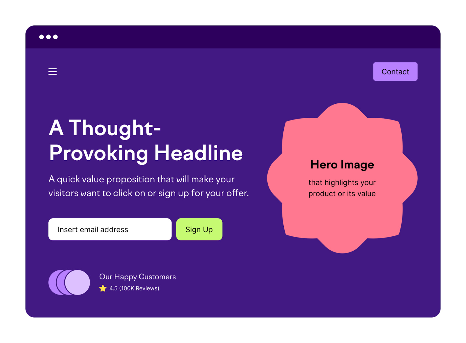
Notice that it has minimal navigation, a straightforward message, and a single (but prominent) CTA. In this case, the goal is to get the visitor to sign up for something like a subscription or digital event.
Why Are Landing Pages Important?
Landing pages can boost the effectiveness of your marketing campaigns. Because your homepage and product or service pages probably won’t generate as many leads or conversions as a dedicated landing page can.
Plus, landing pages:
- Provide targeted messaging that matches visitor expectations
- Simplify campaign measurement with easy tracking and analysis
- Allow you to experiment with different elements (headline, CTA, etc.) without affecting your main website
To sum it up:
Landing pages provide a focused and optimized experience for your visitors. Which increases the likelihood of conversions to drive better results for your marketing campaigns.
How Do Landing Pages Work?
A landing page should be your visitor’s last step before they convert. (Become a lead or customer.)
That means landing pages are great for:
- Getting email signups
- Selling a product or driving pre-orders
- Distributing marketing materials (like ebooks and catalogs)
- Linking users to a downloadable app
- Registering users for an event
- Scheduling a demo or sales call
But landing pages are not so great for:
- Presenting several different products or services
- Linking to other pages on your website
- Telling your company story
Your visitors should arrive at your landing page as a result of the marketing activities you use that align with your goals.
For example, they might click on your ad in Google’s search results. Or a post on social media.
Users can also be directed to a landing page from your website itself. Like if you include a button in a blog post that links to a product page for a product the article describes.
Types of Landing Pages
Landing pages can be classified into two main types: Lead generation landing pages and click-through landing pages.
Lead Generation Landing Pages
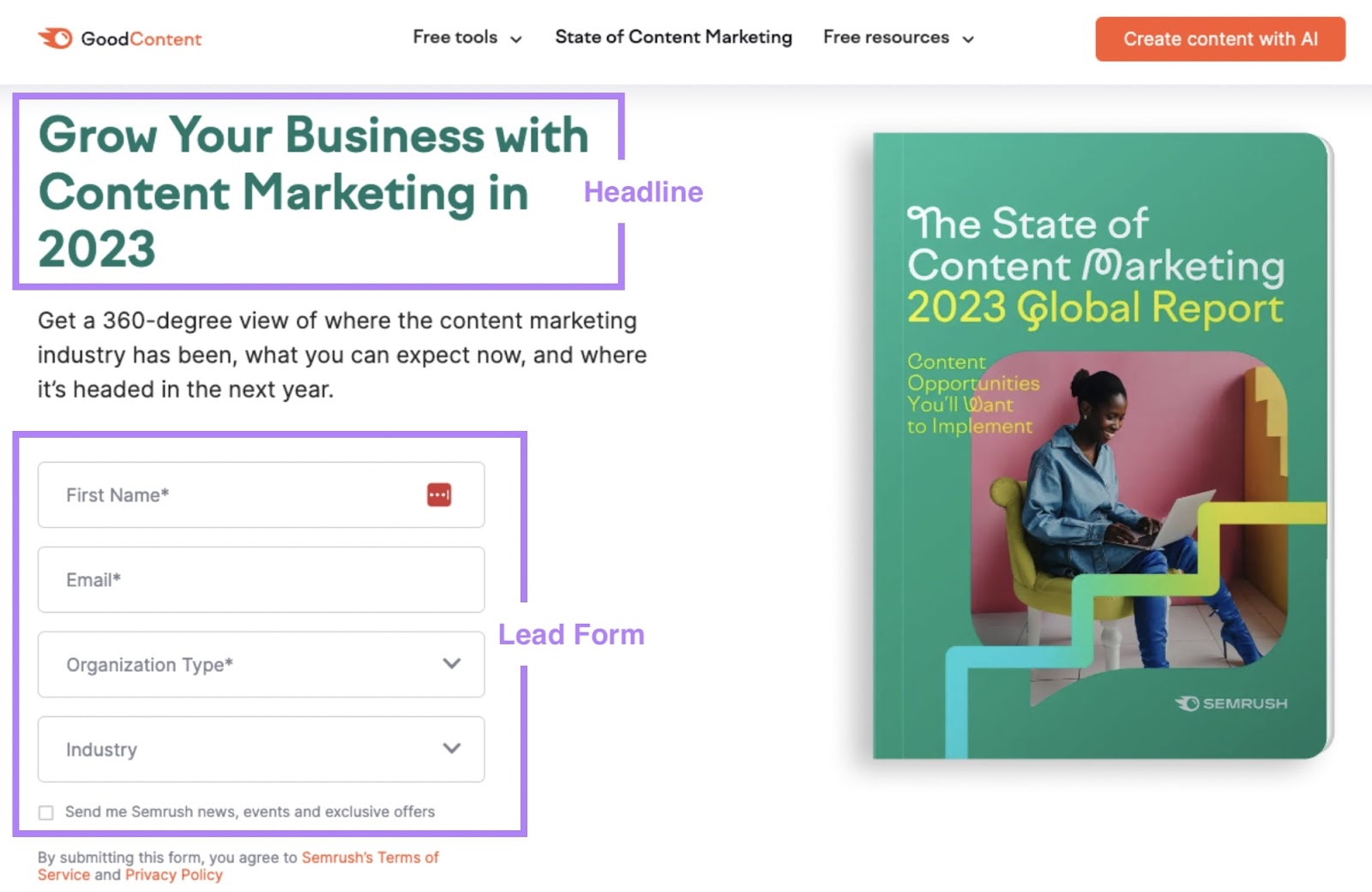
Lead generation landing pages are designed to capture visitor information like names, email addresses, and/or phone numbers. Often in exchange for a free offer or resource like an ebook, whitepaper, or webinar.
These pages typically feature a lead form and a clear, compelling headline that explains the benefits of the resource.
Example:
Click-Through Landing Pages
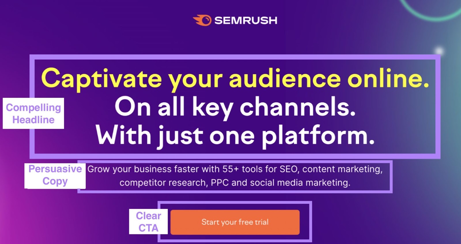
Click-through landing pages are designed to persuade users to click through to a specific page and take a specific action there. Such as making a purchase or signing up for a free trial.
These pages typically feature a clear and compelling headline, persuasive copy, and a clear CTA button.
Like this:
When Should You Use a Landing Page?
Here are four common reasons why you might want to build a landing page:
Product Launches
Product-launch landing pages give visitors information about your new product. And tell them how to buy it.
These landing pages might contain elements like a “Buy Now” button. Or a pre-order form.
For instance, beverage company Seedlip has a landing page with information on their new drink. And it has product details, recipe ideas, and links for people to buy.
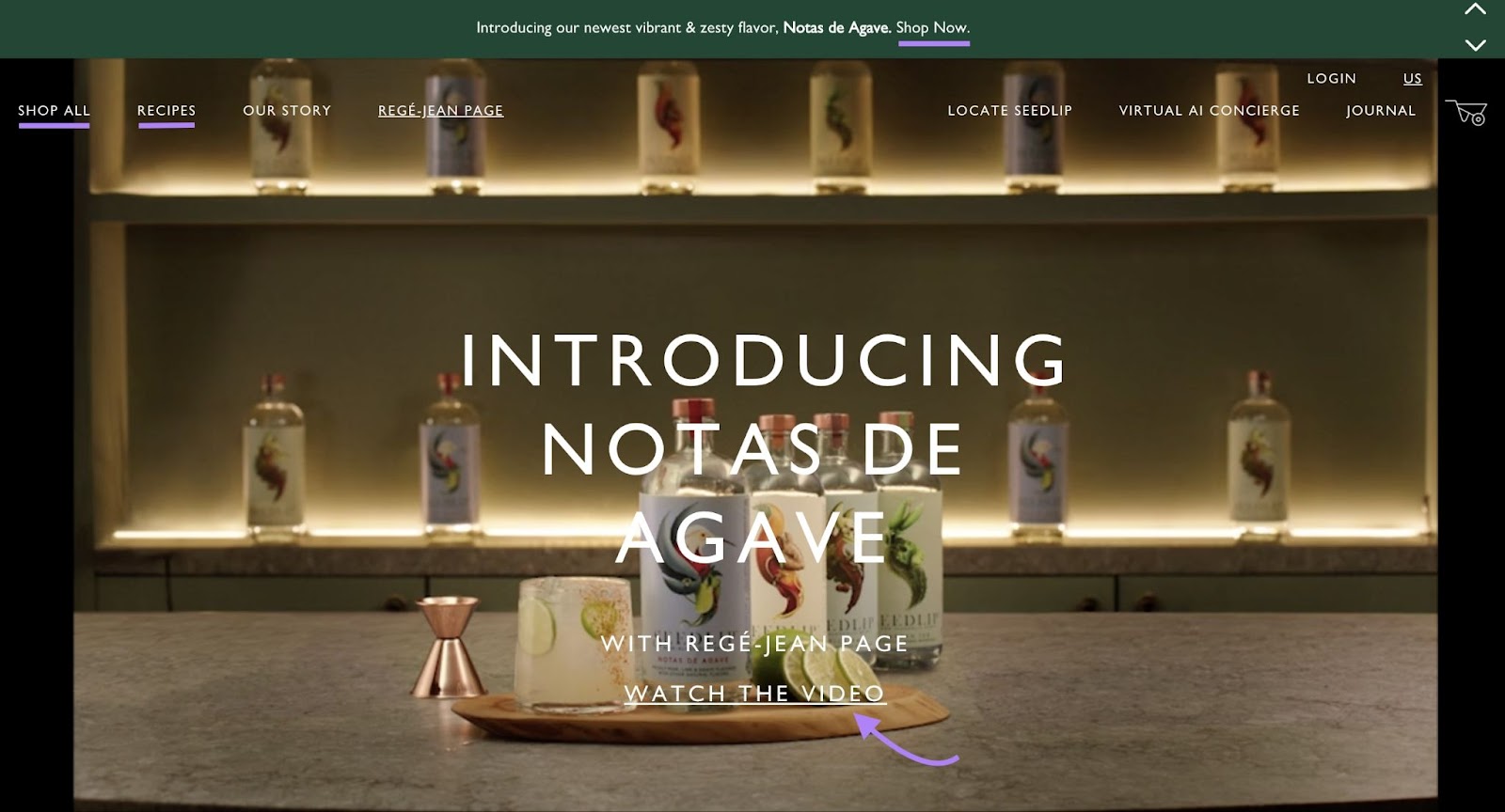
The purpose of this landing page is to get visitors to buy the new, non-alcoholic spirit from Seedlip.
Service Pairing or Inquiry
For service providers, landing pages are often designed around providing custom quotes or pairing visitors with a personalized offering. To give them additional information that can persuade them to take the next step.
For example, this Forbes landing page describes the benefits of financial advisors and entices visitors to use their matching tool.
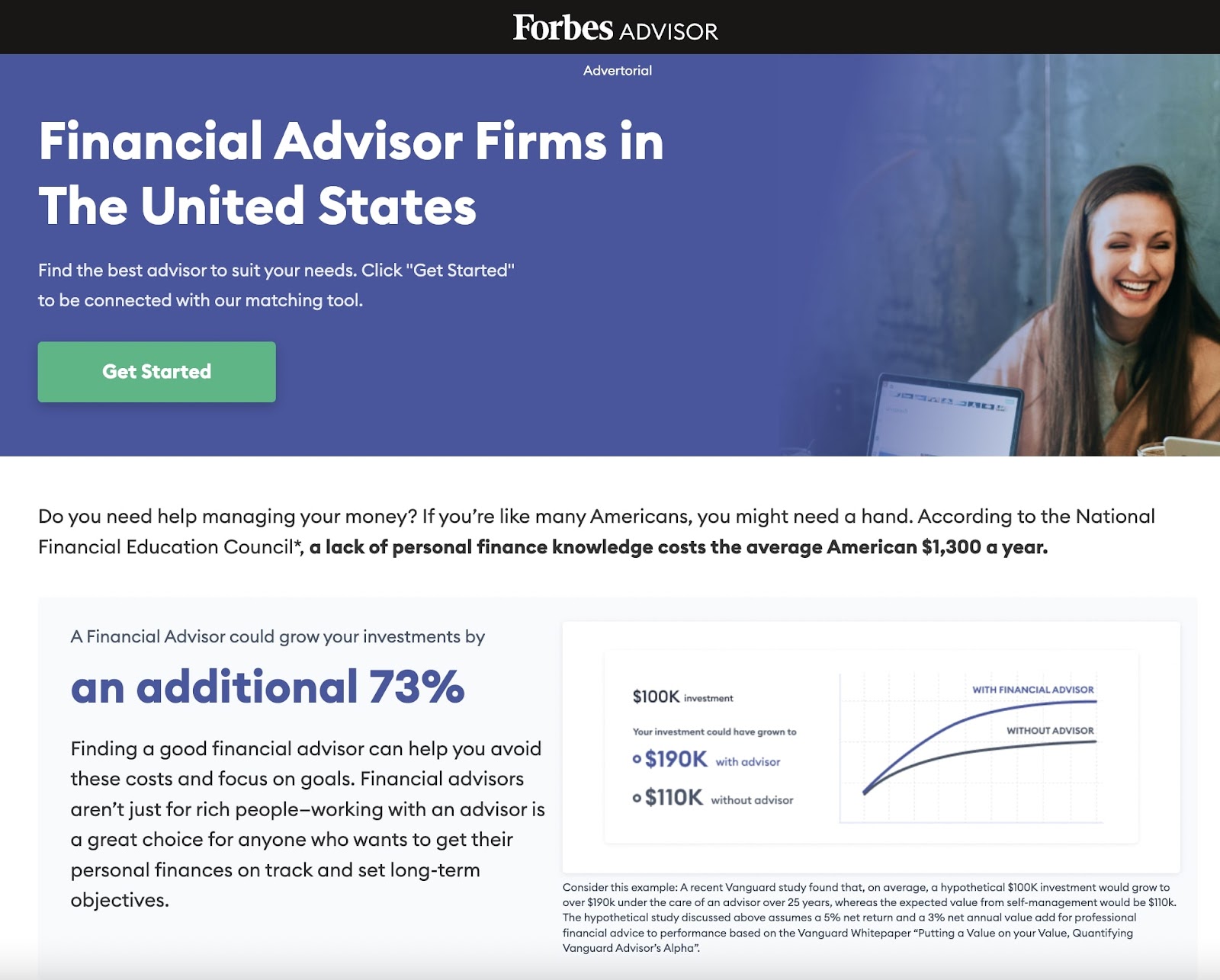
Those CTAs lead to a questionnaire aimed at matching the visitor with a Forbes financial advisor.
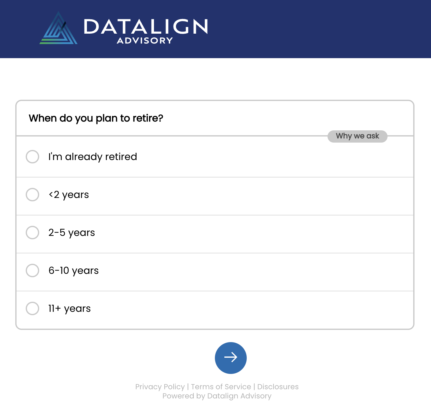
The purpose of this landing page is to turn people into leads.
Special Promotions
Landing pages that promote special offers have a time limit. Which gets people excited to take part.
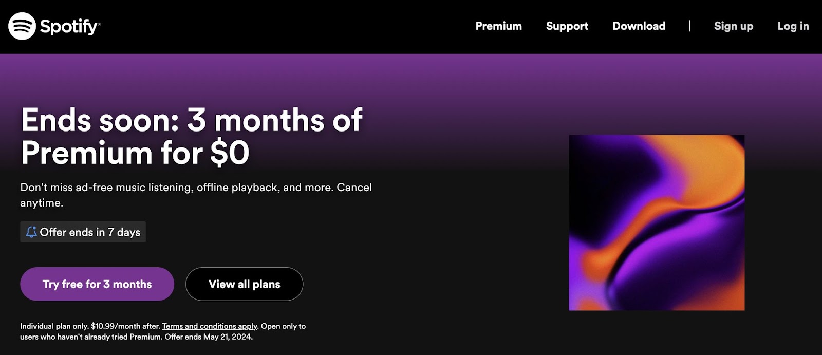
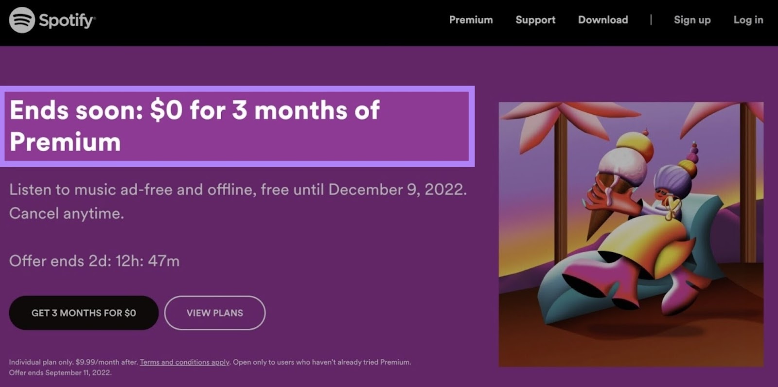
For example, Spotify’s landing page offers a limited-time offer to try their Spotify Premium option.
The landing page has pricing information, FAQs, and details what people get when they subscribe.
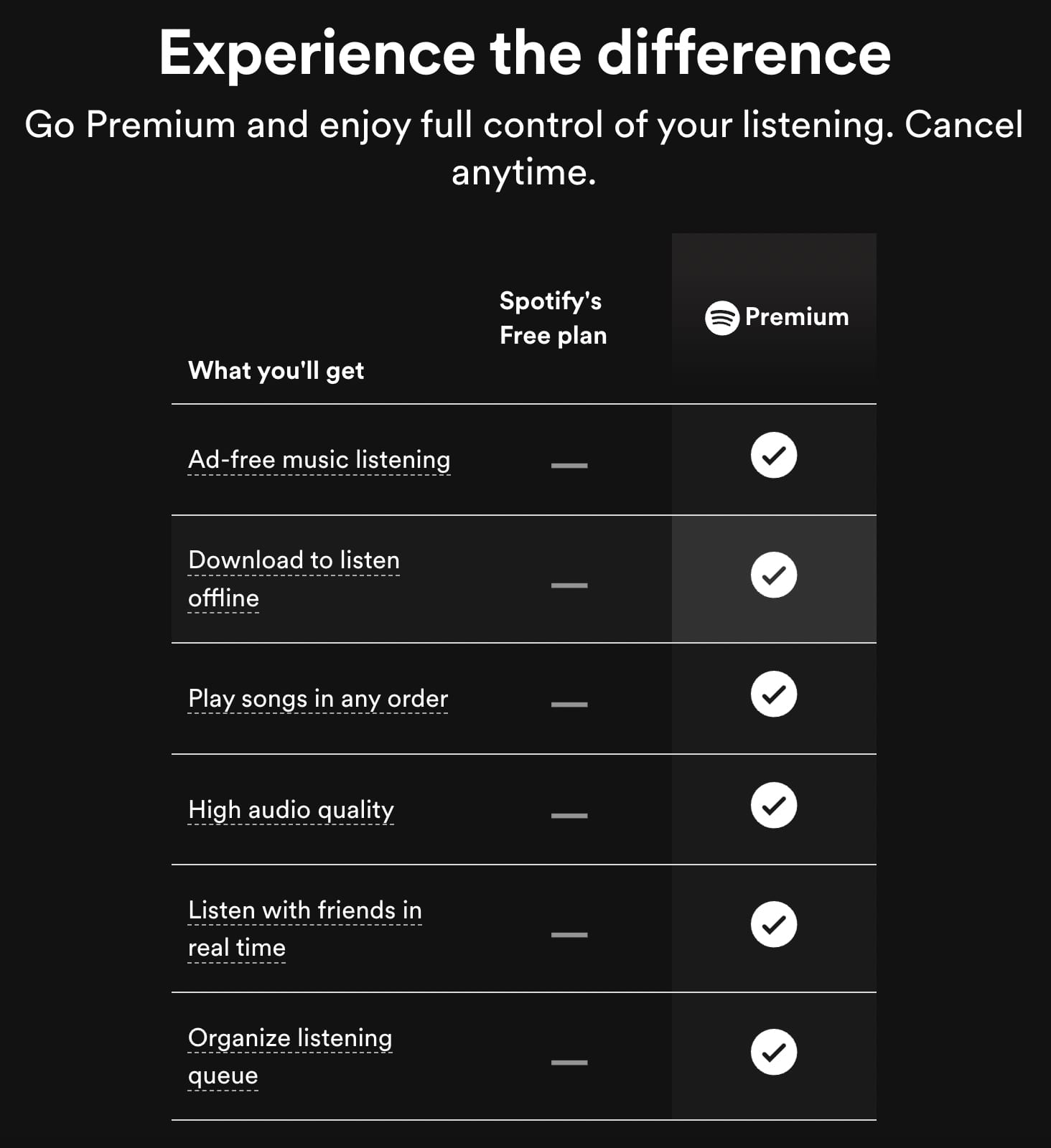
The purpose of this landing page is to convert visitors to become Spotify subscribers.
Events
Event landing pages make it easy for prospective attendees to learn about—and register for—your event.
For example, this event landing page from candle company Milkjar describes their Mother’s Day Workshops. Including what to expect, the cost to attend, the available sessions, and a link to register.
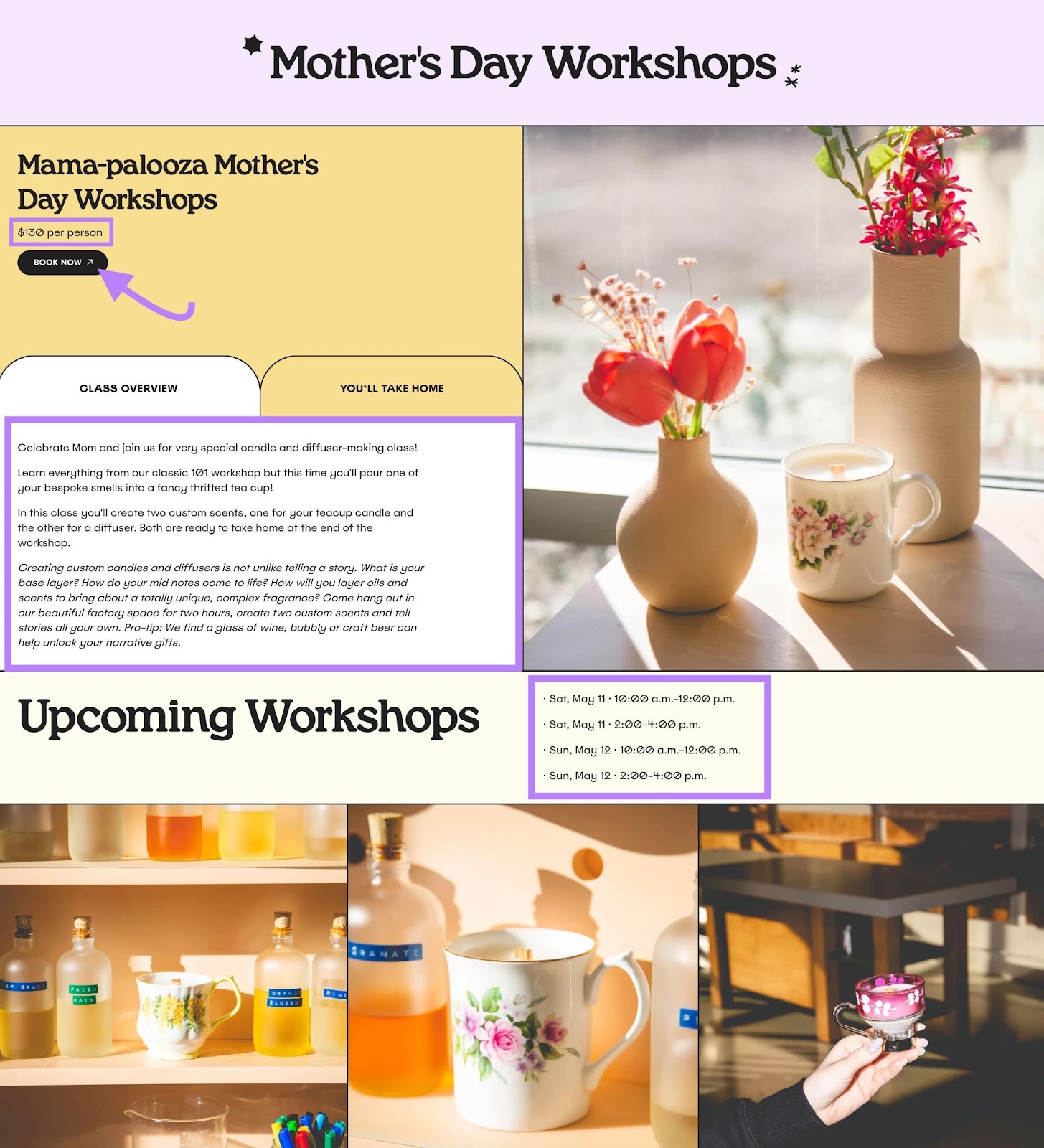
The purpose of this landing page is to attract event attendees.
How to Create a Landing Page
A landing page is designed around a single action. But they might not complete that action if they get distracted.
So, it’s important to keep landing pages as simple as you can.
That means landing pages generally shouldn’t include a top-navigation menu that might take visitors’ focus away from making a purchase decision. If they leave your landing page to go read your latest blog post, you might lose out on a lead or a sale.
Take this landing page from Slack as an example. It’s simple, clean, and direct.
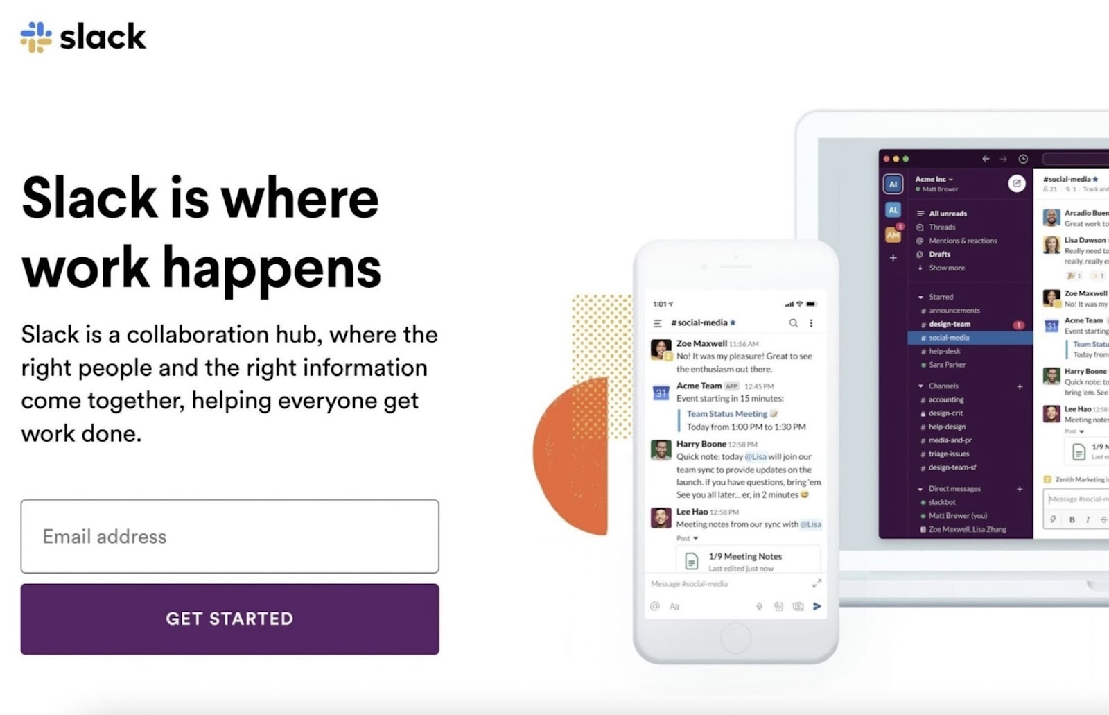
Let’s explore how to create a landing page like this.
Choose a Landing Page Builder
Landing page builders help you create low- to no-code landing pages. Many of them use drag-and-drop technology. So you can build your landing pages visually.
Popular options for landing page builders include:
The landing page builder you choose depends on your needs.
For example, if you already have a WordPress website, you may want a plugin designed to work with WordPress specifically.
If you don’t have a website yet, you have more options.
Simplify the decision by using the Landing Page Builder app from the Semrush App Center.
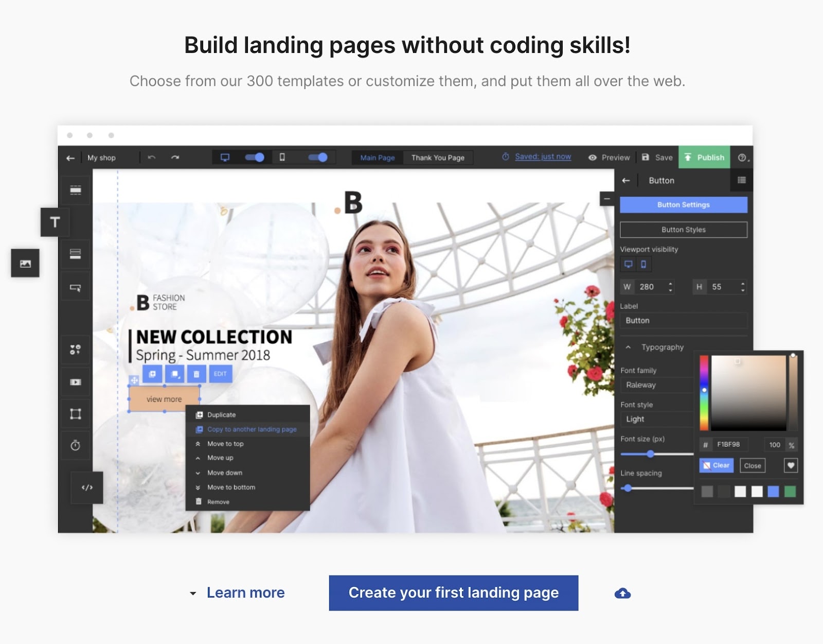
It can help you create and publish high-converting landing pages. No coding skills required.
And you can publish it on your domain by using the direct WordPress option, manually changing the URL, or embedding the page on your site’s server.
Create a Compelling Hero Image
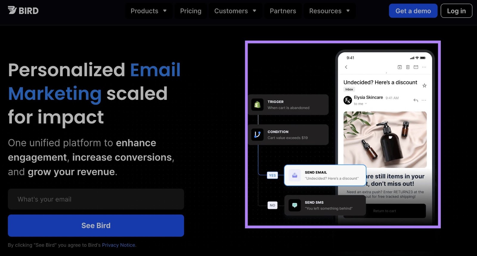
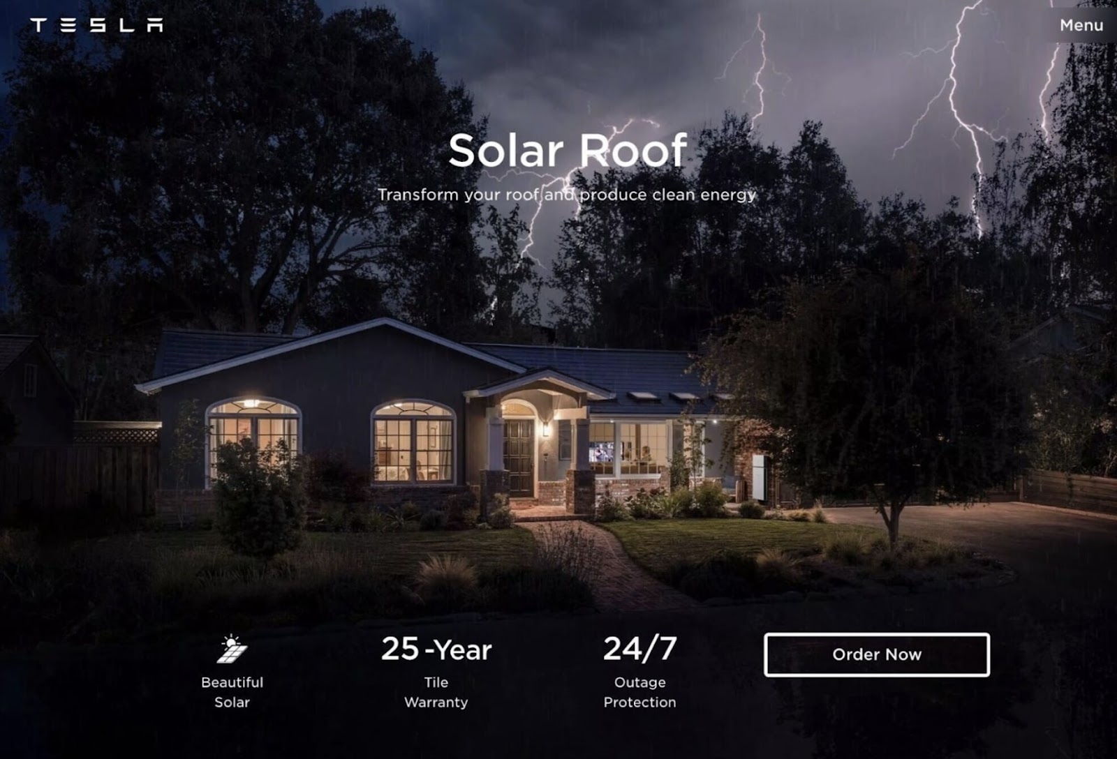
A hero image is a graphical element designed to make your landing page more visually appealing.
It’s big, eye-catching, and located near the top of the page. Like this one:
Or this one, which sits behind the text:
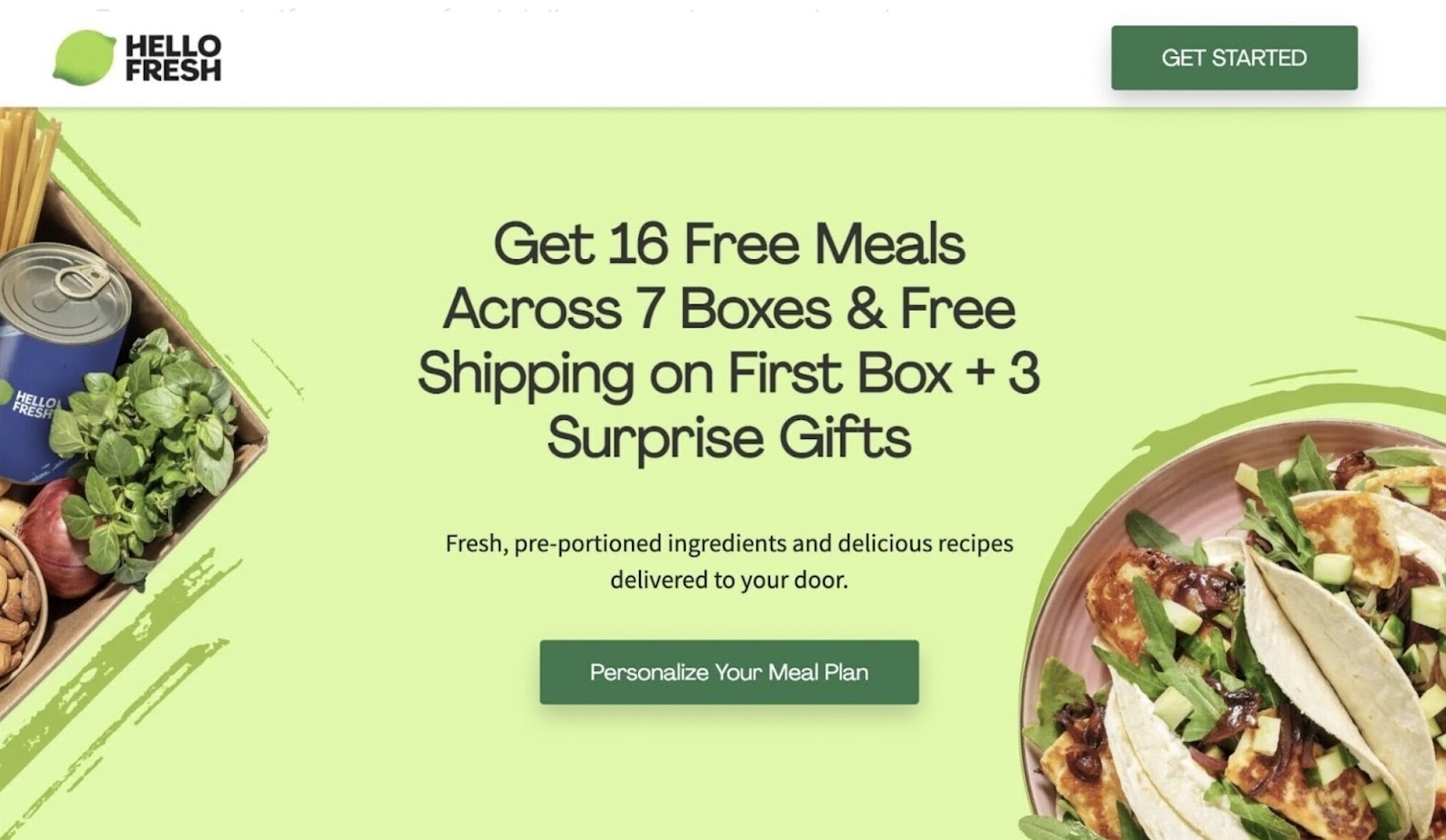
Some companies use hero images that show a literal representation of their product or service.
For example, if you run a food delivery service, your hero image might be a photo of delicious-looking food:
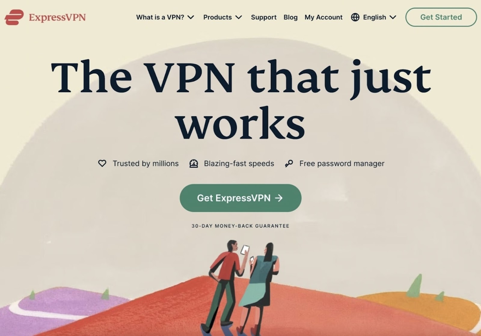
Other companies’ hero images don’t show the product or service at all. But are intended to create a positive first impression with the brand.
Like this landing page’s colorful illustration of two people standing atop a hill:
To find a picture to use for your hero image, check out free stock image libraries like Pixabay, Pexels, and Unsplash (Landing Page Builder lets you access Unsplash images directly within the tool).
Or, hire a designer who can brainstorm ideas and create hero images that are visually pleasing.
Here are some best practices to follow when creating hero images:
- Keep the image simple and uncluttered to avoid overwhelming the user
- Make sure your image complements the overall design and style of your landing page
- Use a hero image that helps the user understand the value of your product or service
- Use only high-quality images
Craft a Catchy Headline and Subheading
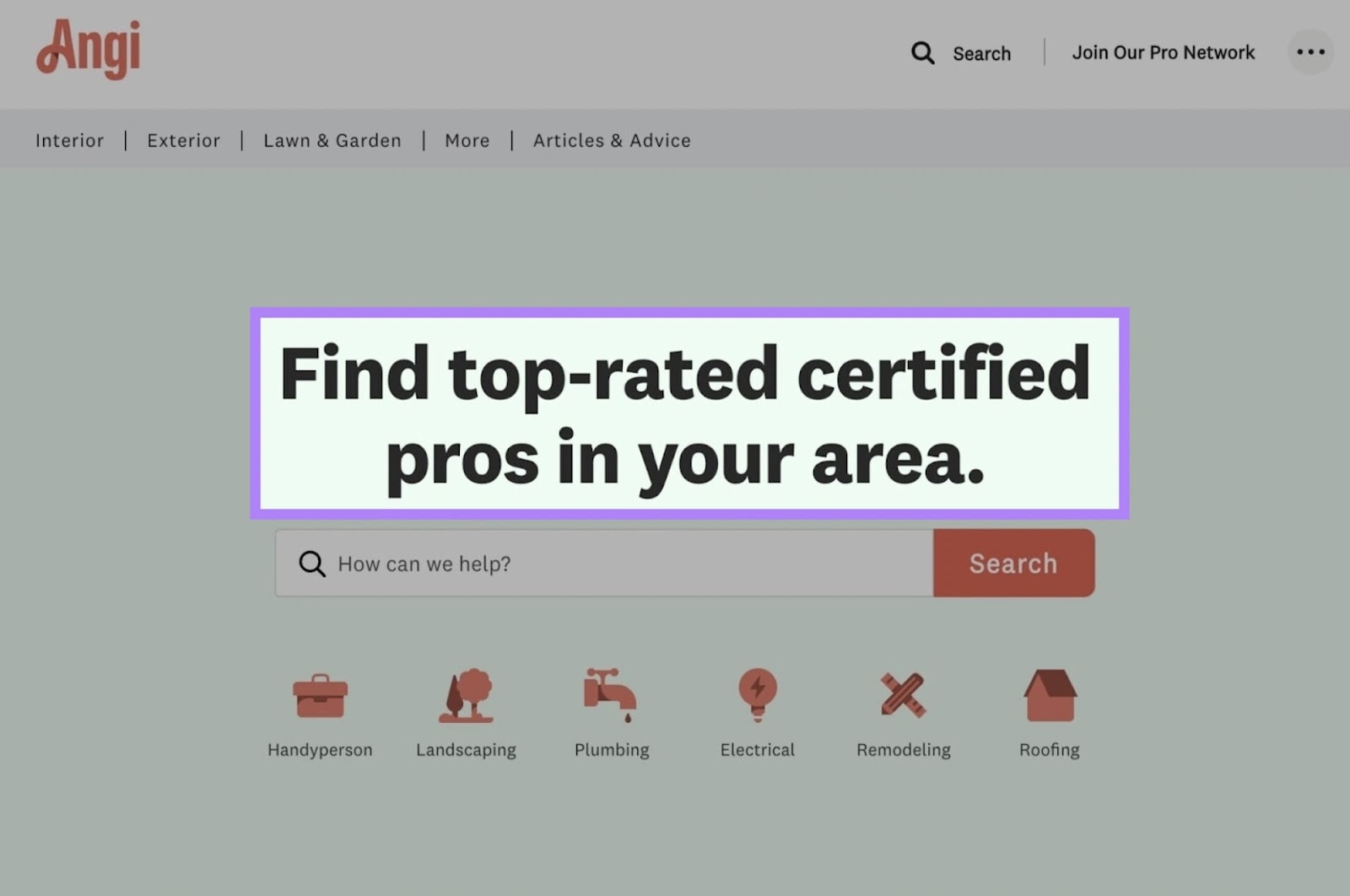
A catchy headline engages the visitor and helps them understand your offer.
The headline could be a value proposition. Like this:
Or it might describe what the visitor can expect when they click through. Like the discount offer from Spotify:
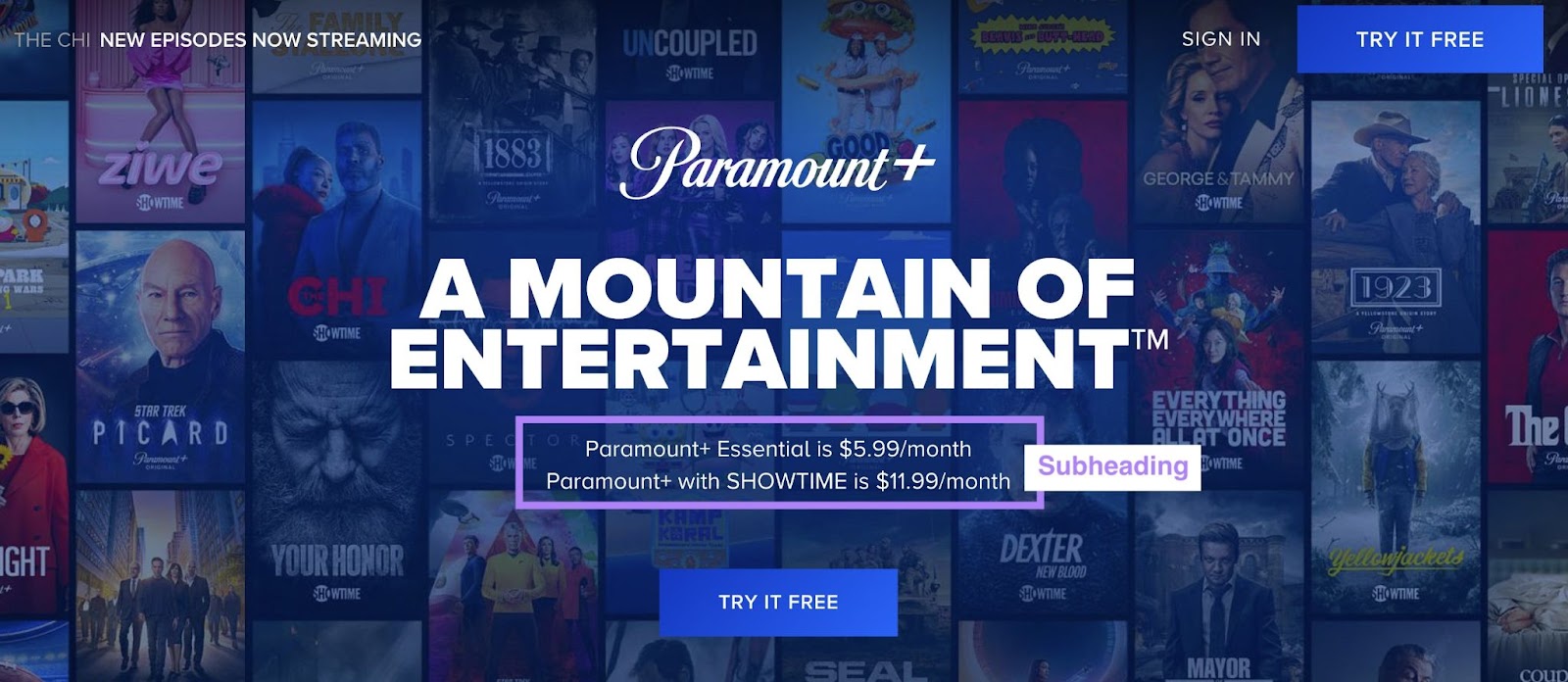
Some headlines are followed by a subheading that’s written in a smaller font than the headline. And provides more details and an additional nudge to get people to convert.
For example, Paramount Plus’s landing page has the headline “A Mountain of Entertainment.”
And underneath that, a subheading contains details about the subscription options and pricing:
Here’s a formula you can use for your headlines and subheadings:
- Headline: [Main benefit visitors will get, in 10 or fewer words]
- Subheading: [Details or additional benefits, in under 20 words]
Here are some additional ideas for crafting good landing page headlines:
- Use strong words that encourage the user to take action (“unlock,” “upgrade,” “boost,” “transform,” etc.)
- Use emotional language that speaks to the user’s pain points or desires
- If possible, use numbers or statistics to emphasize the value of your product or service
Write Concise Supporting Copy
Supporting copy is the text that describes your offer in more detail. It’s usually a few sentences long.
Not every landing page needs supporting copy. Often, a headline, a subheading, and an attractive hero image will do the trick.
But sometimes, adding extra details can convince people to take action.
For example, check out the supporting copy on Audible’s landing page. It describes an additional benefit that isn’t mentioned in the headline or subheading:
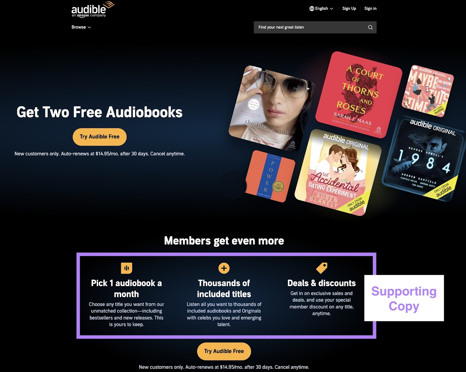
If you’re not sure what to use for supporting copy, ask yourself: “Is there anything important that can’t fit into the headline and subheading?”
If so, add it.
Try to keep it brief. Which you can do by using bullet points to highlight the most important details.
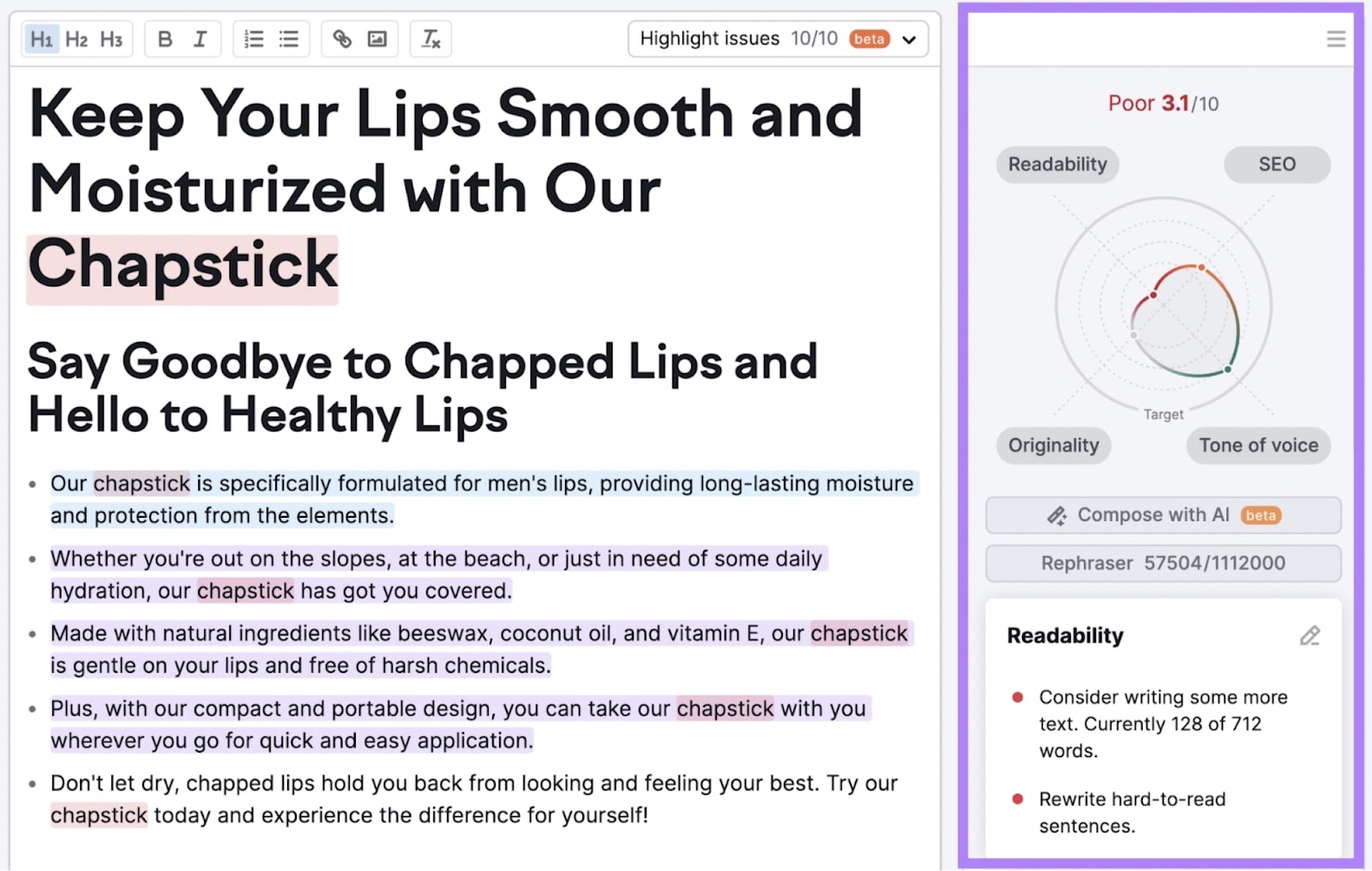
If you need help writing search-optimized copy, try Semrush’s SEO Writing Assistant.
The tool grades your copy based on readability, tone of voice, originality, and SEO potential. And it offers writing suggestions to improve it.
Add a Form
For lead generation landing pages, you’ll need to include a form for the user to enter their information. Otherwise, you may not get the lead.
You can ask for as much information as you want. But know that more fields typically lead to fewer people filling them out, according to an analysis from HubSpot.
In fact, many businesses ask for just an email address. To maximize conversions.
It can be worth asking visitors for information like their names, phone numbers, locations, and preferences. But only if the additional info will help you convert those prospects later.
For example, say you sell both cat toys and dog toys. In that case, you could add a field to your form asking what kind of pet the visitor has.
That way, you’ll be able to feature the products they’re most likely to buy in your future marketing emails.
Add a Strong Call to Action
A CTA is a prompt that encourages users to take the next step with your business. And it’s often a button or link on the landing page.
Visitors might click on a CTA to:
- Purchase a product or service
- Install an app
- Sign up for an event
- Download an ebook
- Subscribe to a company newsletter
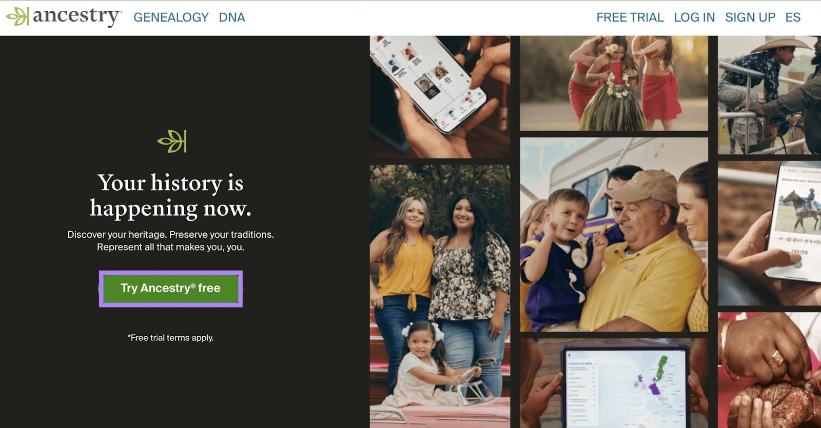
The CTA should be prominently displayed.
Some landing pages place it immediately after a headline or subheading.
Like this:
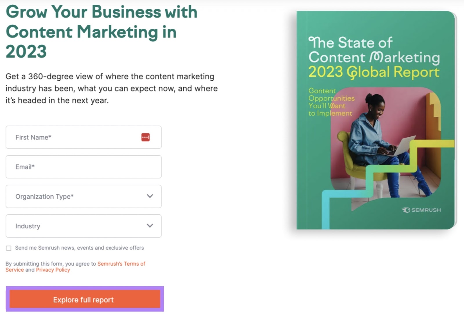
If your landing page includes a form, the CTA will come after it. And clicking the CTA button will submit the information entered in the form.
Here’s an example from our own landing page:
The CTA on the button should indicate what’s going to happen when the visitor clicks it. For example:
- If the landing page is for newsletter subscriptions, the CTA might read “Sign up”
- If the landing page is for a free trial of your product, the CTA might read “Try it now”
- If the button click kicks off a product flow, the CTA might read “Get started”
- If the button click leads to a purchase page, the CTA might read “Buy now”
It’s also a best practice to include your CTA multiple times on the page. Especially for longer landing pages.
For example, an additional CTA might follow your supporting copy. That way, any visitors reading your supporting copy won’t have to scroll back up to convert.
6 Landing Page Best Practices
These tactics will help you create landing pages that engage and convert users:
1. Use Consistent Messaging
Consistent messaging across all touchpoints (ads, emails, social copy, and landing pages) helps convey your main message.
Think of it this way:
Say you get a store flier that advertises a 75% off sale. But when you get to the store, you don’t see anything indicating there’s a sale.
You might ask a sales associate. But you might also feel confused and annoyed. And leave.
The same thing can happen to your audience when they interact with your brand online. They need consistent messaging to convert.
2. Simplify Forms
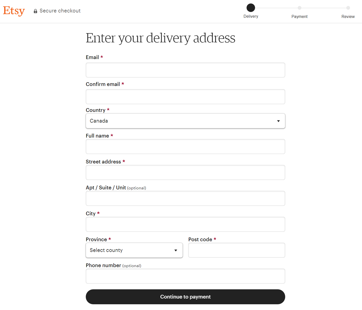
Simplified forms (like checkout forms) can help you convert more users.
Why?
Because 22% of U.S. survey respondents say they’ve abandoned a purchase because the checkout process was too long. Which can be related to the number of form fields users need to fill out.
So, trim your forms down to the essential information you need. Which could include:
- A single name field (rather than one each for first, middle, and last)
- Email address
- Shipping address
- Billing address (or a checkbox where users can tick that their billing address is the same as their shipping address)
- Credit card information
- Coupon code
Here’s an example of a simple checkout form from online marketplace Etsy.
3. Add Social Proof
Social proof supports a psychological phenomenon involving people looking to others to help make decisions. Meaning including it on your landing page can be quite persuasive.
For example, someone looking to buy a new bike might read testimonials and watch video reviews to see what other people have to say. And what they find can nudge them toward a purchase. Or dissuade them completely.
Some examples of social proof you could include on a landing page include:
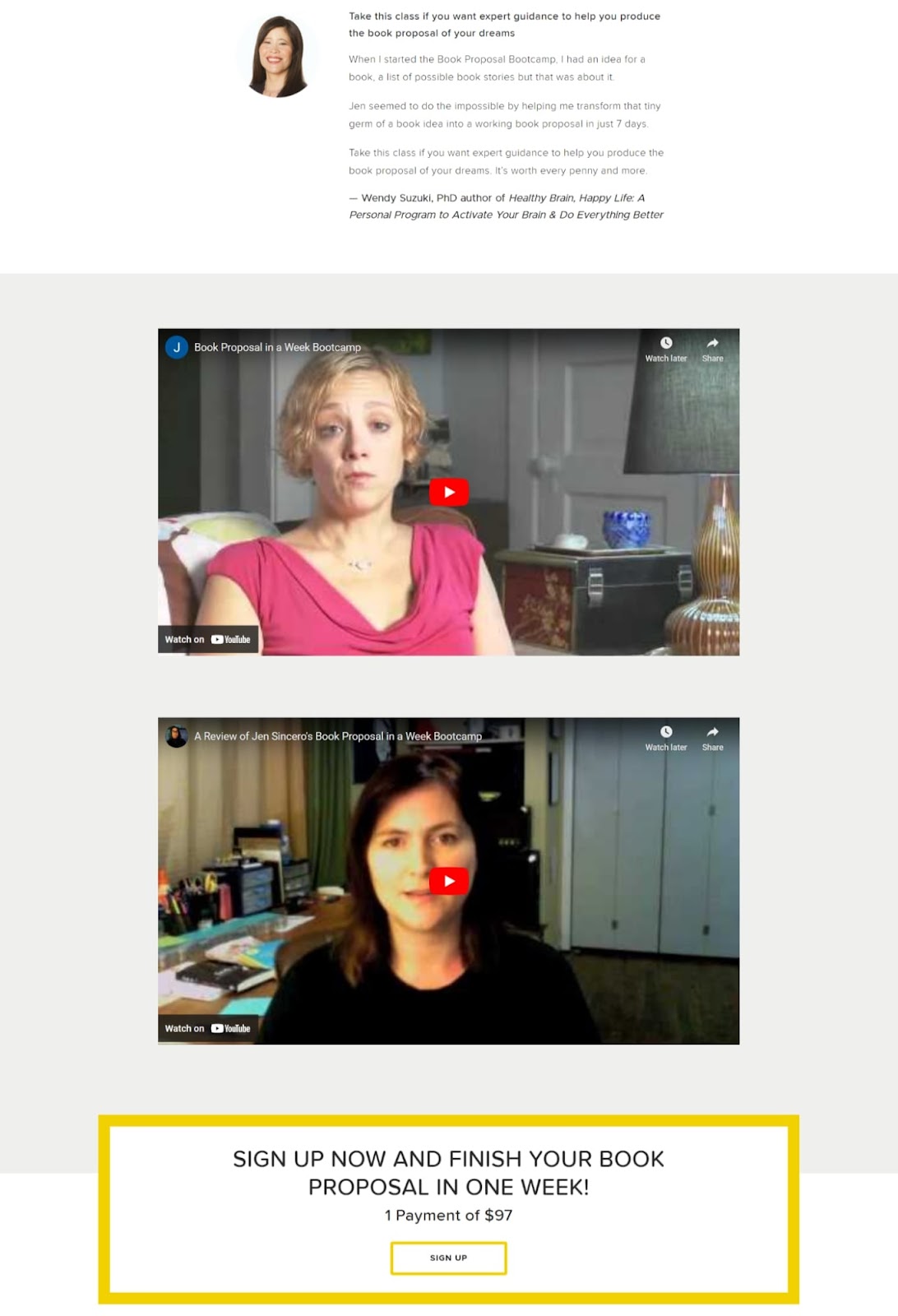
- Reviews and testimonials (video and written)
- Aggregate star rating
- Number of products sold
- Number of social shares
Author Jen Sincero includes written and video testimonials on her landing page:
Try to incorporate multiple elements of social proof throughout your landing page if you can. Especially near the top, so users don’t need to scroll too far.
4. Improve Page Speed
Fast-loading pages improve the user experience. Because they prevent users from becoming frustrated and hitting the back button.
Site speed is also a ranking factor for Google. Meaning having swiftly loading landing pages can help you rank higher in search results.
Here are a few suggestions to help your landing pages run fast:
- Resize large images to fit your site’s maximum width. If your site’s maximum width is 1,000 pixels resize your images to be 1,000 pixels or less
- Compress images (make the file size smaller). Tools like TinyPNG can make your image file sizes smaller without affecting their quality
- Use a content delivery network (CDN). A CDN is a network of servers across different geographical locations. When a user visits your landing page, the server closest to them serves it, making it load faster.
- Minify Javascript, CSS, and HTML. Minifying Javascript, CSS, and HTML is when you condense code (by removing elements like line breaks). It makes it easier for computers to process it. Plugins like WP Rocket can automatically minify this code for you.
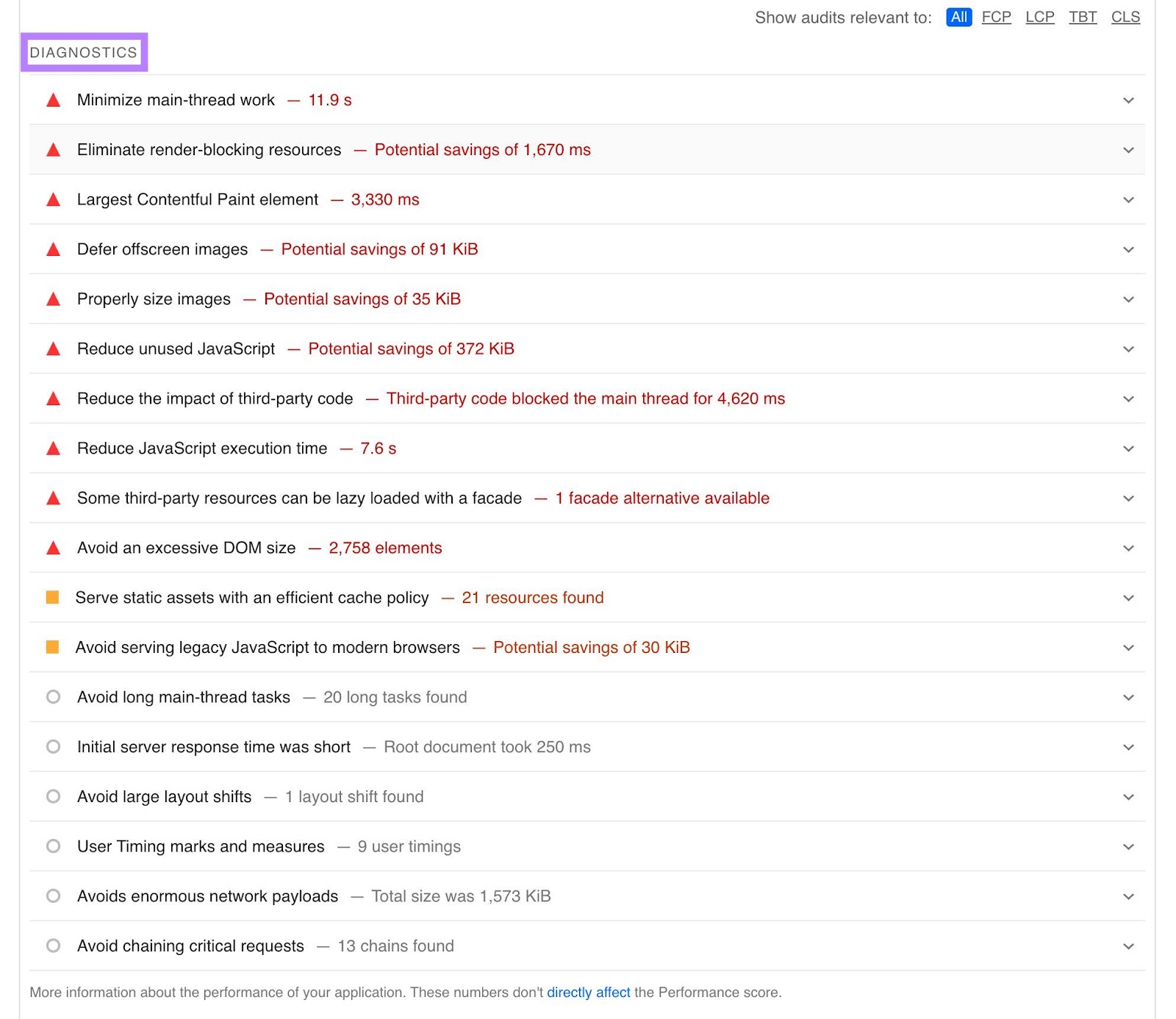
You can also test your landing pages to see how quickly they load using Google’s PageSpeed Insights tool.
It will give you an overall score and also provide recommendations for what you can do to improve.
5. Perform A/B Testing
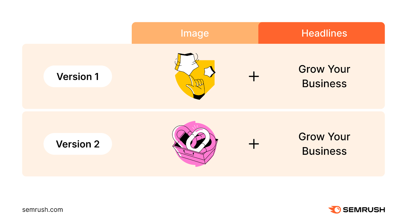
A/B testing is when you test two variants to see which one performs best. For landing pages, that means which one converts better.
For example, you might create two landing pages with different images and the same headline. To test which image leads to more conversions.
Consider A/B testing things like:
- CTA text
- Headlines
- Subheadings
- Images
- Social proof elements
- Page layout and object placements
6. Optimize Your Landing Page for Search Engines
Optimizing landing pages for search engines can help you appear in organic (unpaid) search results. Which can help more people see your offers without additional paid ad investments.
Let’s say you’re a photographer in Chicago. And you have a landing page for family photography sessions.
You might show up in the search results for queries like “family photographer in chicago” if that page is optimized with on-page SEO tactics like including internal links and adding relevant keywords to your content.
Semrush’s On Page SEO Checker gives you custom tips for optimizing your landing pages.
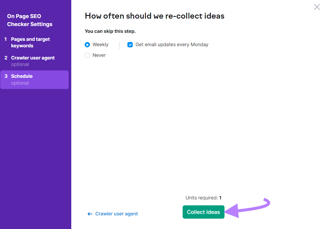
To use it, configure your On Page SEO Checker settings (make sure to include your landing pages when setting up your “Pages and target keywords”). And click “Collect ideas.”
When it’s done running, the tool will display a report.
Click the “Optimization Ideas” tab. Then, enter your landing page’s URL into the search bar and click the “# ideas” button next to it.
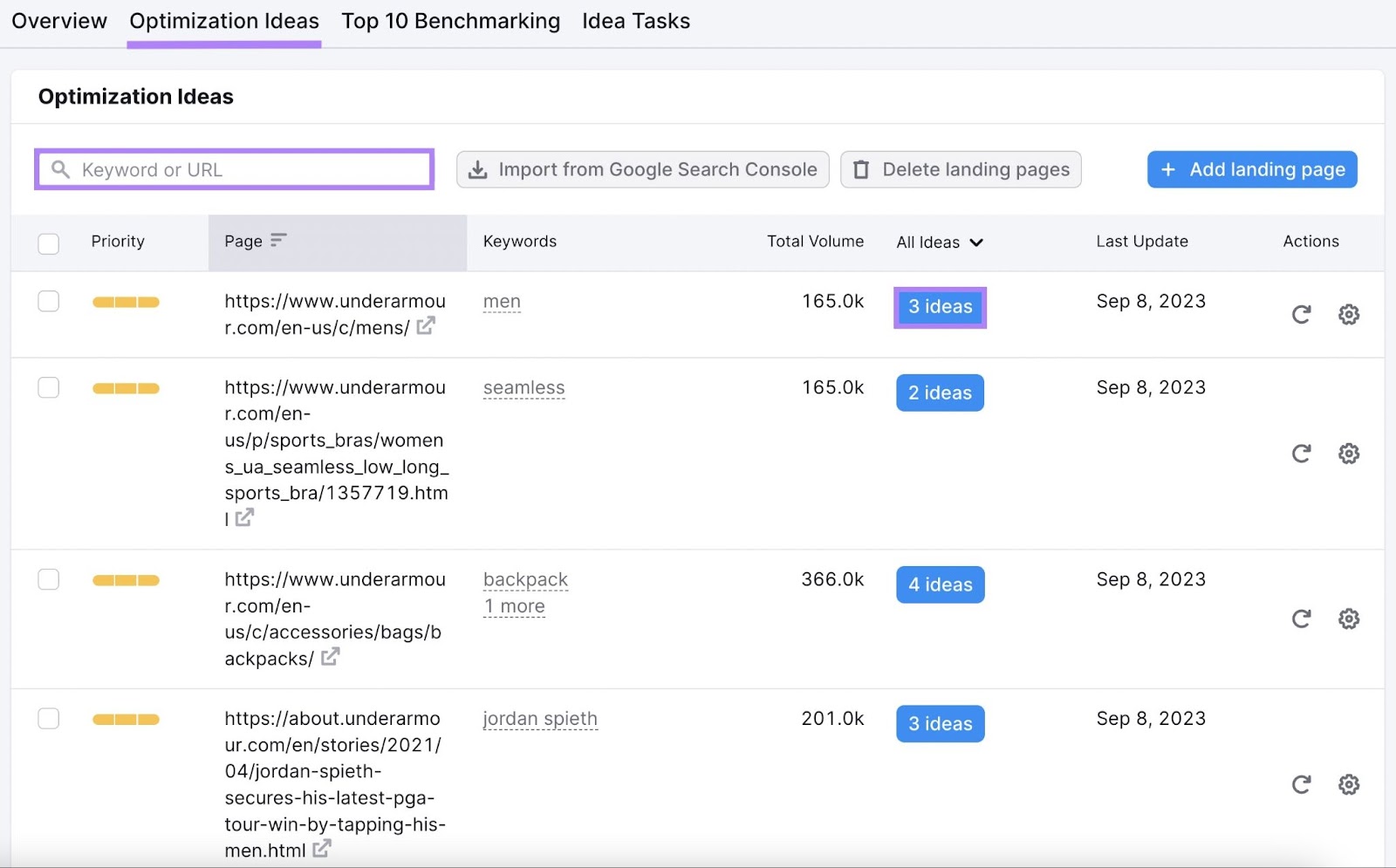
You’ll get a list of ideas to improve your landing page’s on-page SEO.
Hover over “About” to get more information for each idea.
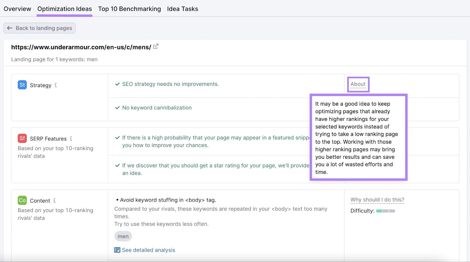
Implement the ideas listed here to increase your chances of ranking higher.
Additional Landing Page Examples to Inspire You
Let’s take a look at some example landing pages. And explore how they use the page elements we’ve discussed above to maximize conversions.
Bestow
Bestow is an online life insurance broker. This is what one of its landing pages looks like:
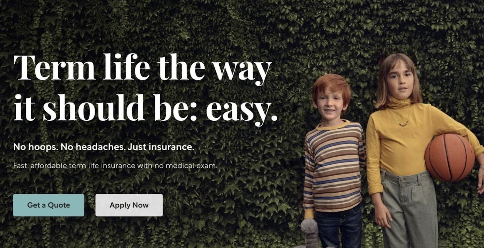
It contains a hero image of two children standing in front of a hedge to serve as a visual reminder that life insurance is meant to protect your loved ones. Without showing the product itself.
The landing page’s headline and subheading both explain that applying for their product is easy.
And one sentence of supporting copy gives one additional detail: The specific type of life insurance Bestow offers.
There are also two CTAs on the page.
One says, “Get a Quote.” And when a visitor clicks through to the next page from there, they’re asked to provide some information about themselves:
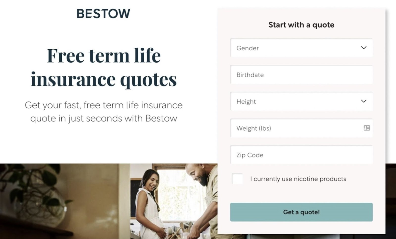
This type of page provides a service to the visitor to help them make a purchase decision. And also lets the business collect information about a prospect to generate a lead. Who they can market to later if they don’t become a customer right away.
The other button on Bestow’s landing page reads “Apply Now.”
This is for users who don’t need additional information about life insurance and are ready to apply for coverage. To convert.
When clicked, the “Apply Now” button takes the visitor to a page that looks like this:
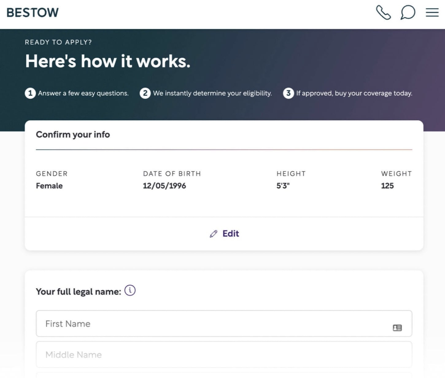
As you can see, it asks some of the same questions as the “Get a Quote” page. But it also includes more personal questions, like the visitor’s home address.
When a customer fills out this form, the company will determine if they qualify to purchase a life insurance policy. If they do, they can purchase the policy right then.
LinkedIn Premium
LinkedIn’s premium service comes with a one-month free trial, which is accessible via this landing page:
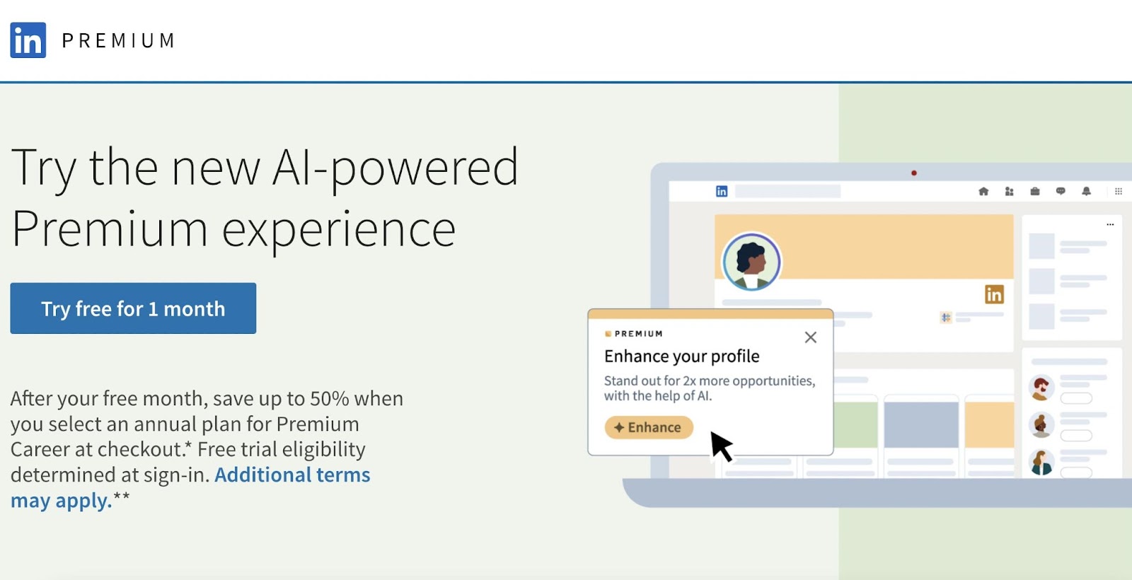
Here, the hero image is a cartoon that depicts LinkedIn Premium in action. It features a function that isn’t available to non-premium subscribers.
The page also uses a large headline to entice visitors to click. And two CTAs.
One is a button that says, “Try free for 1 month.” The other is a button in a different style that says, “Start my free trial.”
Having more than one CTA gives users multiple opportunities to click the offer. Depending on where they are on the page.
Both CTAs lead to the same page to sign in:
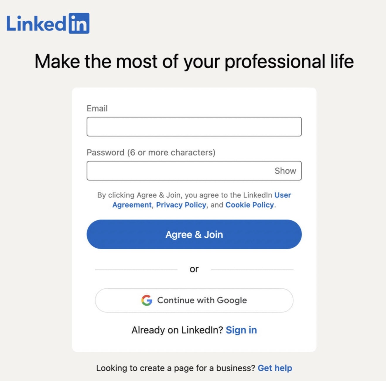
If visitors already have a free account, they can be sold on an additional product after logging in.
And if they have an account, they’ll be able to make one in order to claim the offer. And even if they don’t end up signing up for the trial, they can be reached with additional offers later.
Tor Books
Science fiction and fantasy book publisher Tor offers a free ebook each month.
Their landing page that promotes the offer looks like this:
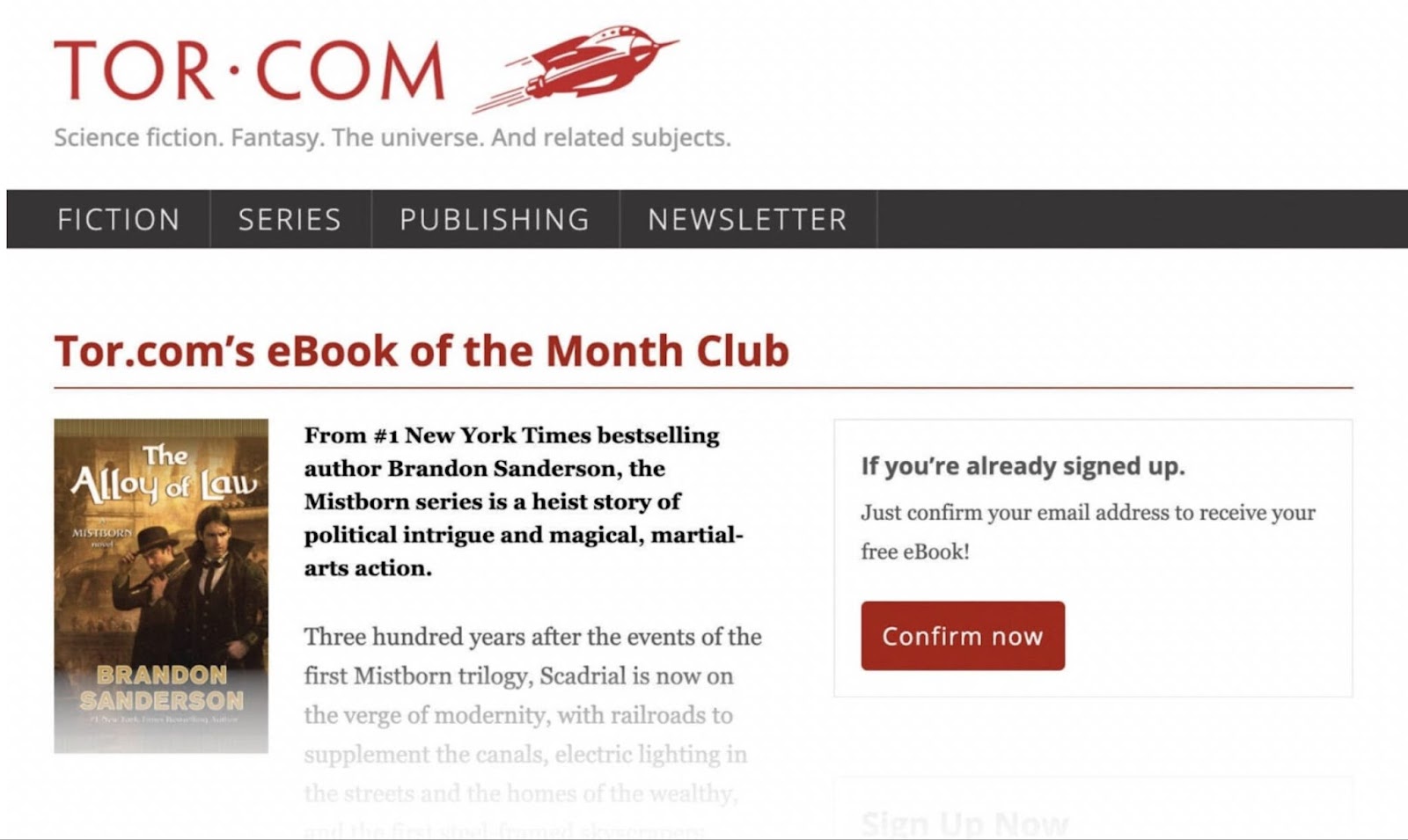
An image of the ebook’s cover serves as the hero image.
A headline details the offer: A book-of-the-month club. And the subheading gives a one-sentence summary of that month’s ebook.
There’s also supporting copy describing the plot. To ensure users know what the ebook is about.
The page has two CTAs.
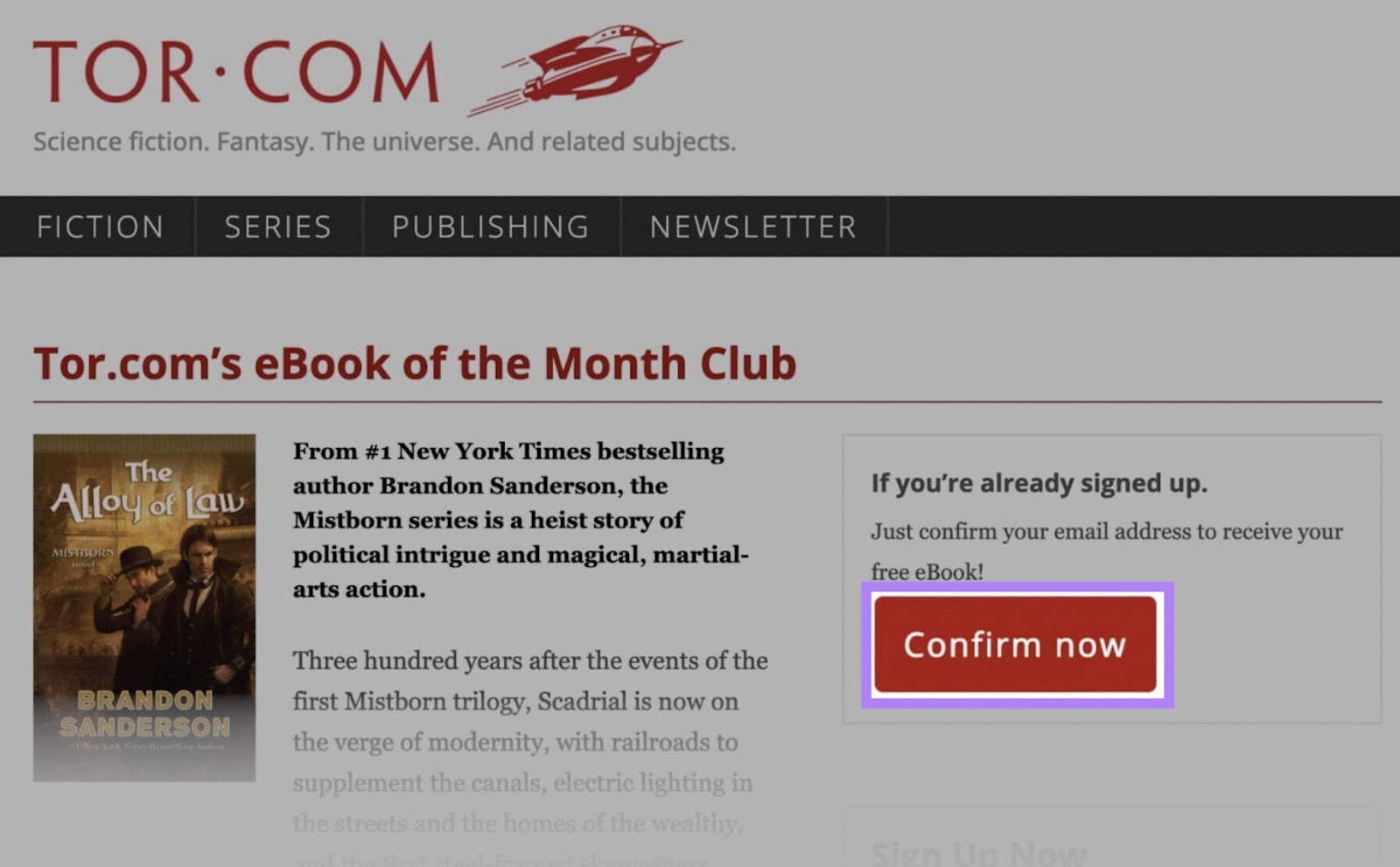
One is a button intended for people who are already Tor customers. If the visitor has already subscribed to Tor’s book-of-the-month club, they can click “Confirm Now” to get the free ebook.
The other CTA button (“Sign Me Up!”) appears below a form asking visitors to fill in some information, accept terms and conditions, and opt in to newsletters.
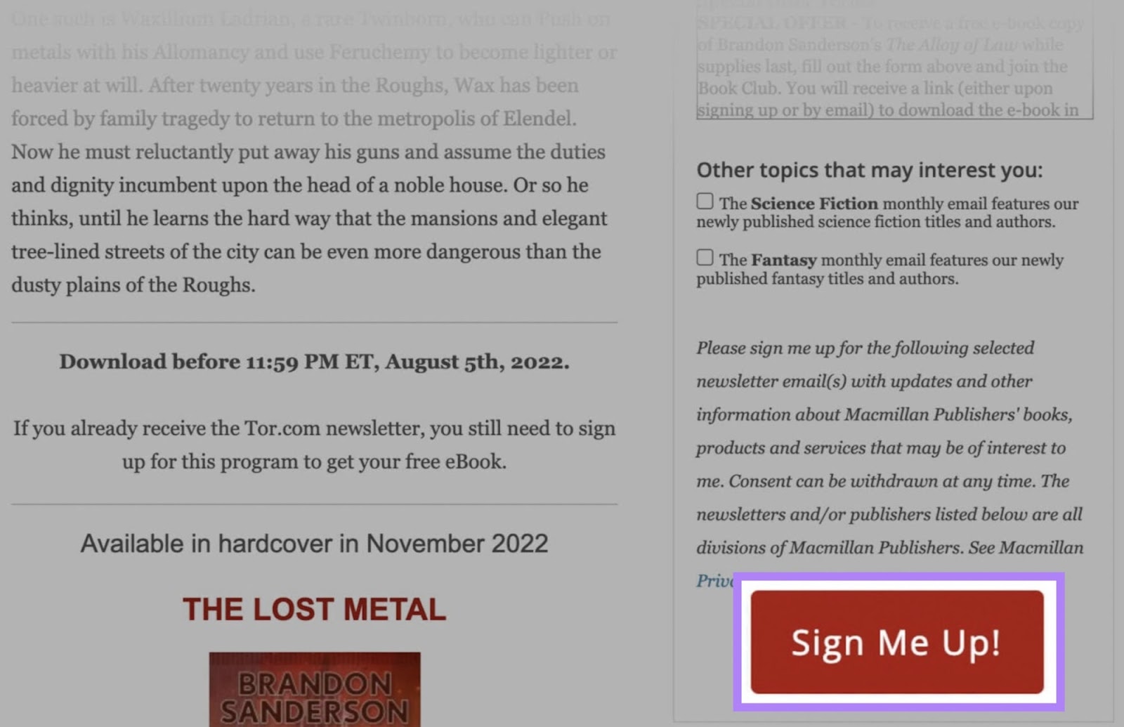
Having these two CTAs means Tor can convert multiple sets of users.
Start Creating Effective Landing Pages
An optimized landing page has the potential to drive leads and sales for your business without increasing your paid ad budget.
But before you can get those leads and sales, your landing page needs organic traffic.
Semrush’s tools can help you optimize your landing pages so they rank high in search results. And drive traffic that turns into prospects and customers.
Ready to give it a try?
Sign up to explore Semrush for free.
