Conversion rate is one of the most important metrics for any website. Because a higher rate results in more leads and sales than a low one—even without increasing traffic.
But how can you actually boost your conversion rate?
In this guide, you’ll learn about 18 proven techniques you can start using right away.
Let’s dive in.
1. Prominently Display Your Value Proposition
Your value proposition is a statement that clearly communicates what your product or service offers to customers and what sets you apart, and placing it high on your homepage, product/service pages, and landing pages helps visitors quickly understand the benefit of becoming a customer.
So, place your value proposition prominently above the fold—the portion of your webpage that’s visible without users having to scroll—on your conversion-oriented pages.
Like this:
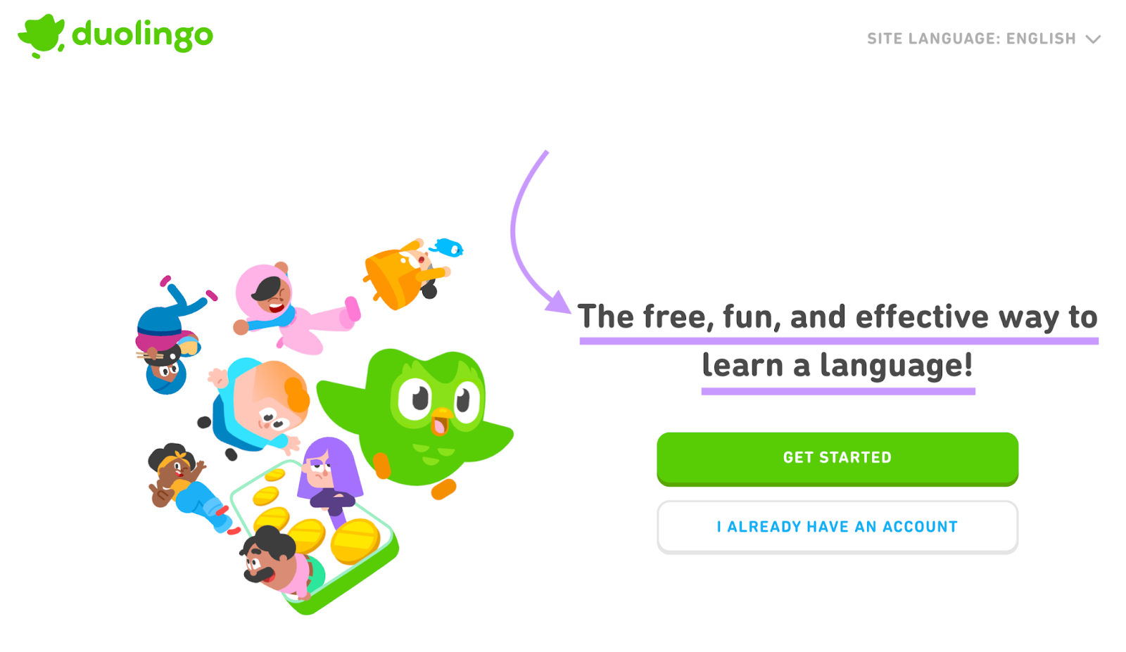
This grabs visitors’ attention and encourages them to explore your offerings.
Keep in mind that your brand’s overall value proposition might not make sense if you have multiple offerings. If that’s the case, tailor your message to what the specific page is promoting.
Here are a few tips for creating a good value proposition:
- Keep it clear and concise: Use straightforward language that’s easy to understand and try to keep your message to one concise sentence
- Highlight what customers get: Focus on how your product or service truly benefits customers
- Convey what makes you unique: Highlight the main difference between you and your competitors
2. Improve Your Copy’s Readability
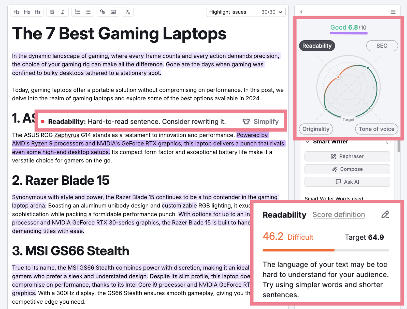
Visitors might leave your site without taking action if your copy isn’t easy to understand, so prioritizing readability can help you capture more conversions.
To do this, make sure to:
- Avoid using jargon: Use simple words that everyone can understand, regardless of their background or expertise
- Use short sentences: Keep your sentences short and to the point to improve readability and comprehension
- Use a conversational tone: Writing in a conversational tone makes your content easier to understand and more approachable
For an easy way to spot opportunities to improve your content’s readability and tone, try the SEO Writing Assistant.
3. Build Trust with Social Proof
Social proof like star ratings and testimonials help prospects see that others have had positive experiences with your product or service and make them more likely to purchase.
For example, Basecamp (a company that sells project management software) has a carousel of testimonials on its homepage.
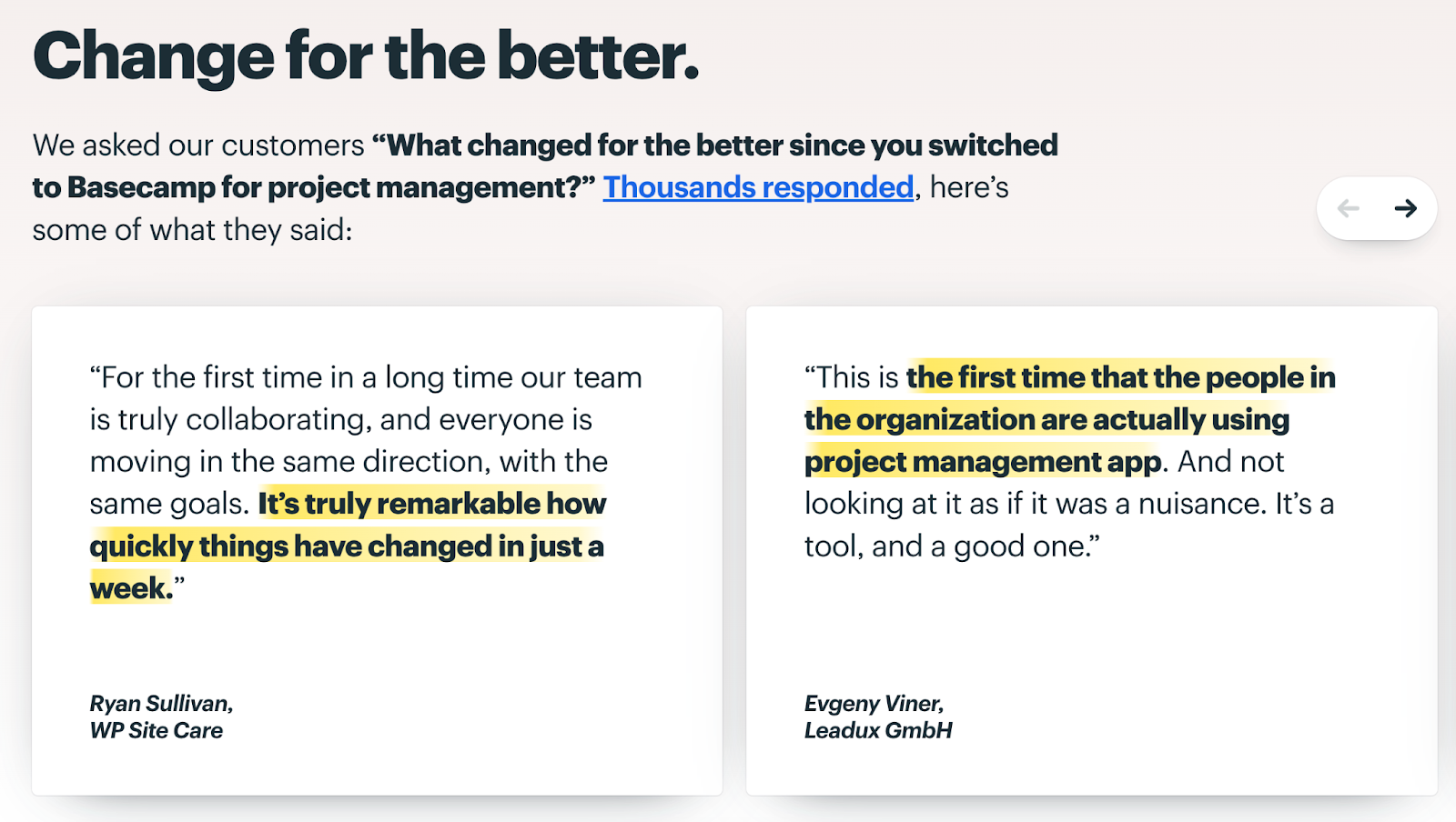
But testimonials aren’t the only way to add social proof.
Here are some other effective tactics:
- Display client logos: If you’ve worked with well-known brands, showcase their logos prominently. This establishes instant credibility.
- Highlight user numbers: Have a large user base? Feature that impressive stat. Statements like “Join 50,000+ satisfied customers” can build trust.
- Share press mentions: Has your company been featured in major media outlets? Include “As seen in” logos or quotes to boost credibility.
- Feature case studies: In-depth case studies that include real data are extremely persuasive forms of social proof. They allow potential customers to see themselves in the story and understand what results they could achieve.
- Add trust seals: Badges from trusted cybersecurity companies, business bureaus, or industry organizations show that your site is secure and/or trustworthy.
4. Simplify Your Forms
It’s best to keep your conversion forms as straightforward and short as possible, because forms that are long or complicated can prevent potential customers from taking action.
For example, Zillow only asks for an email address and password. Visitors will likely think filling out two fields is reasonable.
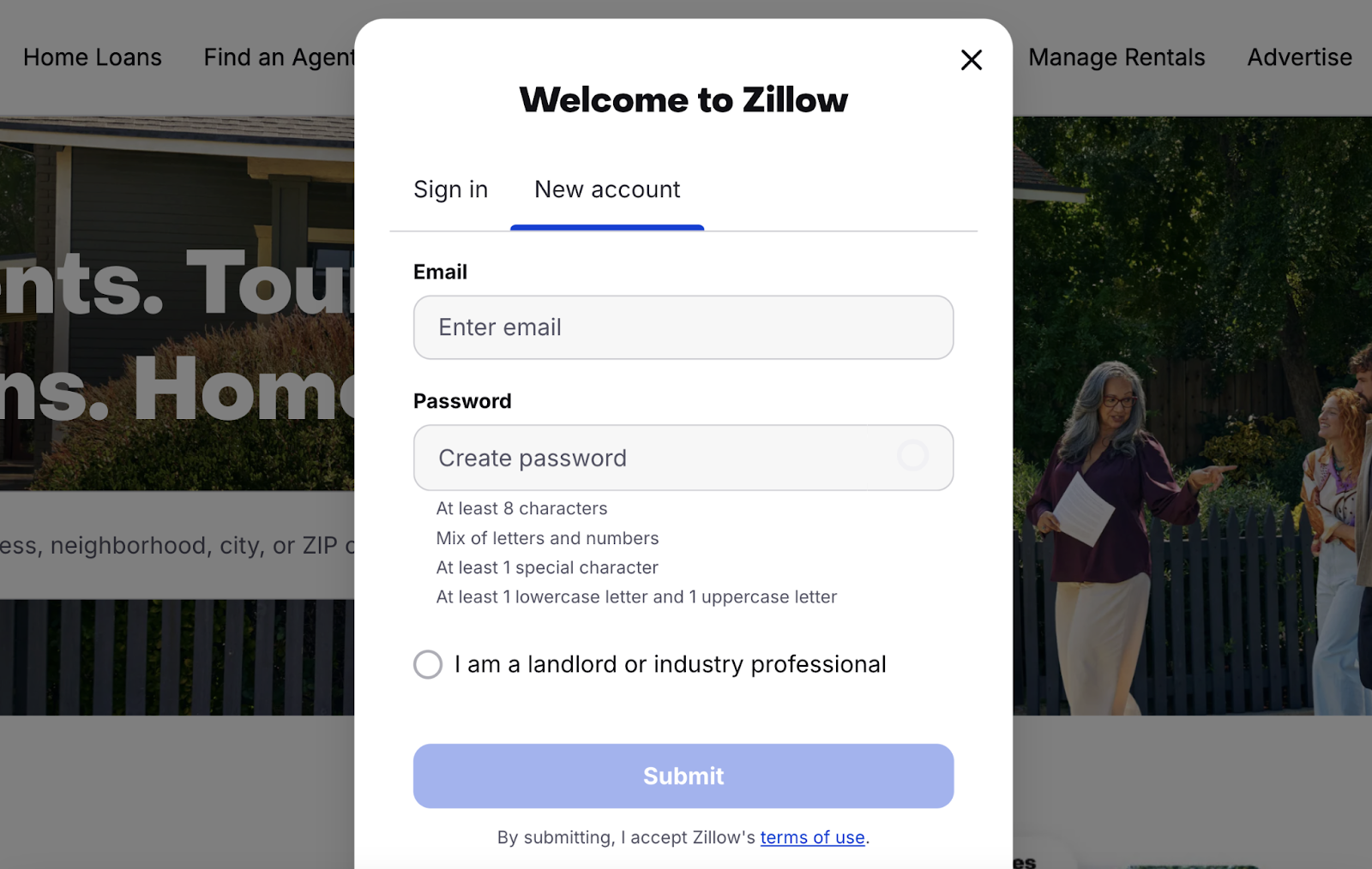
In addition to minimizing the number of fields, here are some other ways to optimize your forms for conversions:
- Use clear labels and instructions: Make it obvious what information is needed in each field
- Break up long forms: If you must collect more information, consider splitting the form into multiple steps
- Make required fields obvious: Use asterisks or other indicators to show which fields must be filled out to submit the form
- Optimize for mobile devices: Use responsive website design to ensure your forms (and other elements on your site) are easy see and interact with on all devices
5. Incentivize First-Time Purchases
Offering an incentive for new customers can drive more purchase conversions because it can provide a final nudge to those who’ve never bought from you and may be hesitant about doing so.
Here are some incentive options to consider:
- Offer a discount: Provide a percentage or dollar amount off the first purchase. For example, “Get 15% off on the premium plan!”
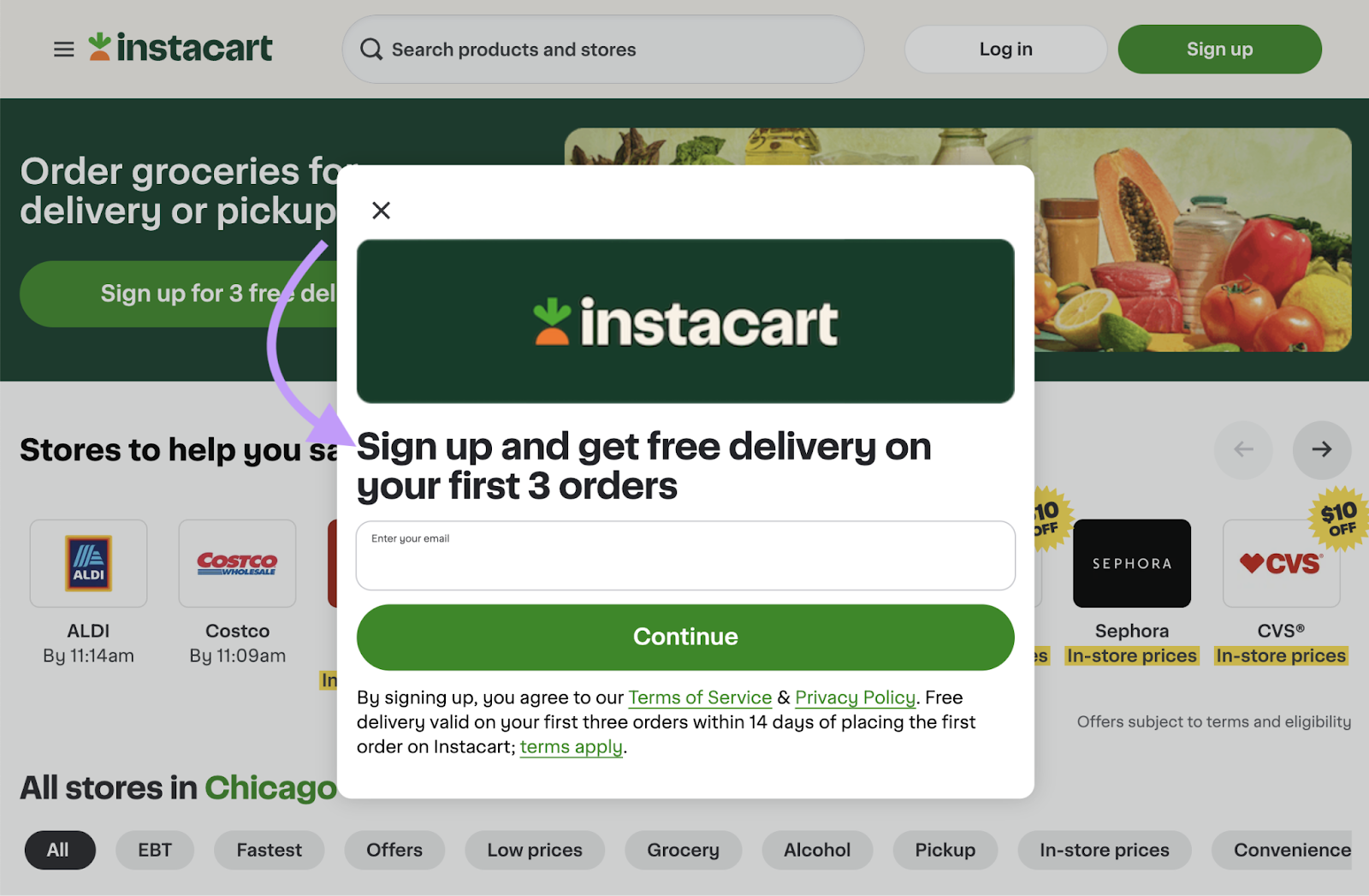
- Provide free shipping or delivery: Unexpected shipping and delivery costs can lead to cart abandonment on ecommerce sites. That means offering free shipping or delivery on the first order can remove friction and drive sales.
For example, Instacart offers free delivery on the first three orders for those who sign up for the service:
6. Use Strong Calls to Action
A call to action (CTA) is a prompt that encourages visitors to take an action like filling out a form, signing up for a newsletter, and making a purchase—and that means they need to be compelling to drive the intended activity.
What makes a CTA good?
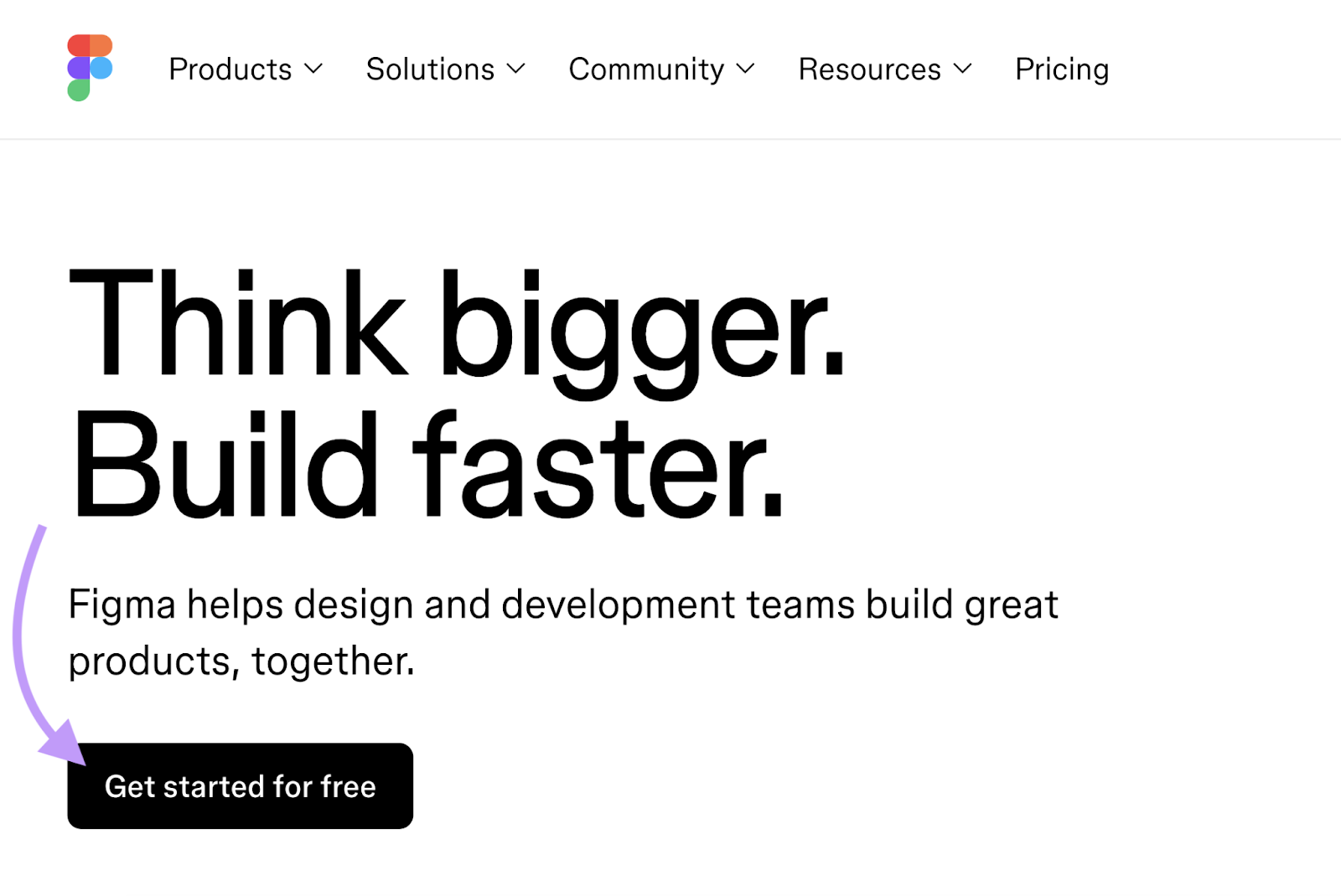
It should clearly tell the visitor what you want them to do and convey a sense of value.
Like this button on Figma’s homepage:
Here are some other tips for creating effective calls to action:
- Use action-oriented language: Start with verbs that encourage action, such as “buy,” “sign up,” or “get started.”
- Position them strategically: Place CTAs in prominent locations where visitors are most likely to see them, such as above the fold, at the end of a piece of content, or alongside product-related information
- Make it stand out: Use contrasting colors to ensure your CTA catches visitors’ attention
7. Reduce Cognitive Load
Minimizing cognitive load (how much mental effort it takes to process information and make decisions) helps users grasp your message more quickly and may encourage them to convert.
Think of it this way:
When a website presents visitors with too much information, complex navigation, or a cluttered design, it overwhelms them and makes it harder to identify the desired action.
Here are some ways to reduce cognitive load:
- Simplify your design: Use a clean, uncluttered layout with plenty of white space. This helps visitors focus on the most important elements without distractions.
- Limit choices: Offering too many options can lead to decision paralysis. Present the most relevant offer to guide users toward a decision.
- Use clear navigation: Organize your menu logically to help users find what they’re looking for without frustration. You may even consider removing the navigation bar from landing pages entirely to further reduce distractions.
- Use familiar icons and symbols: Use common icons that users recognize to convey information quickly without needing additional explanation
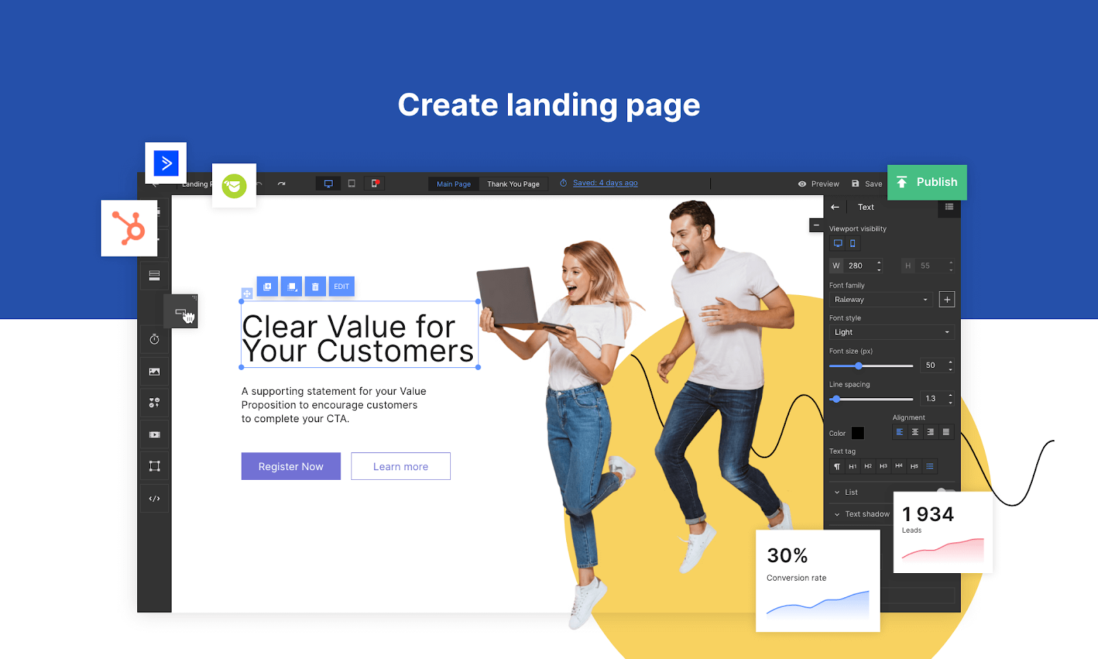
Creating landing pages that use these tactics might seem intimidating, but the Landing Page Builder app can help you create pages that are simple, appealing, and likely to drive conversions.
8. Conduct A/B Testing
A/B testing (also known as split testing) can be used to compare two versions of a webpage to see which one performs better, and the insights you gain often help you discover ways to optimize your conversion rate.
With this method, you can test changes to your headlines, CTAs, images, layout, and more. To see which version leads to more conversions.
As for how to run a test, there are many split testing tools available. Such as VWO, Optimizely, and SplitSignal.
The testing process works roughly like this:
- Generate a hypothesis: Form an idea about what change might improve your conversion rate. For example, you might hypothesize that changing your value proposition headline from “Best Quality Products” to “Premium Quality Products at Affordable Prices” will resonate better with your audience and drive conversions.
- Create two versions: Create a control page and a variation with the change you want to test. Only change one element at a time so you can isolate the effect of each change.
- Run the test: Split your traffic between the original version and the variation. Run the test until for at least several weeks, ideally until you have statistically significant results.
- Analyze the results: Look at the data to see which version performed better. If a variation won by a significant margin, implement the change permanently.
Because there are so many elements to evaluate, it’s a good idea to continuously test new hypotheses to improve your conversion rate (and even other metrics) over time.
9. Use Color Symbolism
You can convey meaning to website visitors based on your use of colors—and you may be able to persuade them to take action.
Here are a few examples of colors and what they can convey, according to the Interaction Design Foundation:
- Red: Passion, strength, danger
- Orange: Creativity, happiness, success
- Yellow: Happiness, caution, intellect
- Green: Nature, freshness, wealth
- Blue: Trust, sadness, peace
- Purple: Wisdom, mystery, luxury
Because different colors can have different meanings, context matters. So, think about what makes sense for your brand as a whole.
Then, try incorporating color strategically on buttons, in subheadings, and in backgrounds (as long as the hue fits with your brand) to convey a message beyond what your copy says.
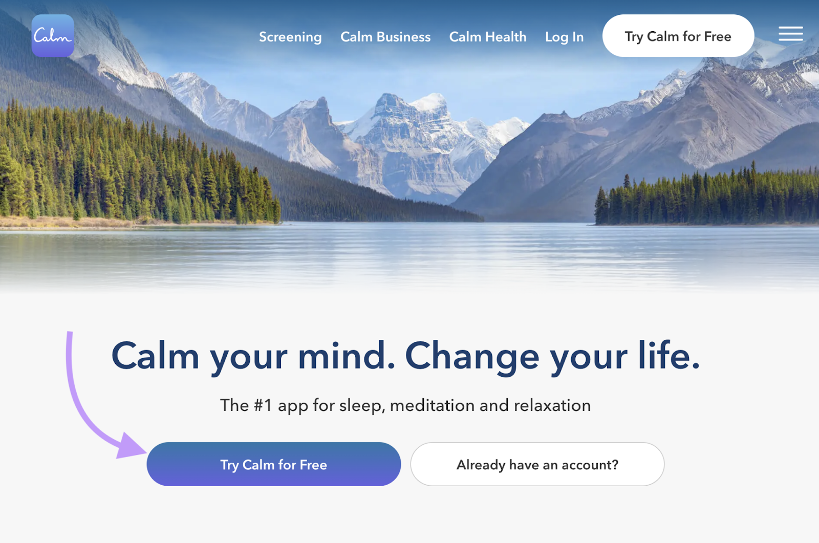
For example, Calm’s use of blue in their homepage’s primary CTA button may subtly assure users that they’re in for a serene experience when they try the app:
10. Add a Live Chat Feature
Implementing a live chat option can boost your conversion rate because it offers a way for people who have questions or concerns to get answers that might persuade them to convert.
For example, Nordstrom uses live chat to enhance users’ shopping experiences.
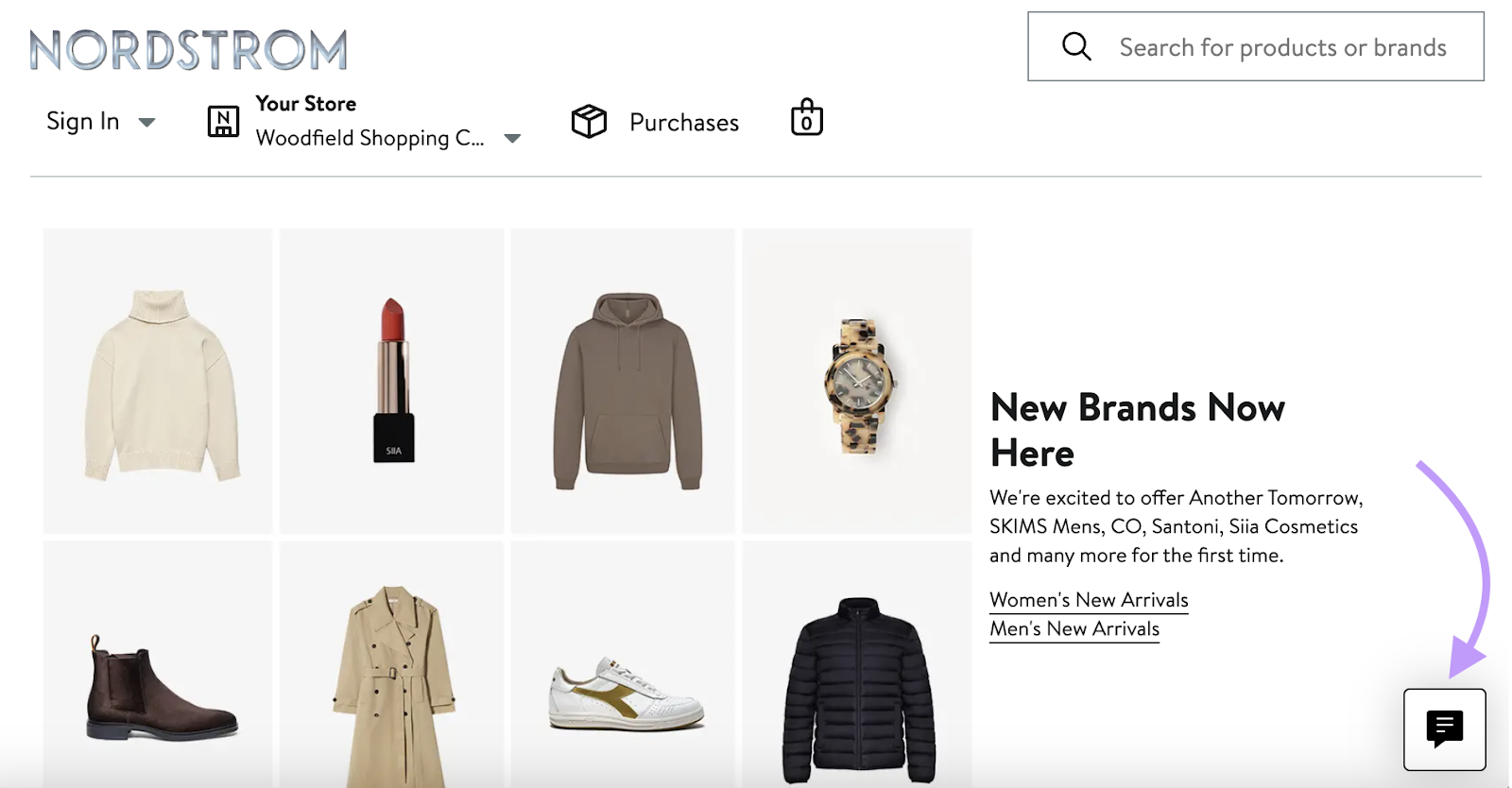
There are a number of ways to implement live chat functionality.
One popular option is to use a platform like Intercom or ChatBot to add an AI chatbot that can directly answer many visitors’ questions.
Another option is to use a live chat that’s staffed by customer service representatives. This option requires dedicated resources, but it can also lead to more personalized experiences and possibly better results.
11. Optimize Your Checkout Process
Ecommerce websites that make it cumbersome to complete a transaction can lose out on purchase conversions, so making it simple and intuitive is key.
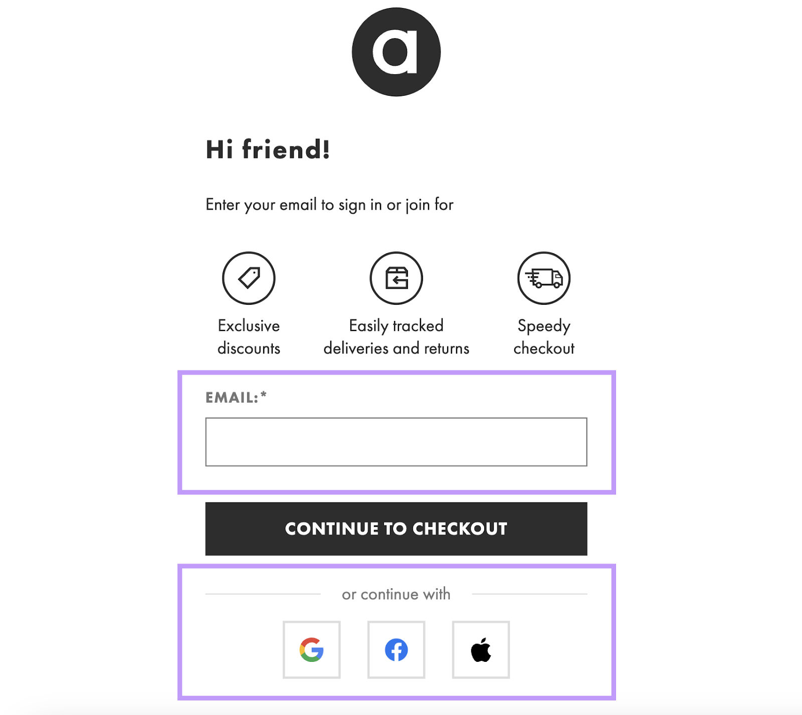
ASOS does a great job of streamlining purchases.
When a user initiates the checkout process, they can easily get started by entering their email address or using a third-party login.
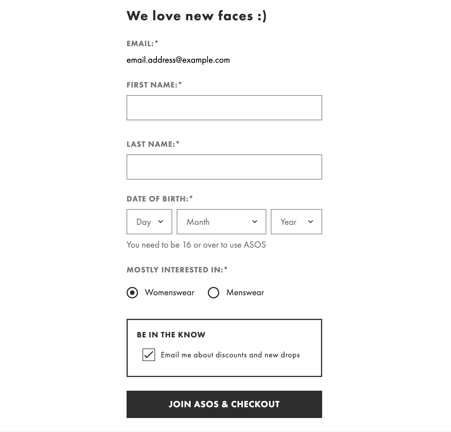
First-time buyers will then see a simple form with just a handful of fields (returning customers get to skip this).
And the checkout page itself takes care of everything else needed to complete the transaction.
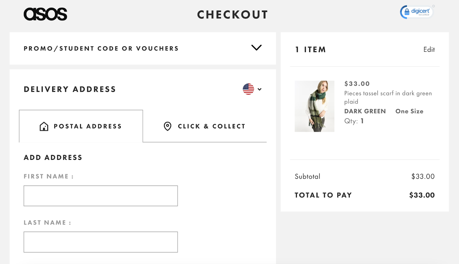
It’s a good idea to work with a developer to determine what’s feasible. But generally speaking, it’s best to use as few pages and fields as possible.
12. Improve the User Experience
Prioritize your site’s user experience (UX) because users are more likely to convert on pages that are free of performance issues and are easy to navigate.
Think of it this way:
Your website could have the most compelling copy and the sleekest design, but visitors are probably going to quickly abandon it if it isn’t easy and pleasant to use.
Here are some key UX elements to focus on:
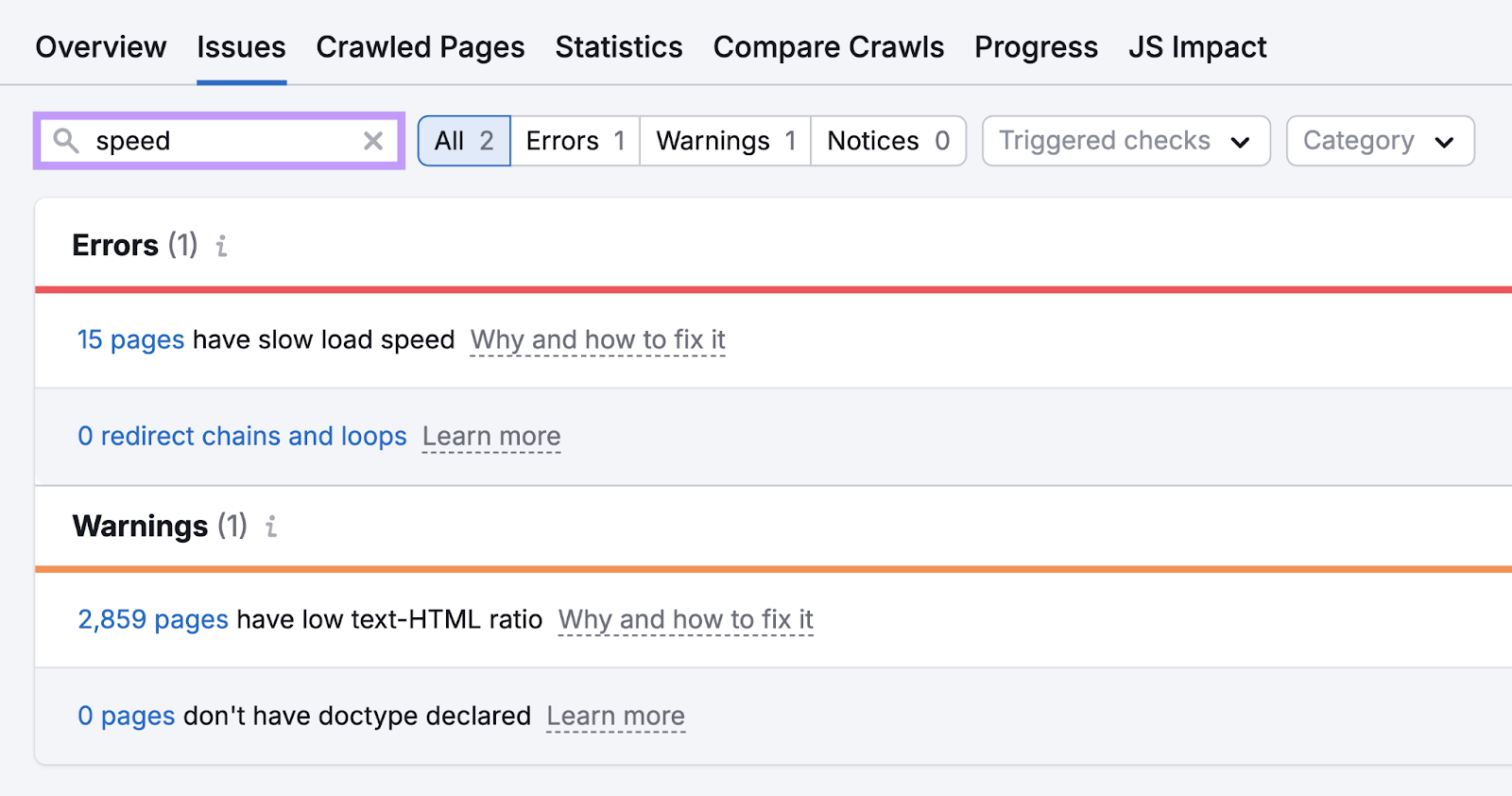
- Page speed: Slow loading pages are incredibly frustrating to visitors, so improve your speed by optimizing your images, minimizing code, and using caching
- Mobile-friendliness: Ensure your website works well on mobile devices. Opt for responsive design because that ensures your site looks good and works well on any device.
- Navigation: Make it easy for users to find what they’re looking for with a clear, logical menu structure and a search function
- Typography: Use readable fonts, ensure adequate font size, and use enough spacing for easy reading. And avoid using too many different fonts.
- Content layout: Use headings, short paragraphs, and bullet points to make content scannable
- Feedback: Use loading indicators (e.g., a rotating circle), success messages (e.g., “We’re processing your order!”), and other feedback to keep users informed of what’s happening
Auditing your site for technical issues can be helpful in finding ways to improve UX.
Semrush’s Site Audit can help you check for many of these problems. Like slow pages, broken links, and mobile optimization issues.
13. Send Cart Abandonment Emails
Using email to reconnect with visitors who left your site before finishing their purchase can persuade them to return and complete their transactions.
And this could significantly impact your purchase conversion rate. Because 70% of online carts are abandoned before the customer completes a purchase, according to the Baymard Institute.
You can recoup those purchases by sending these visitors a well-timed, persuasive email.
Like this:
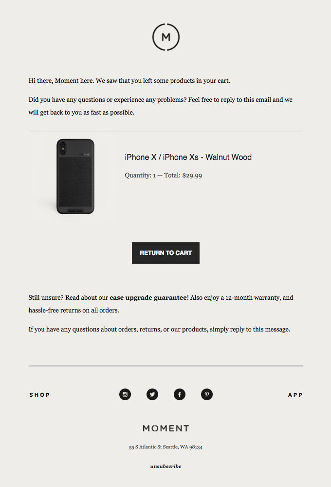
Image Source: Really Good Emails
This is easier to implement than you might think.
Email platforms like Mailchimp integrate with many of the tools you’re likely already using to automate the process.
14. Showcase Your Return Policy and Guarantees
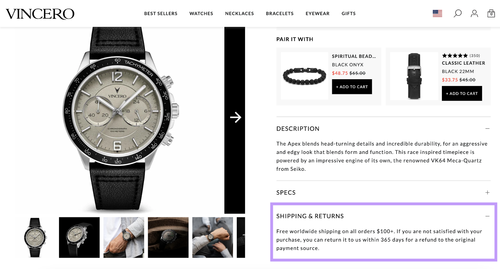
Prominently displaying your return policy and/or any guarantees about your product or service helps to alleviate anxiety or concerns visitors might have about completing a purchase conversion.
This helps you immediately answer questions like:
- Will the product or service work as advertised?
- What if it doesn’t meet expectations?
- Can it be returned easily?
Vincero does this by including shipping and return information directly on product pages:
15. Offer Something Free
Offering something free that visitors are likely to find valuable in exchange for completing a conversion can be a great way to increase your conversion rate.
Why?
Because visitors are more likely to take action if they think they’ll get something valuable out of it.
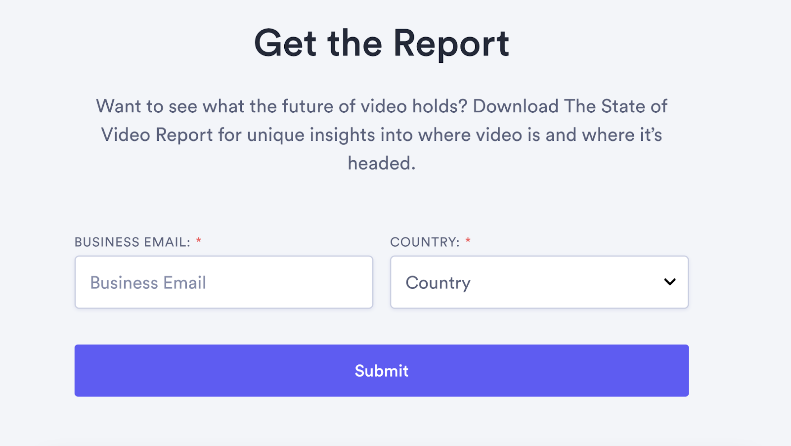
One of the most common ways to do this is to give visitors access to resources like whitepapers, research studies, and webinars in exchange for an email address.
For example, users can access Vidyard’s report on video marketing by providing their contact information:
But you can use this tactic to drive purchase conversions as well. For example, by offering a free gift to anyone who makes a purchase of over $50 in the next 48 hours.
16. Get Input from Your Website Users
One of the best ways to optimize your website for conversions is to get feedback directly from your users—they can provide insights on what could be improved.
Tools like SurveyMonkey, Google Forms, or Typeform can help you create surveys that ask about general ease of use, the quality of your content, issues with the purchase process, and more.
Put a link to your survey on your website or in your post-purchase emails, so visitors and customers can fill it out.
17. Tailor Different Pages to Different Segments
Creating pages (or even entire sections of your website) dedicated to your main audience segments helps you speak to those groups’ pain points and interests—and you may get more conversions as a result.
This is especially true for brands that have several distinct audience segments.
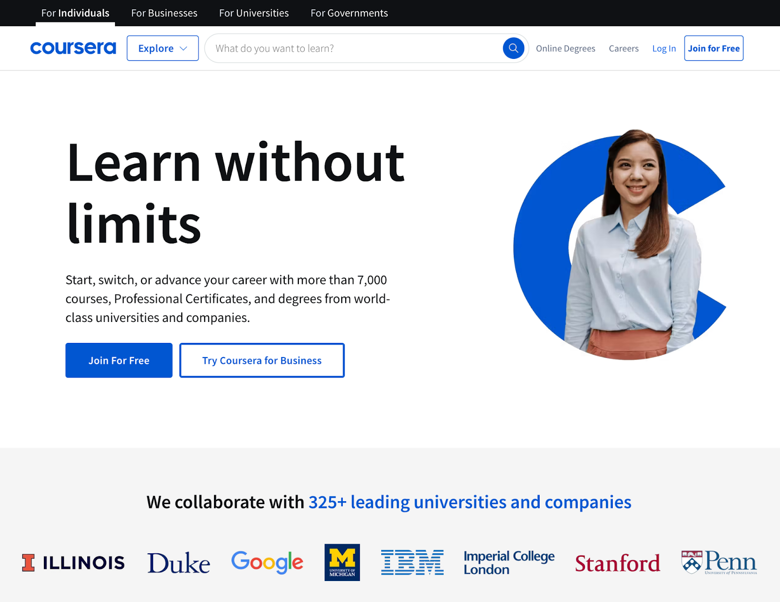
For example, Coursera’s website is divided into four main sections to provide a more relevant experience for their main segments: individuals, businesses, universities, and government organizations.
Doing this requires a thorough understanding of your different audience segments.
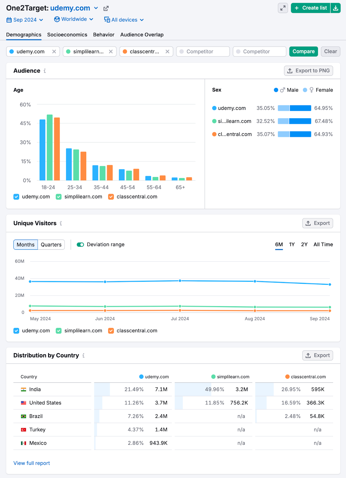
You can gather this information by studying your competitors’ website and social media content.
Or, use One2Target to streamline your research:
18. Use Pop-Ups
Pop-ups that appear over the main website content can be used to encourage users to take certain actions, so they can convince users to stay and convert when they might have otherwise left.
Here’s an example from the New York Times:
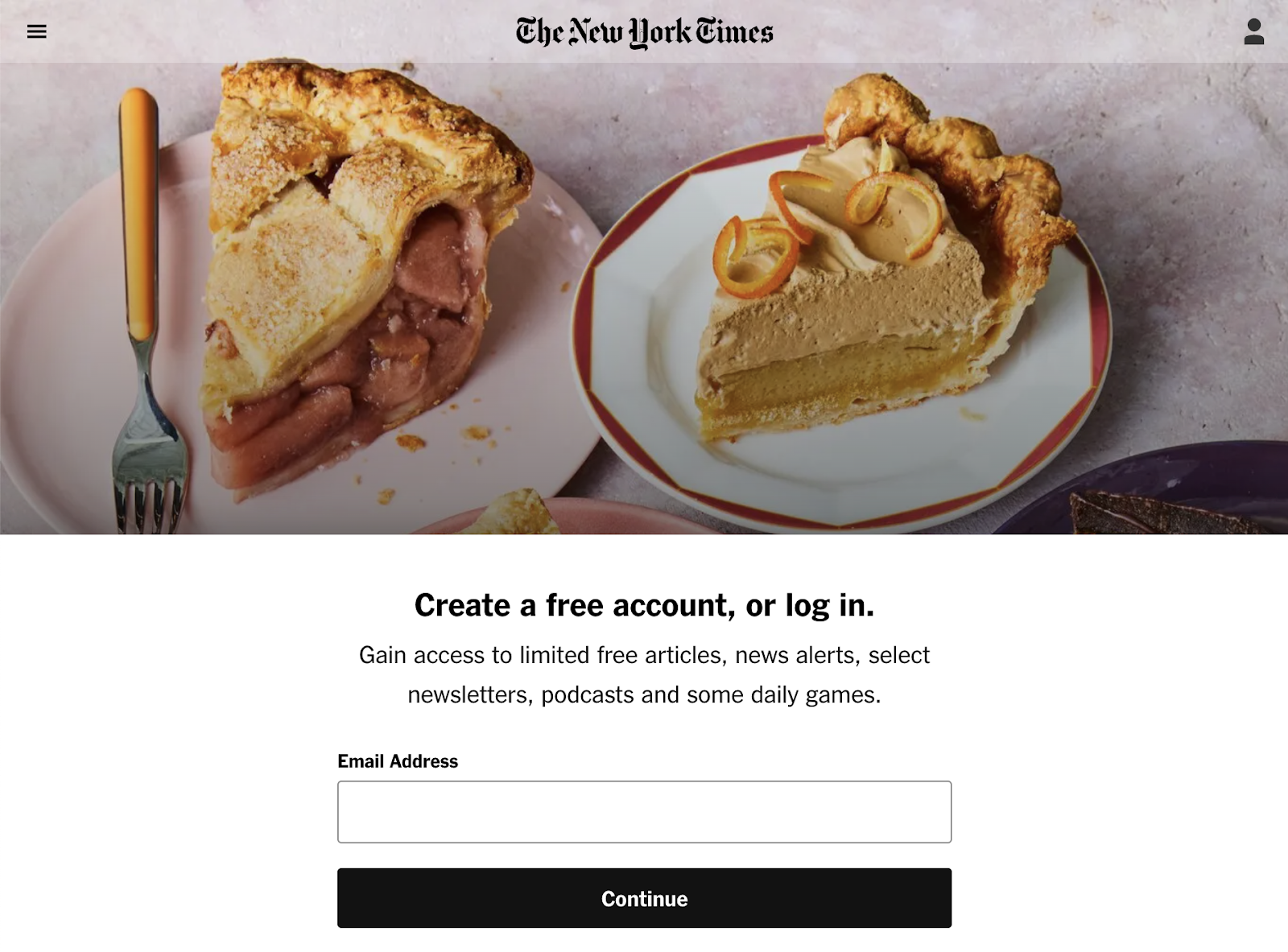
While pop-ups can be helpful, they can also be detrimental if they appear as soon as someone lands on the page.
So, consider triggering pop-ups based on actions like scrolling down the page, clicking a link, or spending a certain amount of time on the site. This ensures users have time to engage with your content first.
And always make sure to provide a clear way for users to close the pop-up if they’re not interested.
Start Increasing Your Conversion Rate
Now that you have a better idea of how to improve conversion rates on your website, you can take action.
And many of these tactics are easy to implement—as long as you have the right tools.
Semrush offers a variety of options that can help with auditing your site to uncover UX issues, writing clear copy, and more.
Sign up today to get started.