The best social media ads capture attention and leave an impression. People are distracted, scrolling through their feeds and the last thing they typically want to see is an intrusive ad.
But some brands and businesses achieved this balance. The ads that resonate the best use creativity to connect to people’s emotions and motivations.
We’ve curated this list of some of our favorite social media ads that capture attention and leave an impression. Get inspired, finesse your strategy, and plan your next awesome social media ad.
Instagram ads thrive on visual storytelling – they combine high-quality images and videos with a strong aesthetic appeal. Whether through carousel posts, reels, or shoppable content, making a successful ad on Instagram can let you connect emotionally with users, and drive your interactions and purchases.
The first handful of ads featured in our list were found thanks to The Ad Professor over on X, who does an excellent job in curating examples of great digital ads (give them a follow for more ad-inspiration).
1. Lavazza: Narrative Storytelling
Coffee brand Lavazza leapt into storytelling with this Instagram video ad. It’s longer than most ads on the platform (over 1 minute 40 seconds) but on this occasion it works because of the narrative.

The ad is effective because it creates a personality and story that viewers can associate with the brand. It’s real – coffee being a perk of mundane office life – but with a touch of fantasy to make it exciting. It also helps having some well-known faces feature in the ad.
2. House of Sunny: Playing with the Carousel Format
The first carousel ad on the list comes from House of Sunny. The clothing brand stretches an image of a sausage dog across four static carousel photos, alongside quotes from the brand team about working on the latest launch.
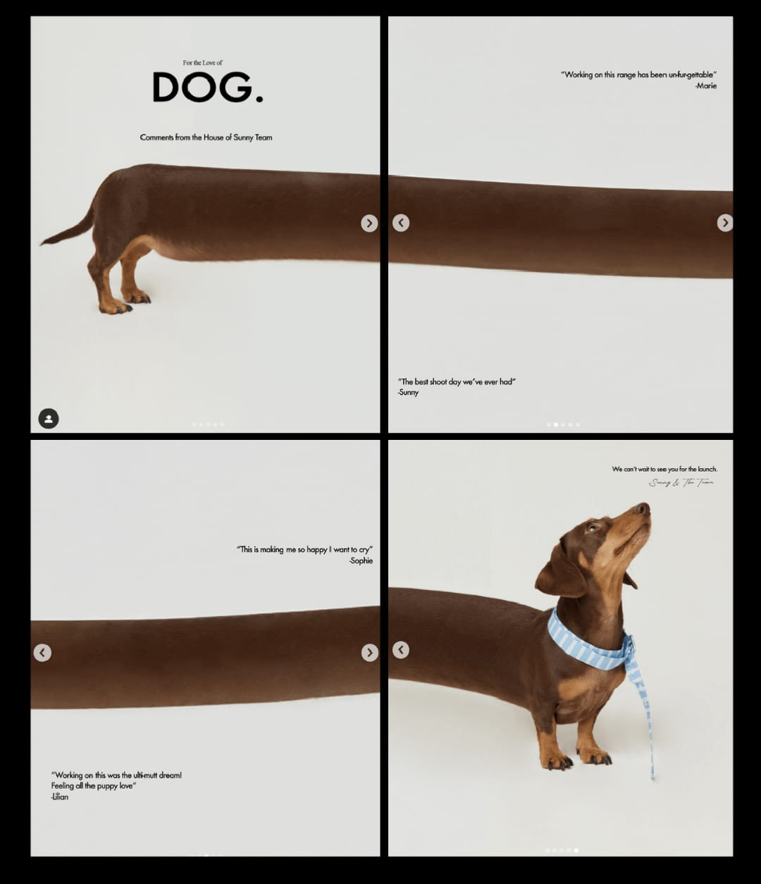
The quotes are mostly dog puns, and the final carousel photo shows the pooch’s face looking upward and with a tape measure about its neck.
Carousels can stop users in their social media tracks, and the sausage dog is a perfect way to keep users engaged. After all, who doesn’t love dogs? And who wouldn’t be curious about what the furry guy is doing on Instagram?
3. Bebax: Breaking the Smartphone Fourth Wall
Another coffee brand ad, this time from Bebax. In the ad, audiences have a normal point of view of someone eating at a table. Suddenly, the view changes to a smart phone screen, with the person turning down the volume and setting ‘do not disturb’ mode. Food and coffee arrives in front, and the person and ad viewers enjoy them in a more focused environment.
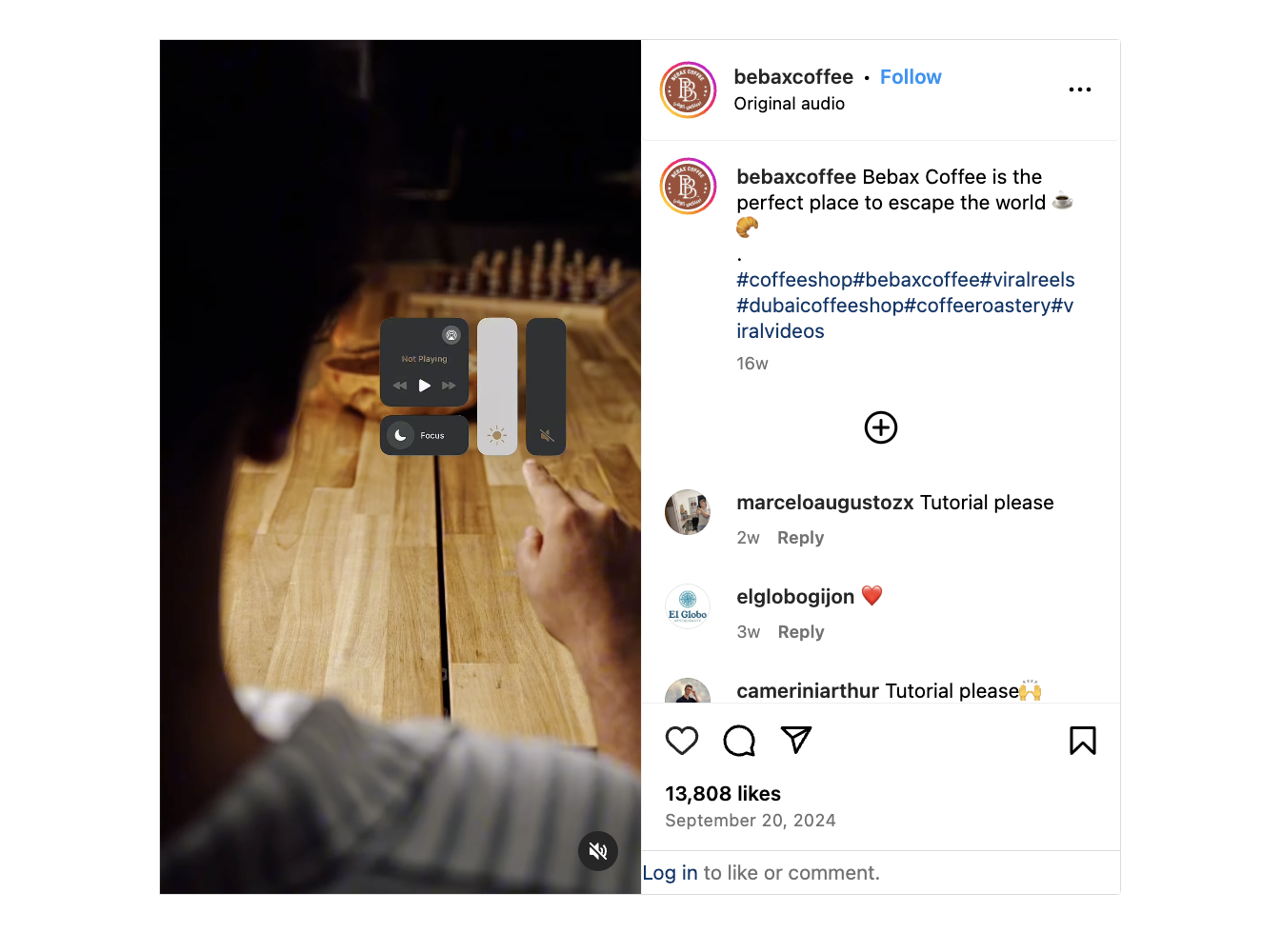
The concept is powerful because it sort of “hacks” audiences’ phones. It’s like the ad is saying “this content is so important, we’re going to adjust your settings.” It also makes the ad relevant with tech-savvy viewers, who can likely edit their virtual environments with a great deal of ease.
4. Ruggable: Aesthetics, Aesthetics, Aesthetics
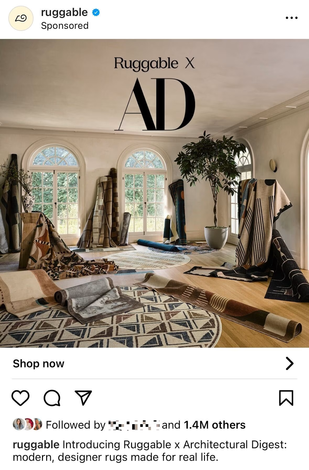
Carpet brand Ruggable announced its partnership with Architectural Digest through this sexy photo of… rugs. The lighting, the draped materials, the plant – it’s all so enticing. There’s no text needed other than the brand names, it’s that powerful.
With a stunning, straightforward aesthetic design, this ad leaves a lasting impression.
Facebook ads have detailed targeting capabilities and versatile formats, from static images to interactive polls. You can reach diverse audiences with compelling ad copy and CTAs on Facebook, making it a good platform for awareness and conversion campaigns.
5. Maids.cc: Taking a Meta Approach to the Feed
Similar to Bebax’s ad, Maids.cc takes a meta approach in its Facebook video ad. The screen first shows a woman cleaning the Facebook ad box. The view then transitions to Maids.cc Google review rating, and then a search bar with the Maids.cc website being entered.
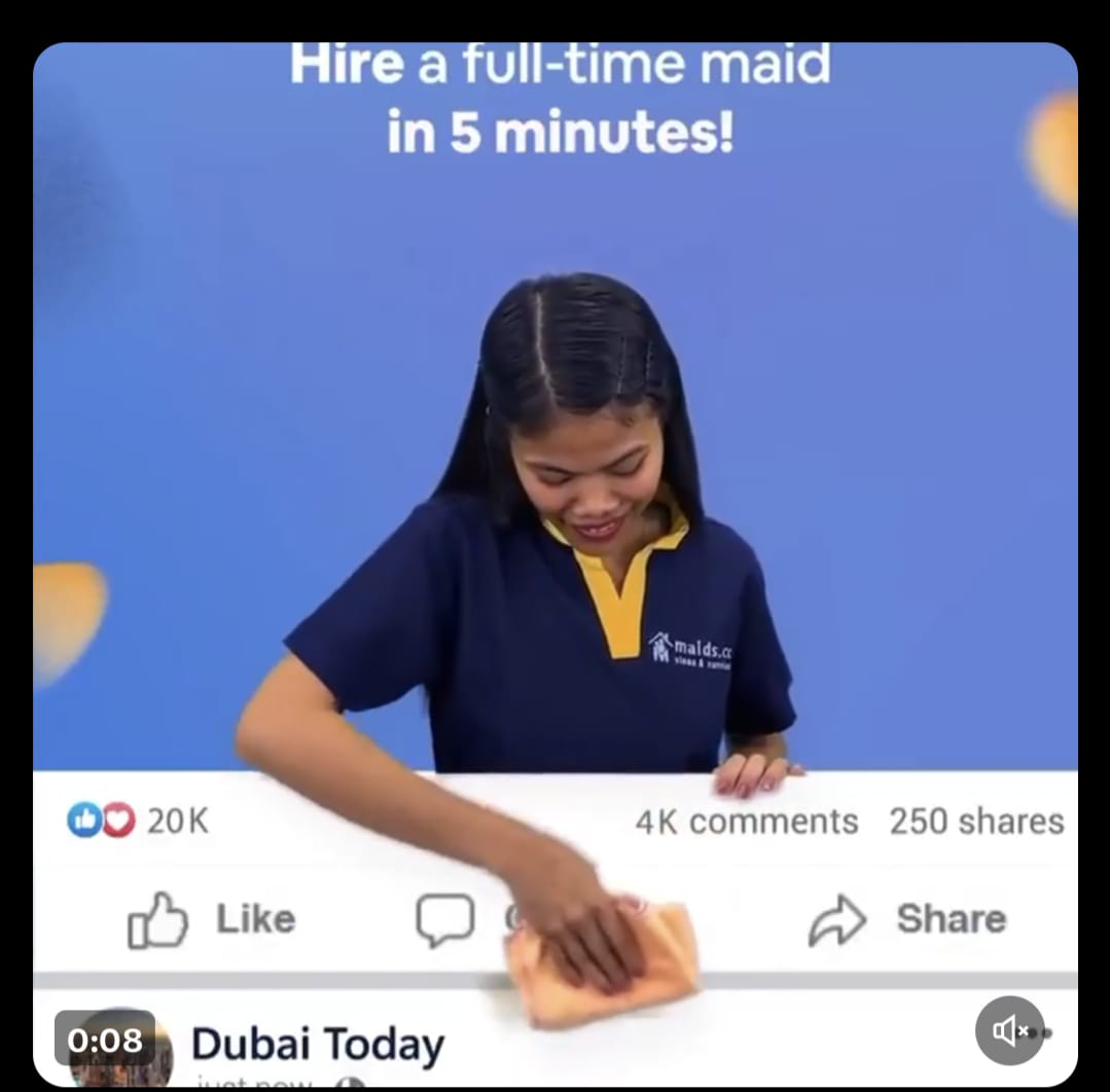
The initial shot is endearing – it inserts the brand’s service into users’ Facebook feed. The second is then informative and directive – it gives users’ social proof and then it subtly influences users to open their browser and visit the site. It’s the right balance of sweet and instructive.
6. Rise Tents: Testing the Product in the Elements
Who knew tents could be so entertaining? Rise Tents did with their video ad of a tent on the back of a trailer speeding down the road in torrential rain. Why? The brand states that it didn’t have a fancy wind tunnel to prove the resistance of its products, so it made its own setup.

The video is funny, a bit daft, but makes its point — the tent stays firmly on the trailer and intact. Not to mention, Rise Tents saved themself an expensive budget with this ad.
7. Levis: Just Be Cool
Levis stepped into its hipster aesthetic with this video ad, which acts as a kind of love letter from YouTuber Emma Chamberlain. It has a retro style, as if it’s been filmed on an old tape recorder, and cuts between frames of Emma at the beach and running through the forest. She looks effortlessly chic in all the moments.
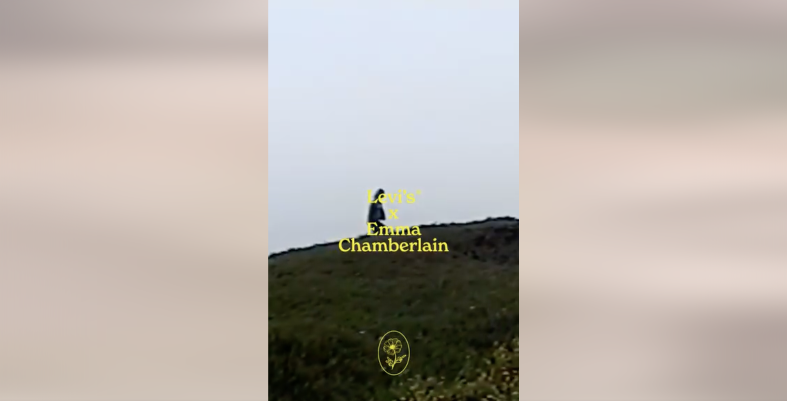
Levis says the ad was inspired by Emma’s laid-back Northern California upbringing, so it appeals to people from there but also those who try to mimic that lifestyle. It blends a distinct fashion with a timeless sense of cool.
8. Urban Canning: Local Goods Limited Offers
Like many small businesses, Urban Canning emphasized its fresh goods by offering them as a limited batch.
Their ad displays a photo of the herbed summer squash product, and then the copy explains the short window of availability – creating a buzz and demand for the paste.

Ads don’t always have to be about flashy formats and making the most of tech features. With a simple design of a hand holding out the product to you, it’s simple and approachable, which is great for a local or small business selling canned goods.
This example from Urban Canning shows us that some good old fashioned FOMO is sufficient for local marketing.
X
Ads on X (formerly Twitter) can capitalize on concise, impactful messaging paired with striking visuals or videos to get users’ attention. With a focus on trending topics and real-time engagement, these ads tend to spark conversations and increase brand visibility.
9. Dove: An Au Natural Ad Share Campaign
Skincare company, Dove, ran its #NationalSelfieDay campaign on X, encouraging people to share photos of themselves without makeup. While the social media campaign was a heartwarming message to promote natural beauty, it was also an impactful ad.
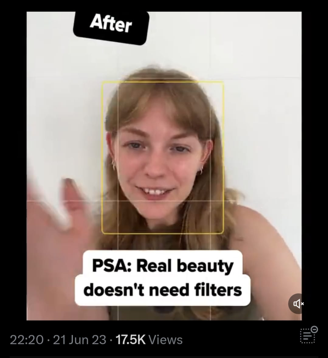
The ad shows a woman happily posing with a ‘before’ sign. A few seconds later, an ‘after’ sign appears and the woman continues smiling, unchanged. The format is powerful because Dove recognizes the beauty industry’s structure of ‘before and after’ to sell products, and inverts it. And, because there’s a hashtag, the brand invites people to participate and promote the ad.
Smart, social, and successful!
10. Airbnb: Sentimental Holiday Snaps
This video ad from Airbnb didn’t come from the rental platform’s official account, but from CEO Brian Chesky’s personal account. The ad plays like a slideshow of someone’s vacation photos. It features a young couple with their baby on his first ever trip. The photos reveal the special memories, slipups, and everything in between that make a holiday unique.
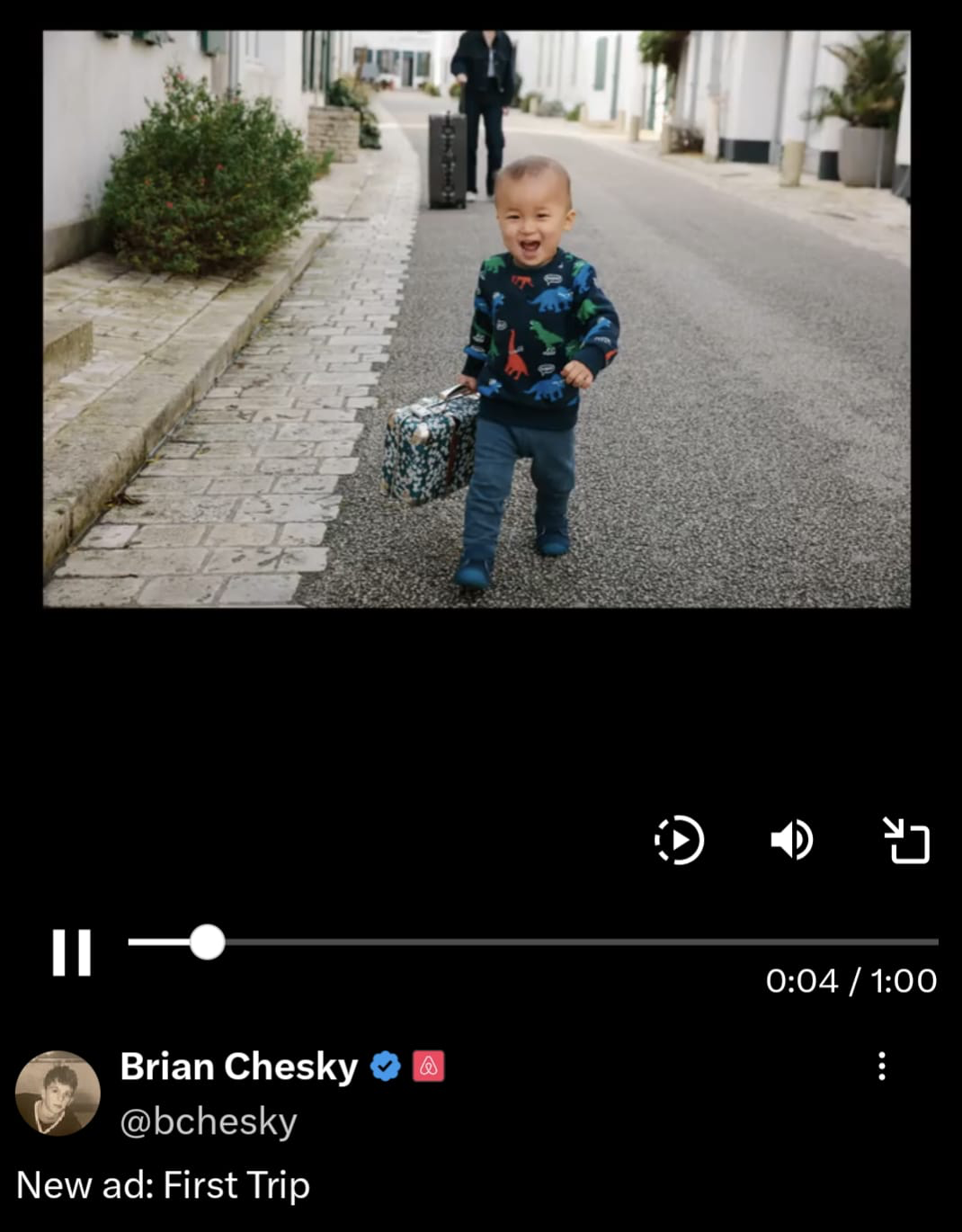
It’s an ad to pull on the heart strings. It shows Airbnb as more than a service, but as a partner that helps families getaway and grow. And the fact that it was posted by the CEO makes the ad all the more intimate – it’s from a human, for humans.
TikTok
TikTok ads leverage the platform’s focus on creativity and authenticity, often blending seamlessly into users’ feeds as entertaining, bite-sized videos. By embracing trends and user-generated content, here, brands can create relatable ads that connect with users and their values.
11. Patagonia: Docu-Ad For Impact
Patagonia has long been praised for its sustainable mission, and in this video ad, we get a short clip from the outdoor clothing brand’s ‘Why Recycled’ film. In the ad, a man explains what recycling is, and why based on the logic of recycling, society should be trying to consume less in tandem with recycling. As he speaks, we’re shown snippets of recycling factories.
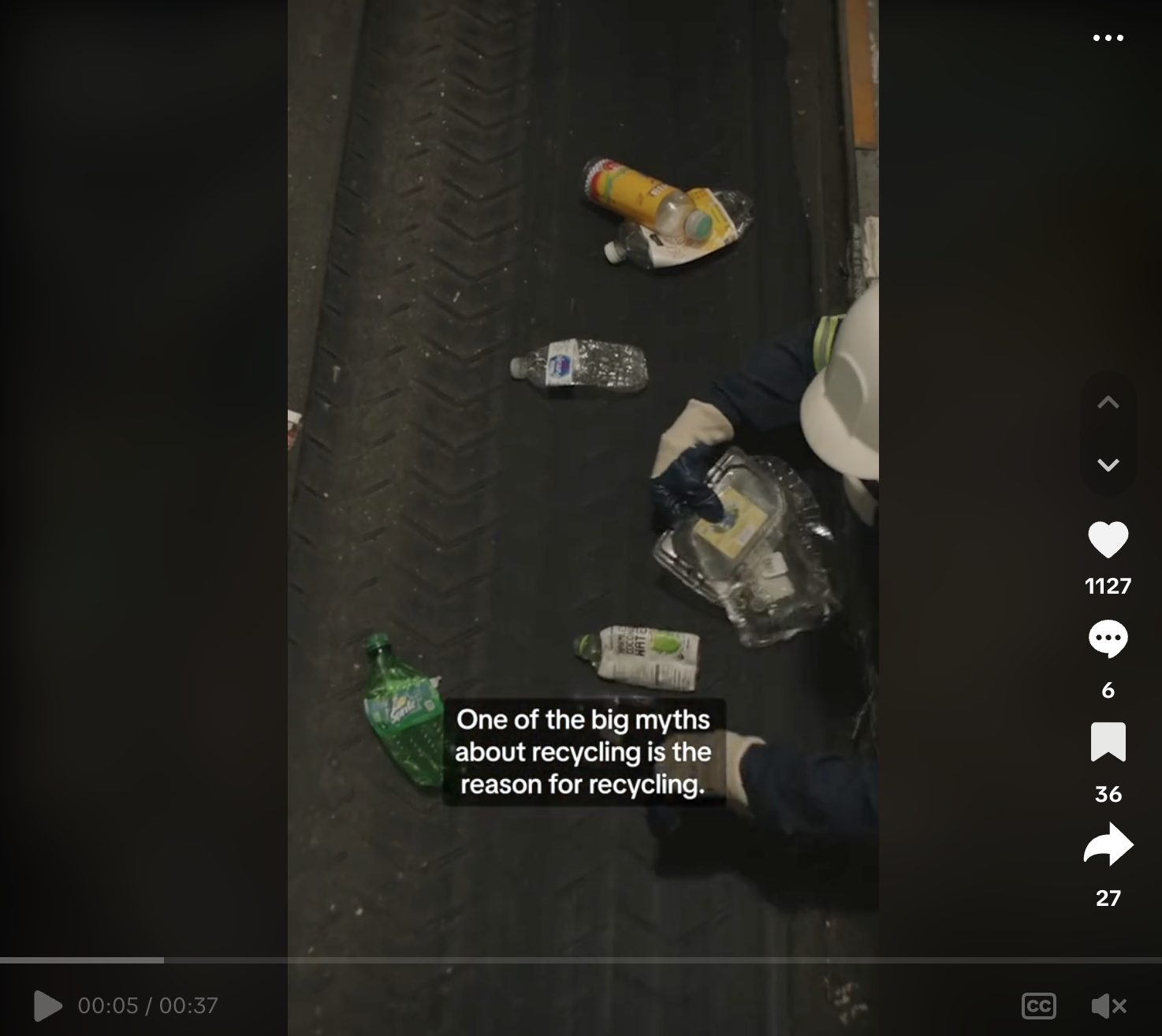
The ad is concise. It’s a no-frills piece of marketing that is consistent with Patagonia’s values and reinforces the brand as trustworthy and influential. For TikTokers, who are generally younger and socially-driven, this ad makes total sense. And, for anyone interested in the message, there’s a full film on the brand’s website to follow up and learn more.
12. Central Houston Nissan: Jumping On (& Falling Off) Trends
TikTok is a Gen Z playground, and this audience has a particular sense of humor that mixes slightly serious with absurd, often rooted in people falling. So naturally, Nissan Central Houston jumped on the comedy bandwagon and has produced a series of perfectly edited ads.
In this ad, the scene starts with someone being carried on a stretcher when they suddenly fall and roll off.

The scene seamlessly transitions to a Nissan car salesman rolling on the showroom floor, pointing at the camera, and instructing people to come down. It’s funny, shocking, and part of a trend.
YouTube
YouTube ads rely on dynamic, longer-form content that speaks to viewers through storytelling, tutorials, or on an emotional level. Pre-roll, mid-roll, or skippable ads allow advertisers to reach audiences at different stages of their YouTube viewing, which can support more effective ad communication.
13. Google: Feeling Nostalgic
Google does storytelling at its finest in this video ad, where an iPhone and the new Google phone are around a campfire, telling a spooky story. The iPhone starts to get freaked out about Google’s new feature launches and AI. The Google phone reassures the iPhone that there’s nothing to be afraid of, but then an old pager appears and they both scream. The tagline is “scary cool updates coming”.
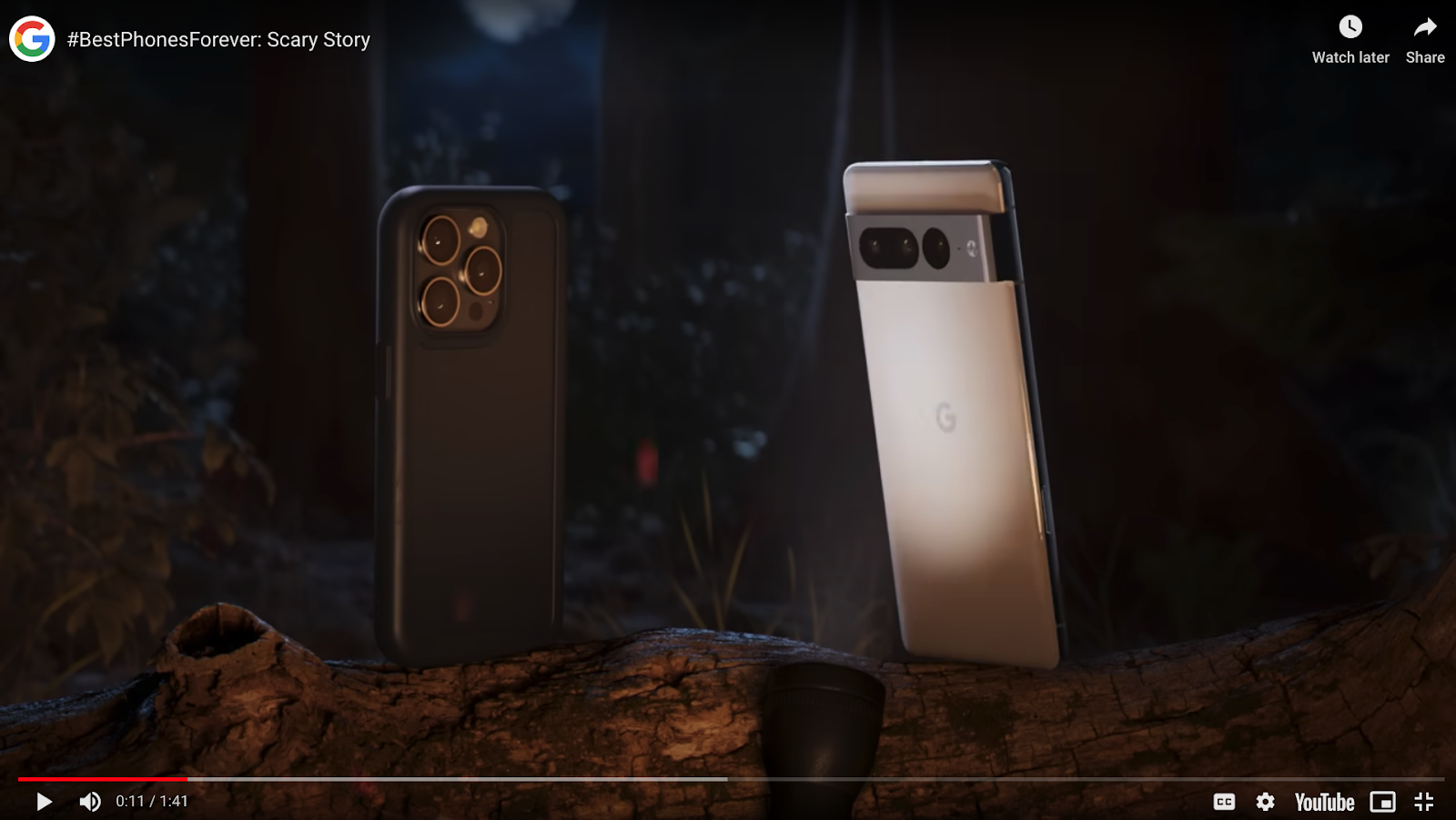
The video is funny, and the campfire is a scenario many people can relate to. It especially appeals to younger generations who are tech literate and constantly changing their phones for the latest models.
14. Tiffany & co.: Classic Chic Ad Content
In just 15 seconds Tiffany & co captures beauty in this ad. Partnering with K-Pop singer, Jimin, the jewelry brand focuses on slow movements and deep stares from the star.

Bracelets and necklaces shine against the monochromatic background, and soft music plays, all creating a sensual atmosphere – felt right through the screen.
15. Mint Mobile: The Mockumentary
Satan working at a phone company? Check. Documentary-style narrative? Check.
The video ad from Mint Mobile is an excellent piece of entertainment. It draws on a trope of phone companies being “evil” and plays with it. It introduces Satan as a regular guy, getting along with his day (with some funny friction, like trying to get his horns out of the bathroom stall) and intentionally setting high prices at the company.
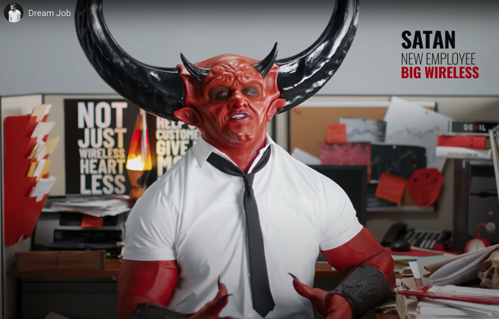
At the end, the text reads “is this wireless heaven?” and shows Mint Mobile prices. By poking fun at the polar extreme of what Mint Mobile is trying to say, it makes its message even harder-hitting.
LinkedIn ads focus on professional and B2B audiences, using targeted messaging and industry-relevant content to drive leads and networking opportunities. From sponsored posts to InMail ads, these ads highlight opportunities and expertise to resonate with people in a more formal space.
16. Fi: Be Cute and Get Down to Business
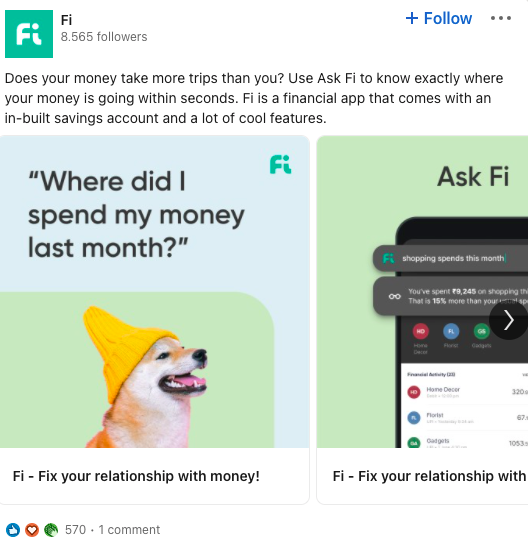
Starting an ad with a question is always a sure way to catch people’s attention. Money management platform, Fi, does just that with their carousel LinkedIn ad. The copy reads “Where did I spend my money last month?” – something many of us wonder on a regular basis. It’s human, but isn’t too daunting or overly serious because beneath, there’s a photo of a dog in a beanie hat.
The two components are slightly random, but they convey that Fi is professional and still approachable. The following carousel images then show different features and stages of the app, showing LinkedIn users how to easily track exactly where their money has been going.
17. Salesforce: Freebies Are Your Forte
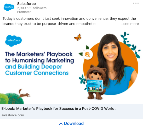
This Salesforce ad is true to the company’s branding – it’s simple, readable, and delivers clear value. It immediately addresses a customer need for all businesses: that people want brands to be purpose-driven and empathic. That insight is then elaborated for LinkedIn users through a downloadable ebook.
The ad is successful because it’s not one-directional. It positions Salesforce as a business leader, but it doesn’t just tell viewers to buy something or sign up to something. The ad gives them a helpful resource, which encourages businesses to engage with them, and refer to their expertise. Clever, right?
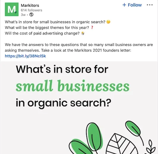
18. Markitors: Question and Answer Structure
Markitors poses a number of questions in this LinkedIn ad, and rather than leave them hanging as rhetorical ones, it gives the answers! Speaking directly to its audience (small business owners), the brand provides a link to its founders letter, where people can get all the information they need.
The ad is tuned into its target audience and is to the point. In a sea of ads and comments, this ad is a refreshingly clean cut.
There’s a whole sea of social media ads that you probably swim through on a daily basis. With these examples now on your brain, take note of the creative, copy, and conversion tactics that you’re exposed to – and apply them to your own branding journey.
