
There’s a good reason why Semrush’s Traffic & Market Toolkitis considered one of the most powerful solutions in the Semrush suite. With Traffic & Market data you gain access to an instant overview of your market and deep competitive insights that offer a clear view of emerging trends and growth opportunities for your business.
Even if you’ve already spent time exploring Semrush Traffic & Market, we’re willing to bet there are features you haven’t yet uncovered. The Traffic & Market dashboards include customizable widgets, charts and graphs, filtering options, and historical data, all of which broaden the scope of insights available to you.
In this article, we analyze the financial services industry to highlight the top 10 Traffic & Market features every marketer should explore.
#1 The Market Summary
Broadly, the Market Overview dashboard enables you to gain a comprehensive understanding of your market. You can use it to identify competitors, examine how the market is evolving, and better understand your in-market audience.
The Market Summary widget provides high-level information about the market that can help you conceptualize the market as a whole, including:
- The level of market competition
- Key players and their individual market share
- Market traffic
- Market traffic cost
- Market size
Here’s an example depicting data for 8 top domains in the financial services industry.

Let’s hone in on Market Competition and Market Size to explore how this data might be useful.
Market Consolidation
The market consolidation scale shows you the level of competition within the market under consideration. The higher the percentage, the harder it will be to compete.

When it comes to financial services, the market competition is on the lower side of the scale, making it relatively easy to compete. More specifically, this number means market share among competitors is pretty even, despite the presence of many players.
This information might help a new company determine the strategy for entering the market, their positioning among other brands, or the budget size for a specific product launch.
Market Size
The Market Size section shows the total number of potential customers in your market. This total number is broken into two more specific metrics:
- Total Addressable Market (TAM)
- Serviceable Available Market (SAM)
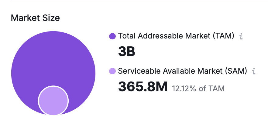
For the domains within our selected market, the TAM is 3 billion. This number reflects everyone in the target audience, including those who are unable or not ready to make a purchase.
The SAM, however, is much smaller at 365.8 million. This is the number of people who are ready and able to purchase a financial product.
Looking at these numbers individually, comparing them to one another, and examining them across various months can inform your strategy when launching new products, developing business or marketing strategies, or projecting potential ROI.
#2 The Growth Quadrant
The Growth Quadrant featured in the Market Overview dashboard helps you visualize the competitive landscape and identify which competitors in your market are:
- Game Changers
- Niche Players
- Leaders
- Established Players
Their positions on the competitive matrix are determined by their traffic metrics and their traffic growth percentage.

This example shows the placement of financial services companies based on traffic data from the last six months, July 2021 to January 2022.
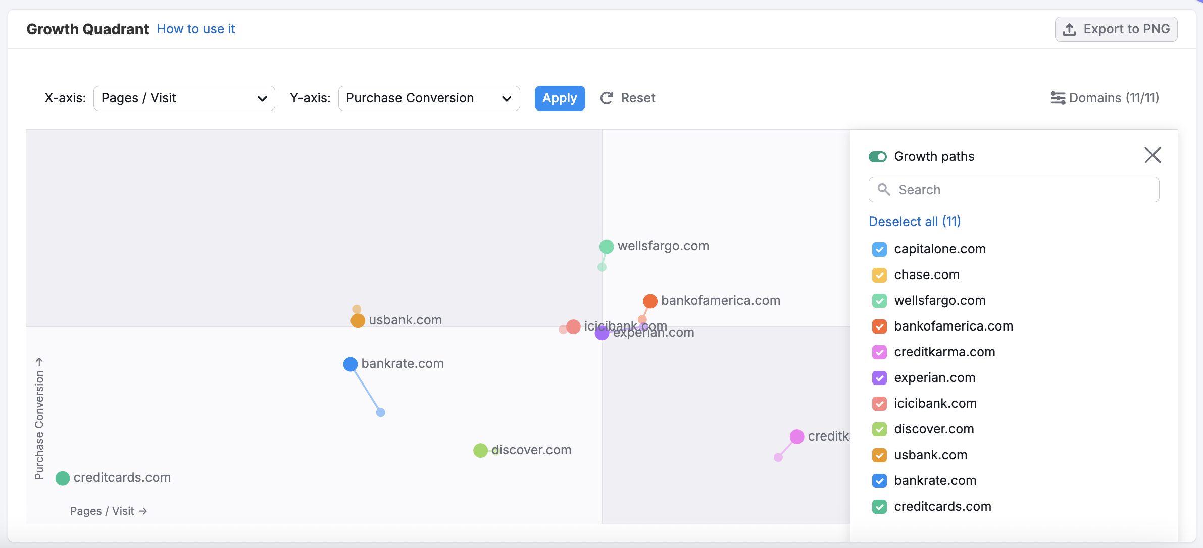
You can change the data presented in the quadrant by selecting various criteria for the X- and Y-axis. And using the “Domains” button in the right corner, you can select specific domains to include or exclude from the quadrant.
#3 Daily Trends
The Daily Trends dashboard offers a near real-time view of traffic performance across selected domains, helping you track fluctuations and patterns as they unfold. Whether you’re monitoring your own site or keeping tabs on competitors, this dashboard reveals daily shifts that might be missed in weekly or monthly views.

The Traffic Trend graph shows how visit volume changes over time, letting you quickly spot spikes, drops, and general momentum. In the example below, we compare daily traffic for major financial services domains like Chase, Capital One, and Bank of America. It’s clear at a glance which brands are holding steady and which ones experience more volatility day-to-day.
If you want to understand where that traffic is coming from, the Traffic Channel Trend breaks it down by source—organic search, paid search, direct, referral, and more. Comparing channel performance across competitors can help you infer marketing strategies or identify sudden shifts in spend or engagement.

Each traffic source also has its own chart within the dashboard, allowing you to zoom in on just one channel at a time. This makes it easier to focus your analysis—whether you’re digging into SEO wins, evaluating paid performance, or benchmarking brand strength through direct traffic.

Overall, Daily Trends is an invaluable tool for marketers who need to move quickly, spot patterns early, and make timely, informed decisions.
#4 Competitor Traffic Summary
The Traffic Summary table in theTraffic Analytics dashboard is your go-to snapshot for side-by-side performance comparisons. It pulls together essential traffic metrics for each selected domain, giving you a quick but powerful way to benchmark competitors across key engagement indicators.
At a glance, you can compare:
- Total visits and unique visitors
- Conversion rate
- Pages per visit
- Average visit duration
- Bounce rate

In the financial services example here, Chase leads the group with over 420 million visits, while Capital One shows standout performance in conversions at 1.18%. Meanwhile, Bank of America’s users are spending the most time on site and visiting the most pages, which could suggest deeper engagement.
Each metric includes directional indicators (up or down) showing performance trends compared to the previous period—ideal for spotting momentum shifts and market changes.
Use this summary to:
- Benchmark your own site against direct competitors
- Track which players are growing or losing traffic
- Evaluate the quality of visits—not just quantity
- Identify outliers that may signal campaign success or UX issues
Whether you’re refining your strategy or reporting to stakeholders, this table distills complex data into fast, actionable insight.
#5 Traffic Channel Trends & Dashboards
Understanding where traffic is coming from is just as important as knowing how much you’re getting—and that’s where the Traffic Channel Trend in the Traffic Analytics dashboard comes in.

This chart gives you a multi-channel view of how users arrive at competing domains over time. You can quickly switch between sources—Direct, Organic Search, Paid Search, Social, Referral, Email, and Display—to see which strategies are driving the most engagement. In the financial services space, for example, Direct and Organic Search dominate, while channels like Email and Display play a smaller role.
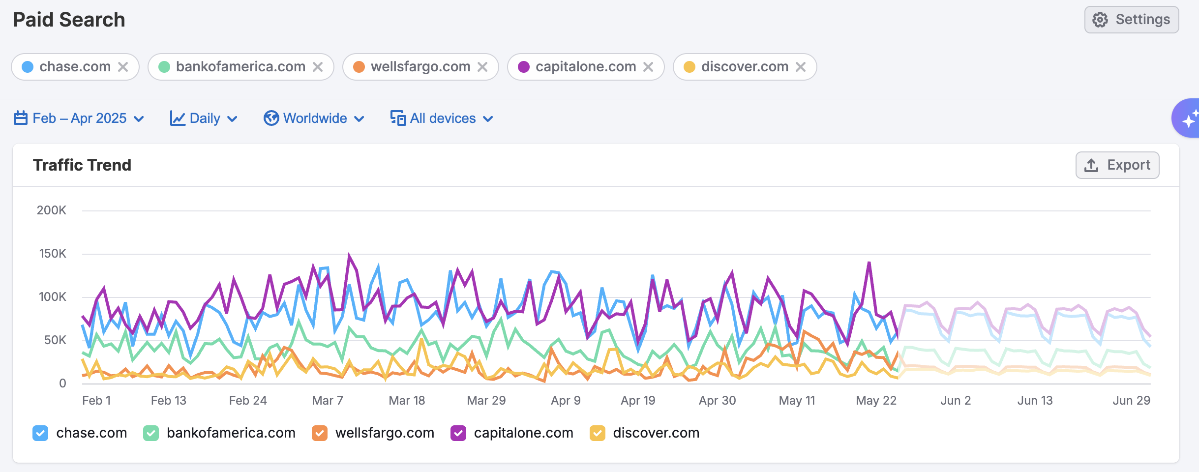
To dive deeper, each traffic source has its own dedicated dashboard, offering a more focused look at performance. Take the Paid Search dashboard: beyond visit trends, you’ll find insights on device breakdowns (desktop vs. mobile), trending landing pages, top paid sources, and even high-performing paid keywords.
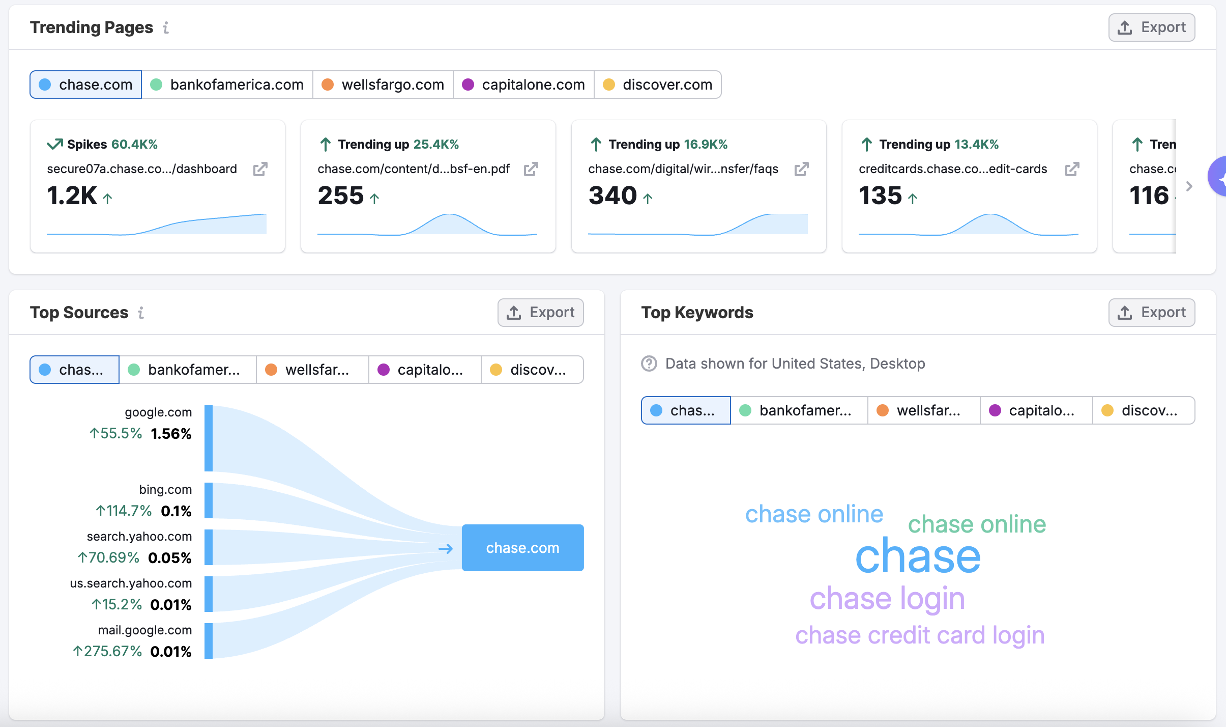
These views let you assess how aggressively competitors are spending, what content or campaigns are gaining traction, and which channels are delivering the highest ROI—making it easier to benchmark and optimize your own acquisition efforts.
#6 Traffic Sources & Destinations
The Sources & Destinations dashboard gives you a powerful view into your competitive landscape—letting you pinpoint which domains are sending traffic to your competitors and which domains their users visit next.
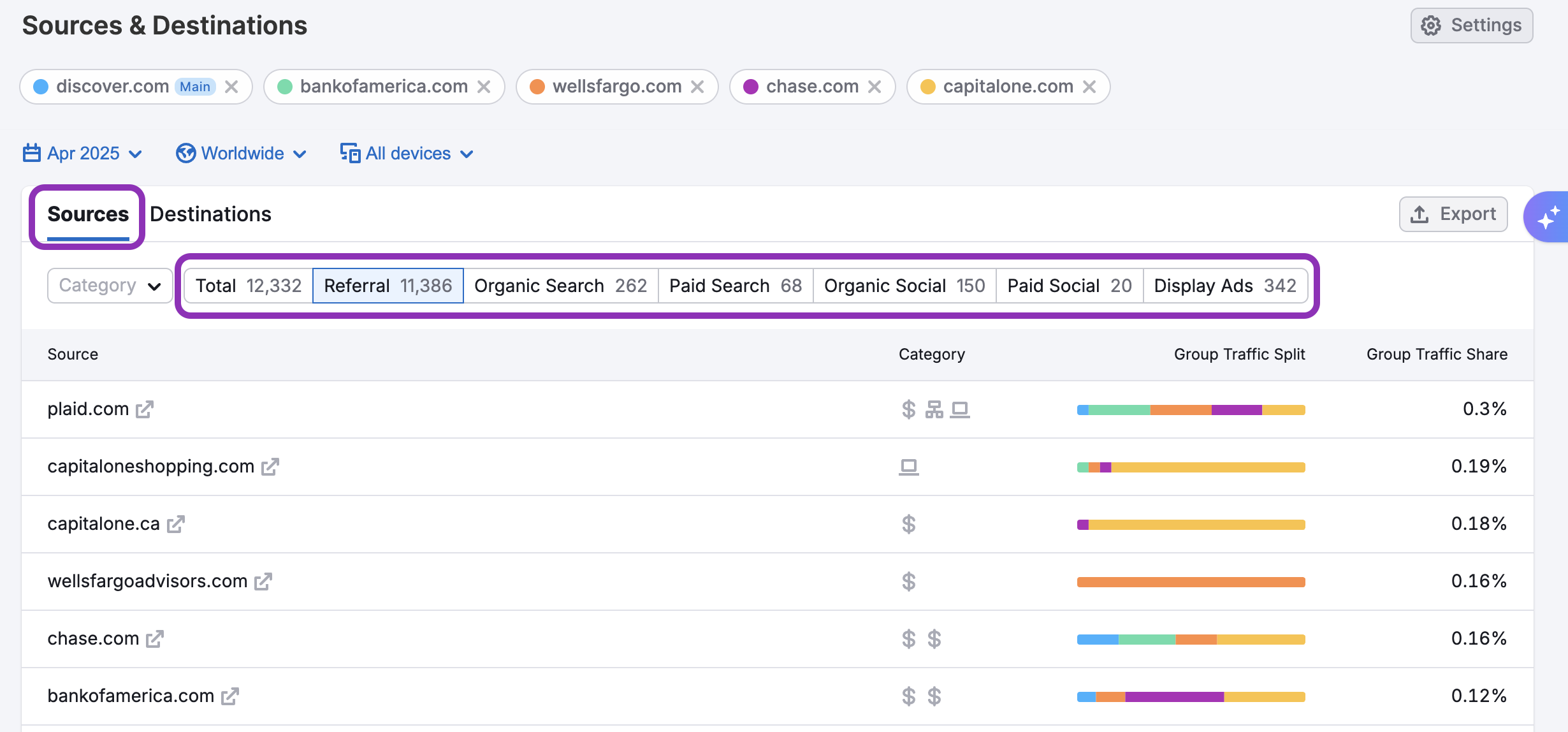
In the Sources tab, you can break down incoming traffic by specific channels to see exactly how users are reaching your selected competitors. This includes:
- Referral traffic from other websites
- Organic Search from search engines like Google
- Paid Search from PPC campaigns
- Organic Social from unpaid social posts
- Paid Social from social ad campaigns
- Display Ads from banner placements
This breakdown helps you assess which marketing efforts are driving the most visits and which tactics competitors may be investing in.
You can also view a detailed list of referring domains, giving you insight into partnership opportunities or affiliate relationships that may be boosting your competitors’ visibility.
Flip over to the Destinations tab to see which domains users visit after leaving your competitors’ sites.

This view reveals post-visit behavior—where audiences are headed and which brands are attracting continued engagement.
To make the analysis more focused, you can apply Category Filters. In this case, filtering by the Banking category reveals that after visiting sites like Discover, Bank of America, or Wells Fargo, many users continue on to Chase, Citi, and MoneyDesktop.
This can help uncover competitors you may not be tracking—or unexpected digital journeys in your audience’s path. Together, these insights let you map out key entry and exit points in your competitive funnel and identify new traffic partnerships, advertising targets, or content gaps worth exploring.
#7 Competitor’s Top Pages
The Top Pages dashboard surfaces the most valuable real estate across a competitor’s site by showing which URLs are trending and where the bulk of their traffic lands. It opens with a Trending Pages section, which highlights pages that have recently spiked in visibility.
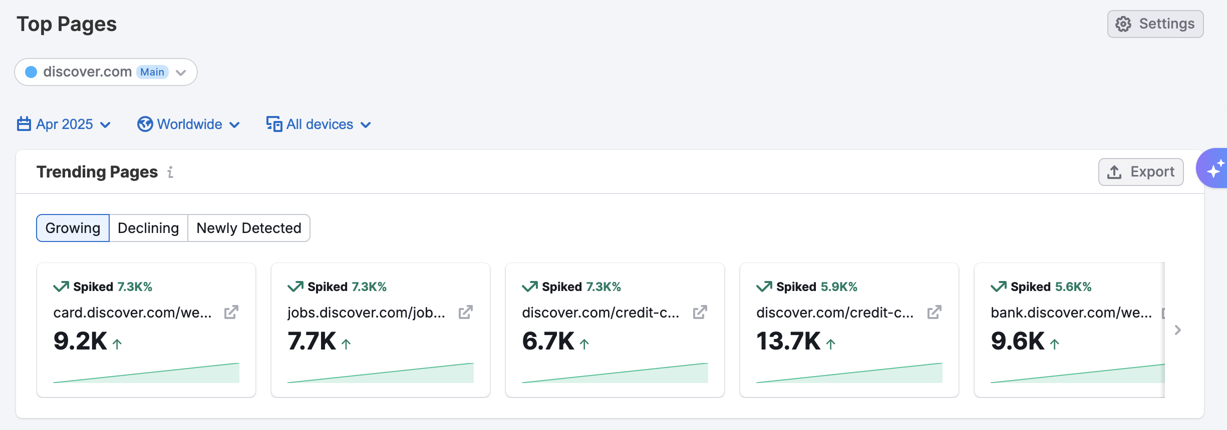
You can toggle between Growing, Declining, and Newly Detected pages to monitor emerging interest or sudden shifts in performance.
Below that, the full Top Pages table presents a comprehensive view of the site’s traffic hierarchy. You’ll see each page’s share of total traffic alongside metrics like unique visitors, pageviews, visit duration, and visits.
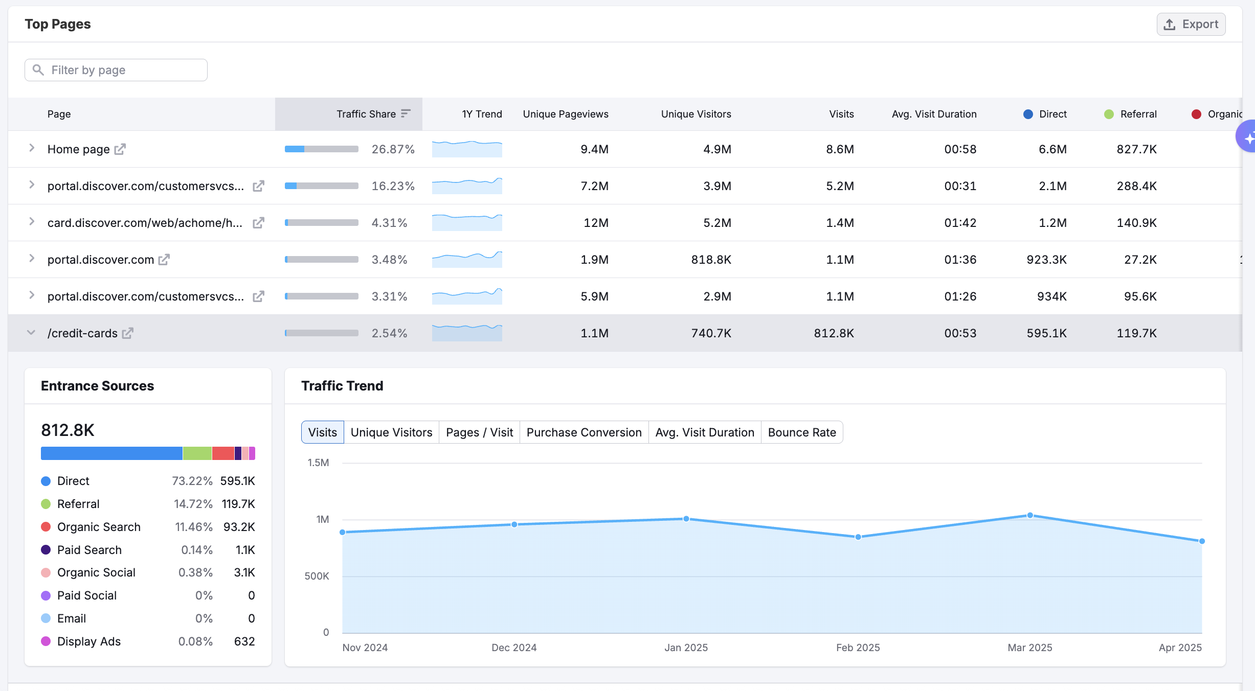
You can filter this data by traffic channel to focus on users arriving through specific pathways—such as Organic Search or Paid Search—making it easier to isolate which content is working best in which channel.
Clicking the dropdown on any page reveals deeper insights like purchase conversion, bounce rate, and pages per visit. This allows you to evaluate not just which pages are popular, but which are performing.
For instance, a high-traffic page with a short visit duration may signal surface-level engagement, while a smaller but highly converting page could be a hidden powerhouse. This blend of trending movement and granular performance makes the Top Pages section a go-to destination for identifying content that drives value—or spotting gaps that need attention.
#8 Audience Demographics & Overlaps
TheDemographics dashboard helps you break down your competitors’ audiences by age and sex, giving you a clear snapshot of who their users really are.
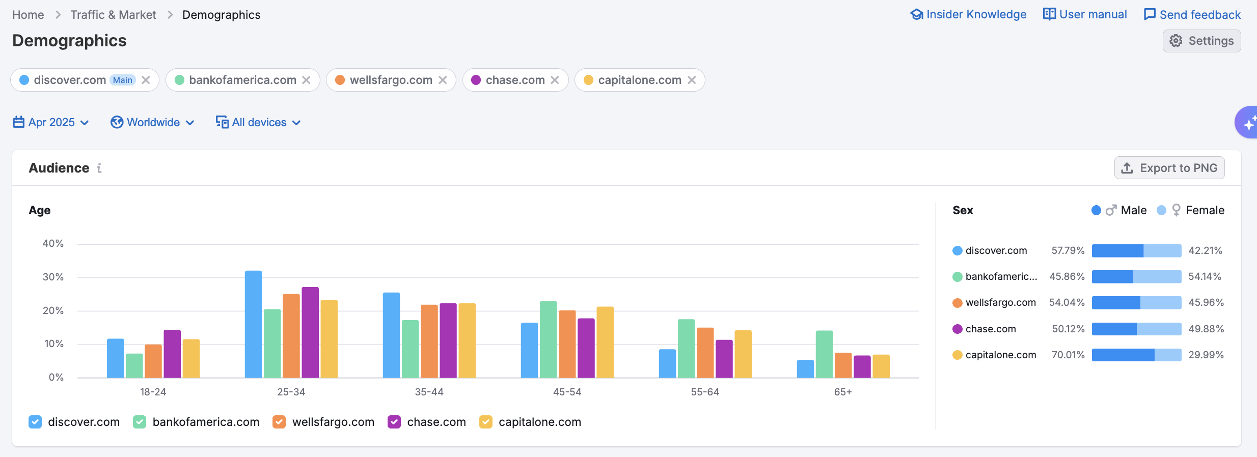
For example, Discover.com has a younger audience, with over 30% in the 25–34 age group—more than other major banks. CapitalOne.com skews heavily male, with 70% of users identifying as male, compared to the more balanced gender splits on Chase or Bank of America.
These details can shape everything from targeting strategies to messaging tone, ensuring your content and offers resonate with the right segments.
In the Audience Overlap dashboard, you can compare audiences across multiple competitors to gauge how much market share they’re fighting over—and how unique or shared their users really are.
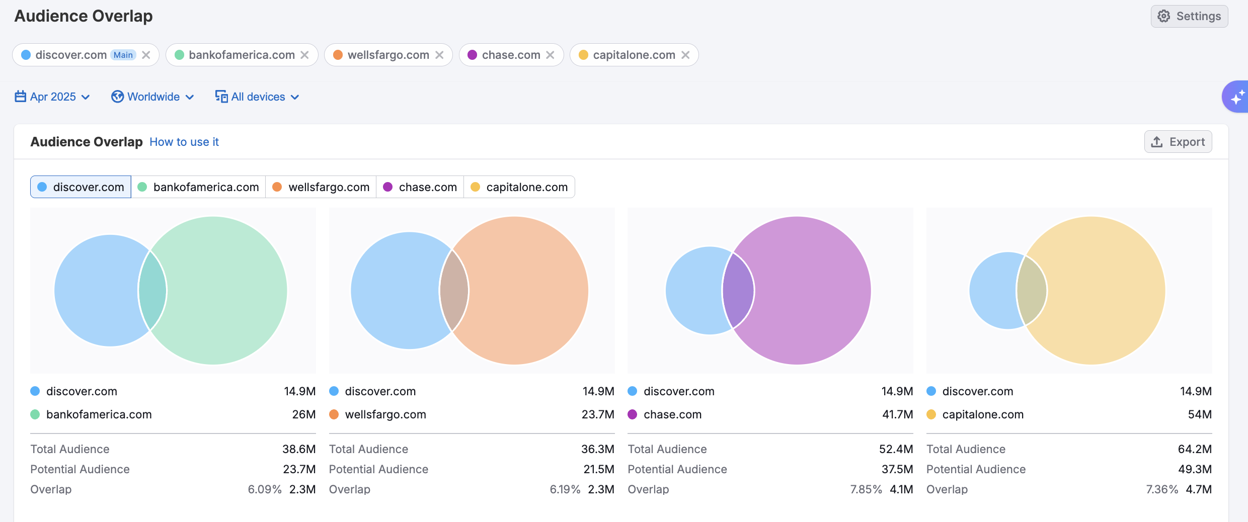
The visual overlap between Discover and Capital One, for instance, reveals that they share 4.7 million users out of a combined potential audience of 49.3 million. Chase shows a slightly higher overlap, indicating a significant intersection with Discover’s audience.
This kind of analysis is invaluable for assessing where your audience growth opportunities lie. If your closest competitor shares only a small portion of your audience, you may be tapping into different segments—or missing out on theirs entirely.
#9 U.S.A. Traffic by State
TheUSAdashboard breaks down traffic performance at the state level, giving you visibility into where your users are coming from—and how their behavior differs across regions. To visualize distribution, the traffic map highlights where visits are most concentrated.
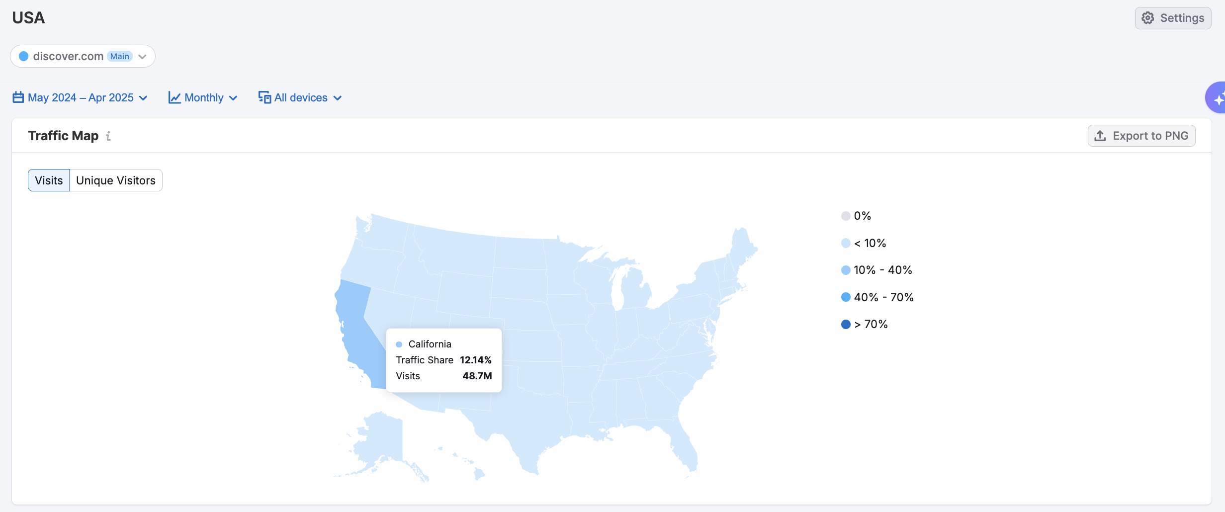
The traffic trend graph tracks state-level performance over time. California consistently drives the highest monthly volume, with Texas, Florida, and New York closely trailing. Seasonal spikes are also visible, helping uncover patterns that can inform campaign timing, local promotions, or geo-targeted optimizations.

Below the Traffic Trend, the Traffic by State Table reveals traffic metrics for specific states, along with top-performing pages. Here, core login and homepage URLs dominate, suggesting most visitors arrive with strong intent, either to access their account or explore card offerings. This view helps you identify regional content needs or evaluate if different landing experiences are warranted by state.
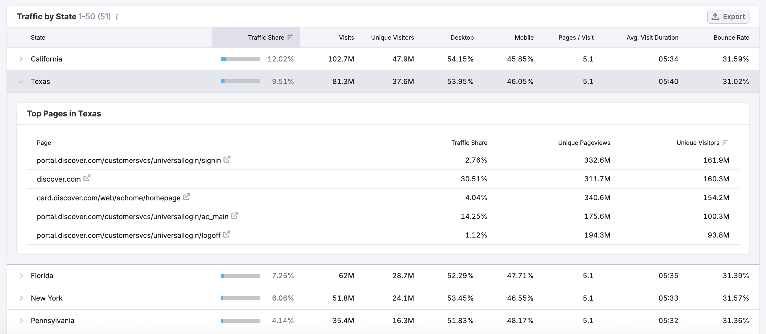
Altogether, the USA dashboard combines geographic reach with engagement depth—critical for brands looking to tailor strategies by region.
The EyeOndashboard lets you keep a close watch on the competition. You can enter up to 5 competitors and EyeOn will automatically track their Google Search Ads and new blog content.
#9 EyeOn’s Trends and Timeline
The EyeOndashboard lets you keep a close watch on the competition. You can enter up to 5 competitors and EyeOn will automatically track their Google Search Ads and new blog content.
The Trend graph in the EyeOn dashboard allows you to see trends in your competitors’ ads and content posting. For example, here is a look at Discover.com’s Google Search Ads Trend over the month of May 2025.
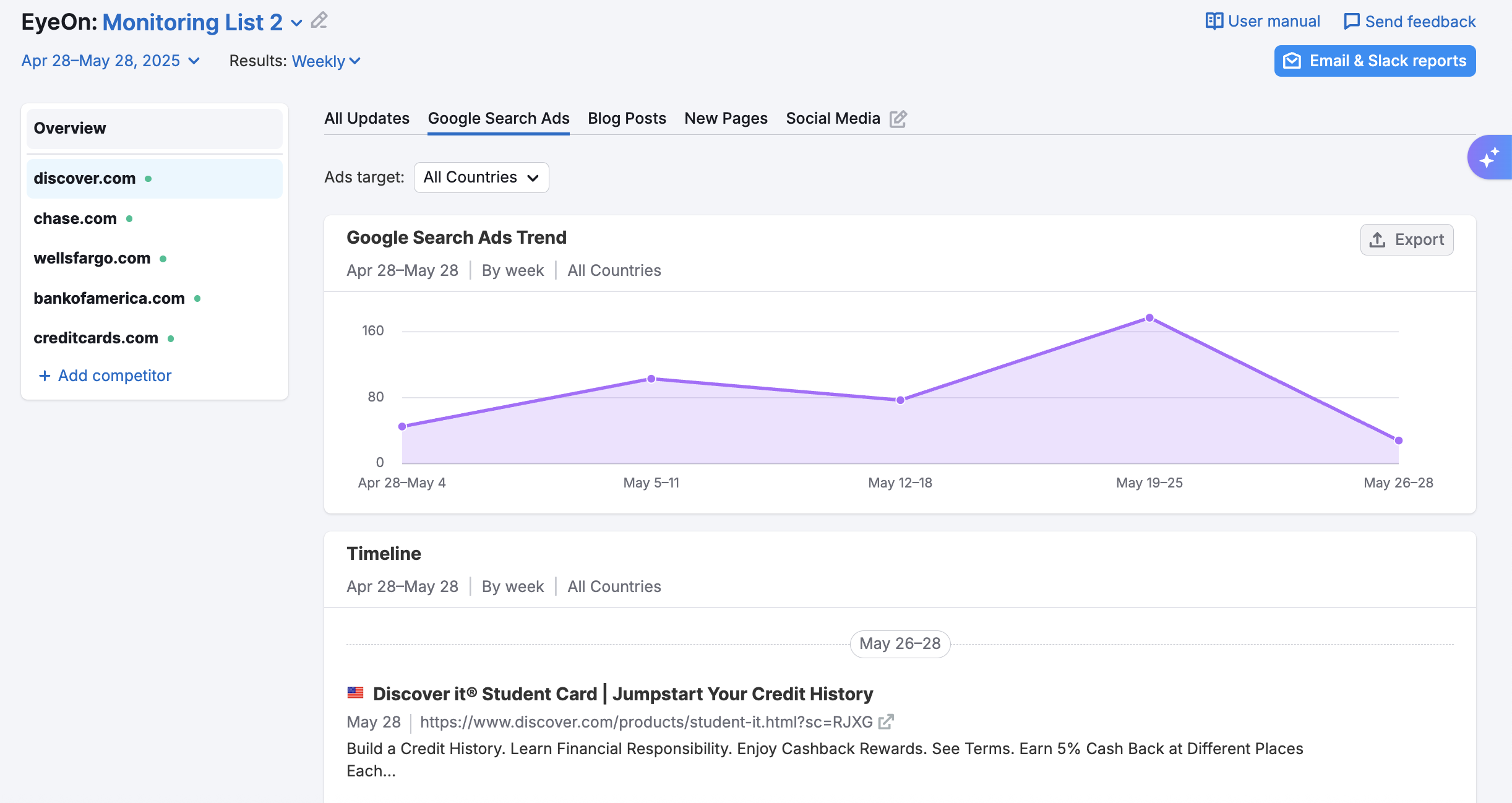
The graph shows several peaks in Google search ads that might be of interest if we wanted to dig deeper into their marketing strategy.
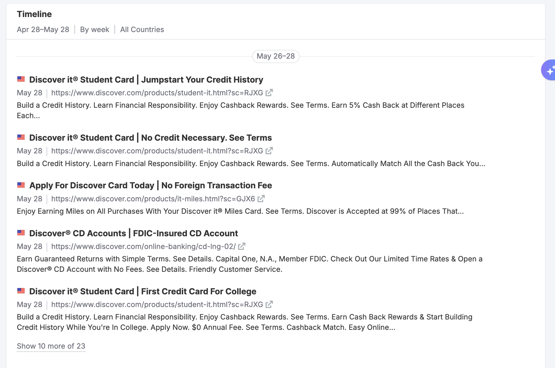
You can also view the Timeline of ads and new content releases. The Timeline provides a link to the landing page and the ad text organized by day, week, or month. Here’s an example of Discover’s Google Search Ads in the United States for the month of May 2025.
With all of your competitors’ activity visible in one dashboard, you can uncover trends in their marketing activities, track seasonal shifts in their advertising and content creation, and stay aware of new products or campaigns that may impact your business.
Keeping track of competitors can be overwhelming. The EyeOn dashboard makes it easy by sending you a weekly email update that includes an overview of your competitors’ activities online.
With automated reports sent directly to your email, you’ll be able to easily overview your competitor’s activities and focus your energy on your own marketing efforts.
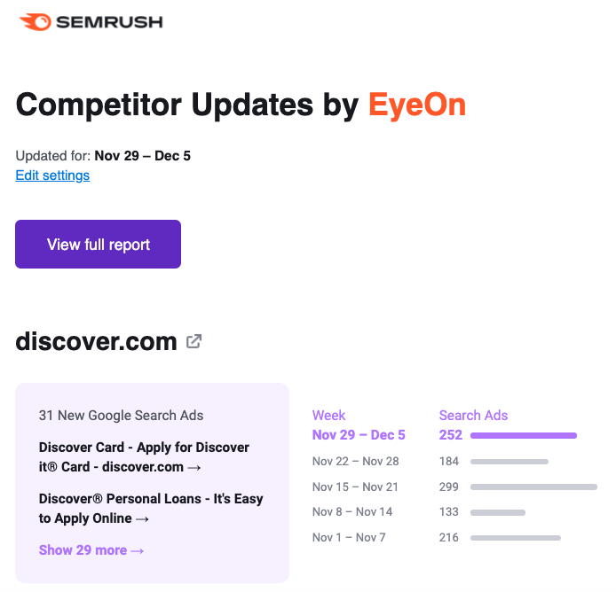
If you notice something of interest, you can navigate directly from the email to your Semrush account and begin to dig deeper.
Way More than a Simple Snapshot…
Now that we’ve covered a few of our favorite Semrush Traffic & Market features in depth, we hope you have a better understanding of the true power and utility of the Traffic & Market toolkit.
Markets are never static. In order to keep your finger on the pulse, you need tools that allow you to gain an understanding of ever-changing conditions. The data included with Semrush Traffic & Market dashboards not only offers easy-to-understand charts and graphs, but include features such as filtering, historical data, and automated reporting that allow you to derive the deepest possible insights.
Maintaining an edge isn’t just about reviewing past market conditions and peeking at competitor traffic numbers, it’s about understanding shifting market dynamics, emerging trends, and competitor’s evolving strategies. With Semrush Traffic & Market, you can stay ahead of the curve and continue to outpace the competition.


