What Is Mobile-First Indexing?
Mobile-first indexing means Google’s web crawler prioritizes indexing the mobile version of a website’s content over its desktop counterpart. Which informs rankings.
With Google’s original desktop-first indexing, their system would crawl pages from your site with the desktop and mobile user agent (crawlers).
Then, it would get page information from the desktop page’s content.
And show it in search results if the search engine thought the information was relevant to the user’s query.
But with mobile-first indexing, the indexing system will look at the mobile page instead of the desktop page for information.
What Does Mobile-First Indexing Mean for SEO?
Mobile-first indexing has a significant impact on SEO. It affects how your Google crawls, indexes, and (hopefully) ranks your site.
Which means:
If your site isn’t optimized for a stellar mobile user experience, it could negatively affect how it performs in search results. Or even prevent it from appearing in results.
To check your site’s mobile-friendliness, run a quick audit.
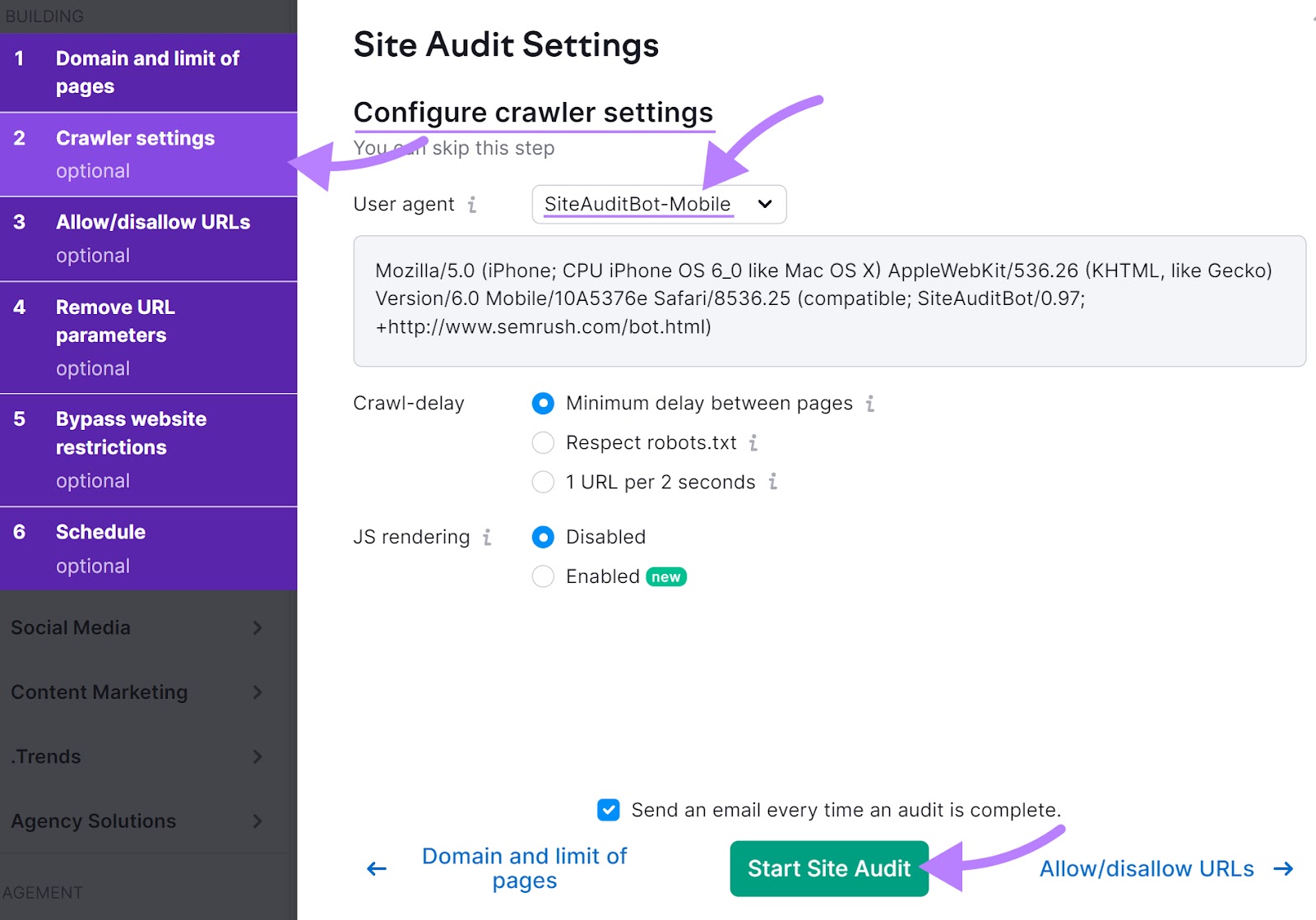
Sign up for a free Semrush account and open Site Audit—it’ll crawl your site with a mobile bot, just like Google.
In the settings, double-check that the crawler is set to “SiteAuditBot-Mobile.”
And, click “Start Site Audit.”
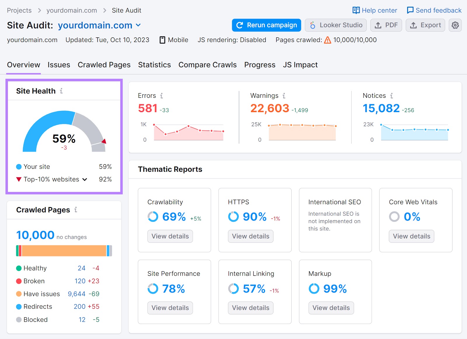
You’ll see a dashboard showing your site’s SEO health.
Like this:
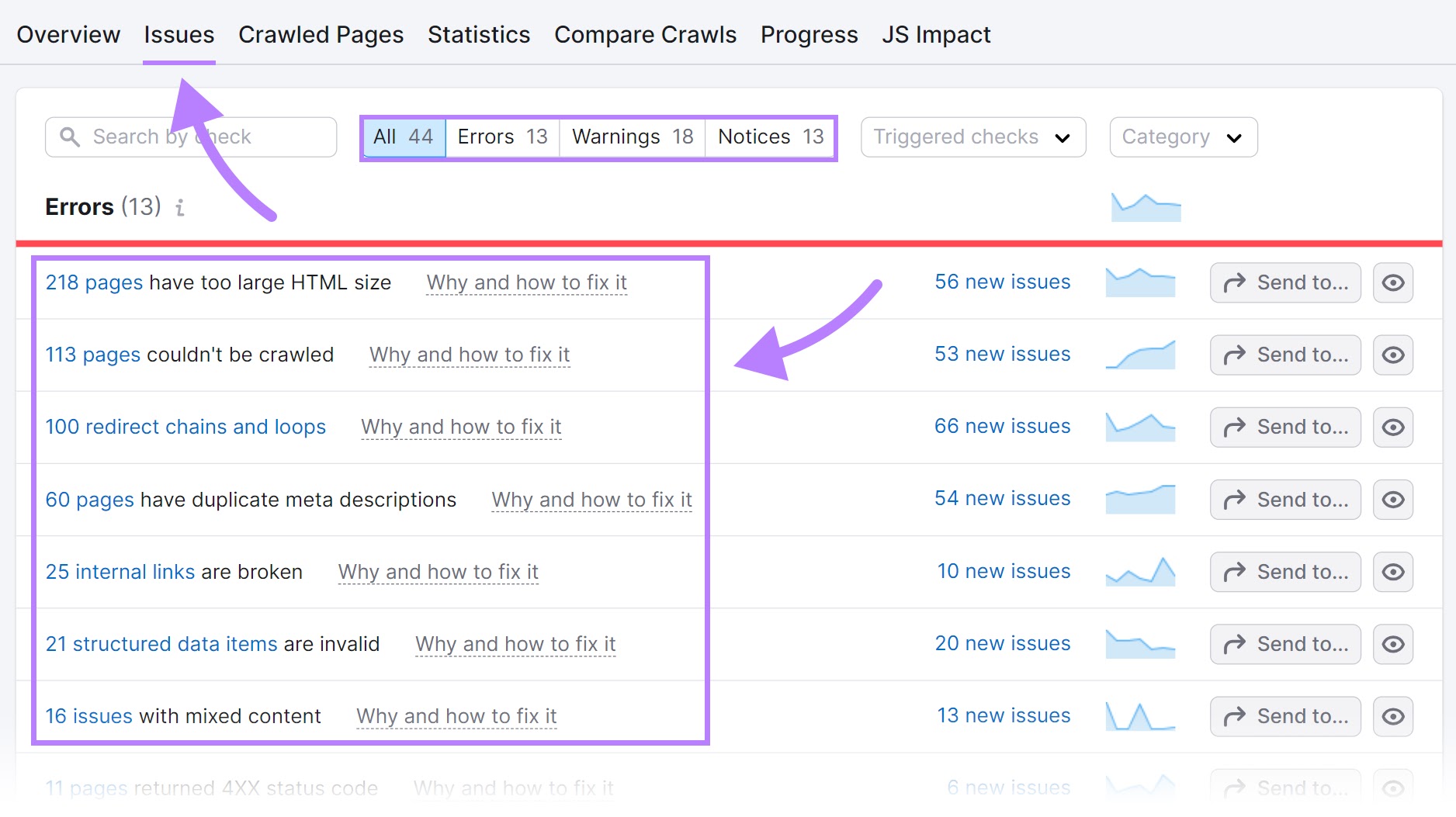
Head to the “Issues” tab, and you’ll see the “Errors,” “Warnings,” and “Notices” holding your site back. And the number of affected pages.
Mobile-First Indexing Best Practices
Follow these best practices to make sure your site is optimized for Google’s mobile-first indexing:
Make Your Site Mobile-Friendly and Responsive
A responsive web design automatically adapts to multiple screen sizes, orientations, and devices.
It rearranges elements, adjusts font sizes, and hides unnecessary content. Making your site look great and work well on any device.
That’s key for user experience. And mobile-friendliness.
Here’s what responsive design looks like on a real page:
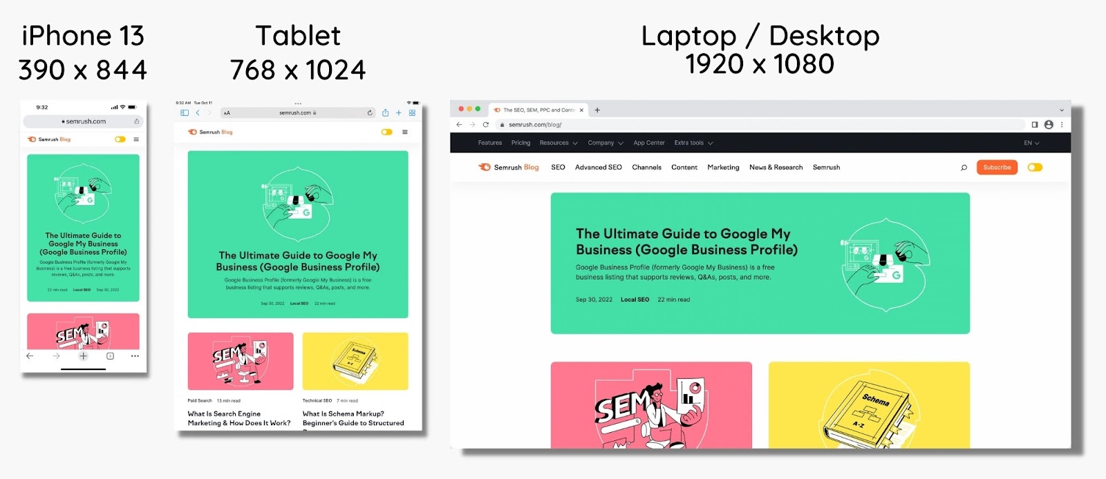
So, instead of having multiple URLs (one for mobile and one for desktop), pick a theme for your site that’s responsive.
As you browse themes for your site, check if it’s responsive by seeing the demo page. Most website builders have this option.
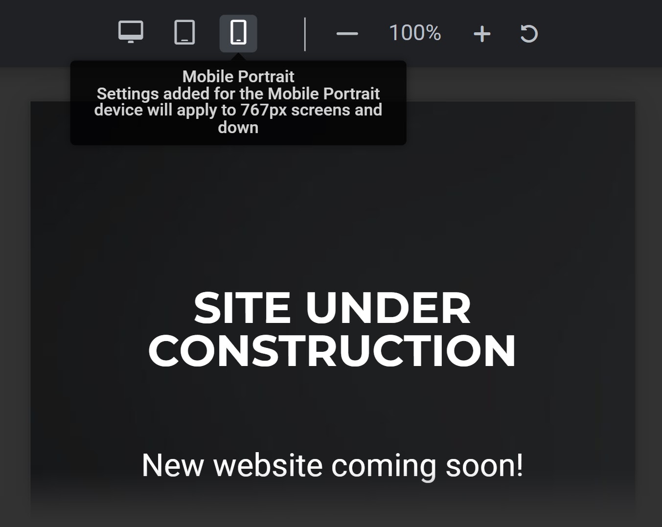
Alternatively, you could try shrinking your browser window. To see if everything resizes appropriately.
You can also use your phone or tablet to visit the page. Can you explore the site easily?
Note: If the theme you’re currently using isn’t mobile-friendly, you might need to find a new mobile-friendly theme for your site.
Further reading:
Ensure Your Website Is Crawlable
If you want Google to rank your site’s content, you need to make sure your website is crawlable.
Google needs to be able to find your pages, run your code, and assess your content. Especially on mobile.
Here are a few best practices to make sure your site is crawlable and indexable:
- Use structured data markup (a type of code that helps search engines understand your content)
- Avoid blocking any resources like CSS, JavaScript, or images
- Regularly audit your site for issues
To quickly test your site’s crawlability, run it through Site Audit.
Tip: Make sure the user agent is set to “SiteAuditBot-Mobile” in the settings.

Head to the “Issues” tab. And in the “Category” drop-down menu, select “Crawlability.”
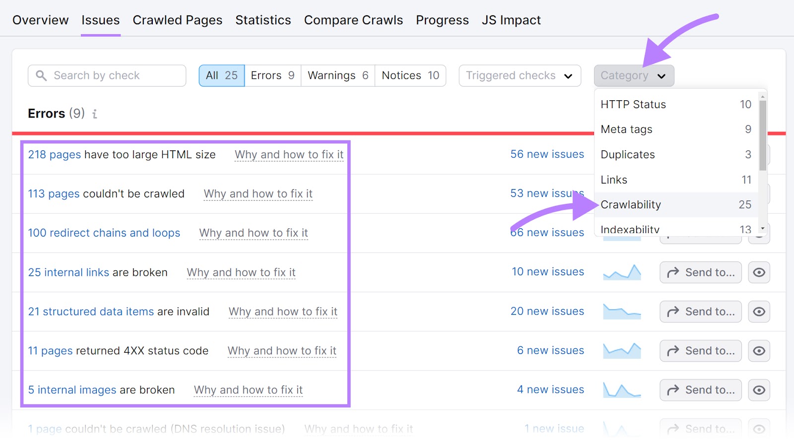
These are all of the errors, warnings, and notices affecting your site’s crawlability.
Then, check for indexability issues.
In the “Category” drop-down, select “Indexability.”
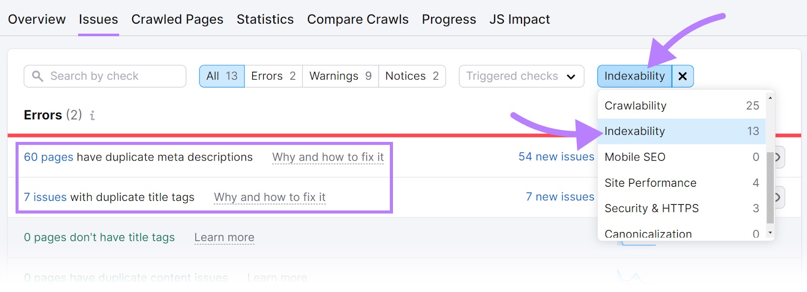
Fix as many crawlability and indexability issues as you can.
Further reading:
Optimize Images and Other Media for Mobile & Desktop
Images are a fundamental part of most websites.
And images can take up a ton of bandwidth—especially on mobile devices.
That’s why it’s essential to optimize all images and other media for all devices. Especially now that Google is fully mobile-first indexing.
So, follow image SEO best practices.
Here are a few specific guidelines to ensure images are optimized for mobile:
- Use high-quality images, but compress them to help decrease page load times
- Provide an image sitemap (a file that helps search engines discover and index your images)
- Provide a video sitemap (a file that helps search engines discover and index your videos)
- Use structured data for media
- Lazy-load images (postpone loading images until they are visible on the page) to improve site speed and save bandwidth
Follow these steps and you’ll be able to create a better user experience and improve performance for both mobile and desktop.
Further reading:
How to Fix Mobile Indexing Issues
Check for Mobile-Friendliness
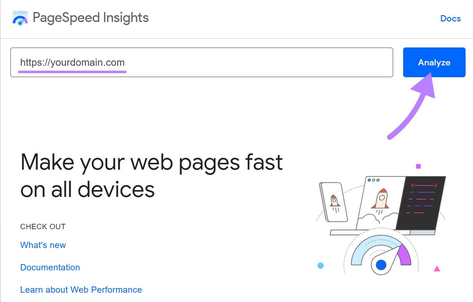
One of the best ways to test your site’s mobile-friendliness is with Google’s PageSpeed Insights tool.
It analyzes webpages and gives you a score for both mobile and desktop. And suggestions on how to improve them.
Note: You can also use Google’s Mobile-Friendly Test to see at a high level whether your site is mobile-friendly. But this tool offers limited insights compared to PageSpeed Insights.
Open the tool, enter a URL, and click “Analyze.”
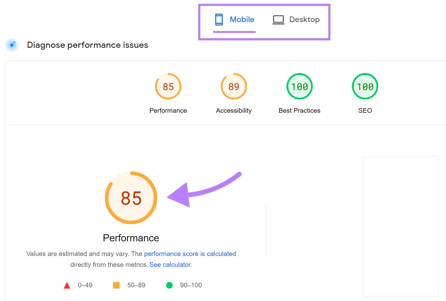
You’ll see two tabs in the report: “Mobile” and “Desktop.”
Click on the “Mobile” tab to see your site’s mobile-friendliness score and recommendations.
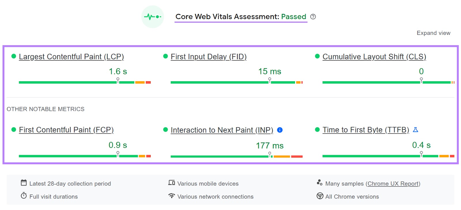
The report shows a “Core Web Vitals Assessment”—which measures how fast your site loads and how stable it is during loading.
The better these metrics are, the more mobile-friendly your site is.
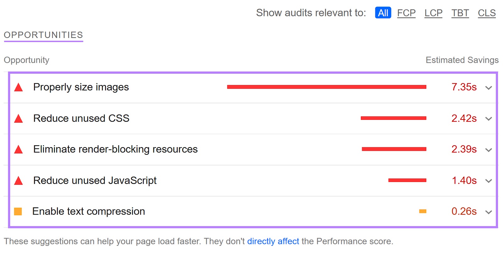
And below, you’ll see a list of opportunities and diagnostics that can help you improve your site’s mobile performance and user experience.
For example, you may see suggestions to properly size images, reduce unused CSS, or eliminate render-blocking resources.
Like this:
You can also click on any issue to see more information and examples:
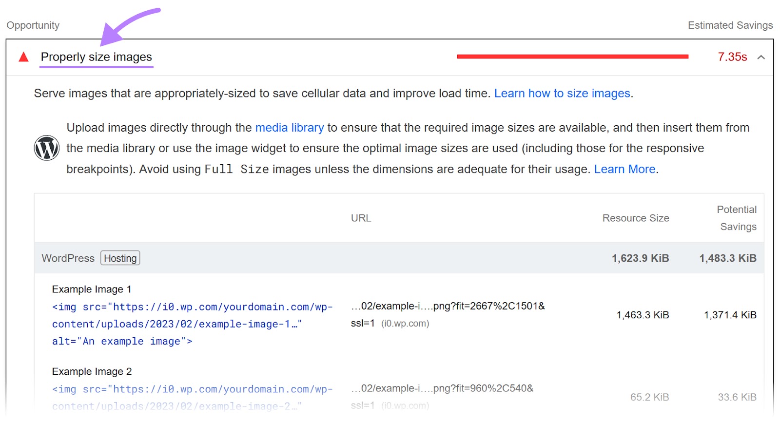
The only problem with PageSpeed Insights is it can get very technical, quickly. And the jargon can be a bit intimidating.
Still, implement as many of the tool’s suggestions as you can. Then, run the tool again to see how your scores improve.
Further reading:
Run a Site Audit
A better solution to finding and fixing mobile indexing issues is to run a full website audit. And you can use a tool like Site Audit.
Note: Sign up for a free account and you can audit up to 100 URLs. Every day.
Open the tool, enter your domain, and click “Start Audit.”

Then, configure the settings.
And in the second tab, “Crawler settings,” make sure the “User agent” is set to “SiteAuditBot-Mobile.”
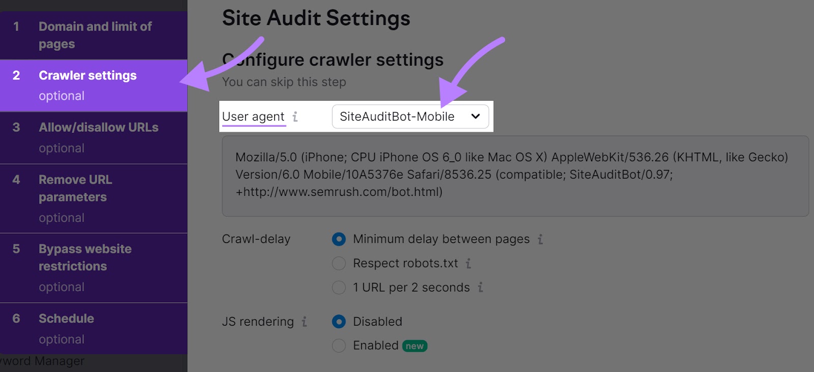
Once you’re done, click “Start Site Audit.”
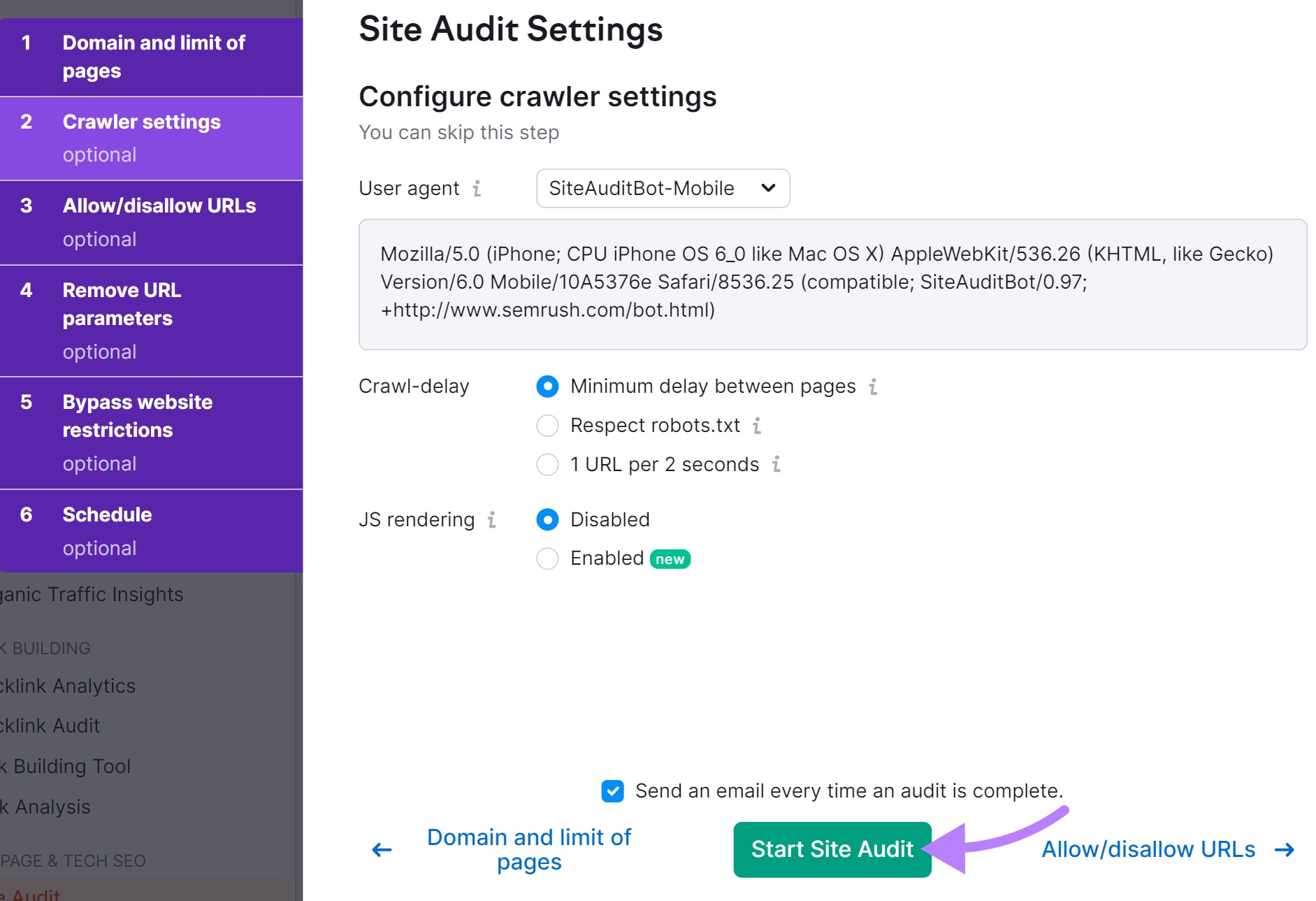
You’ll see a dashboard with your site’s overall health. And other thematic reports.

Head to the “Issues” tab and you’ll get a list of all the issues affecting your site.
Like this:

To learn more about each issue and how to address it, click on “Why and how to fix it.”
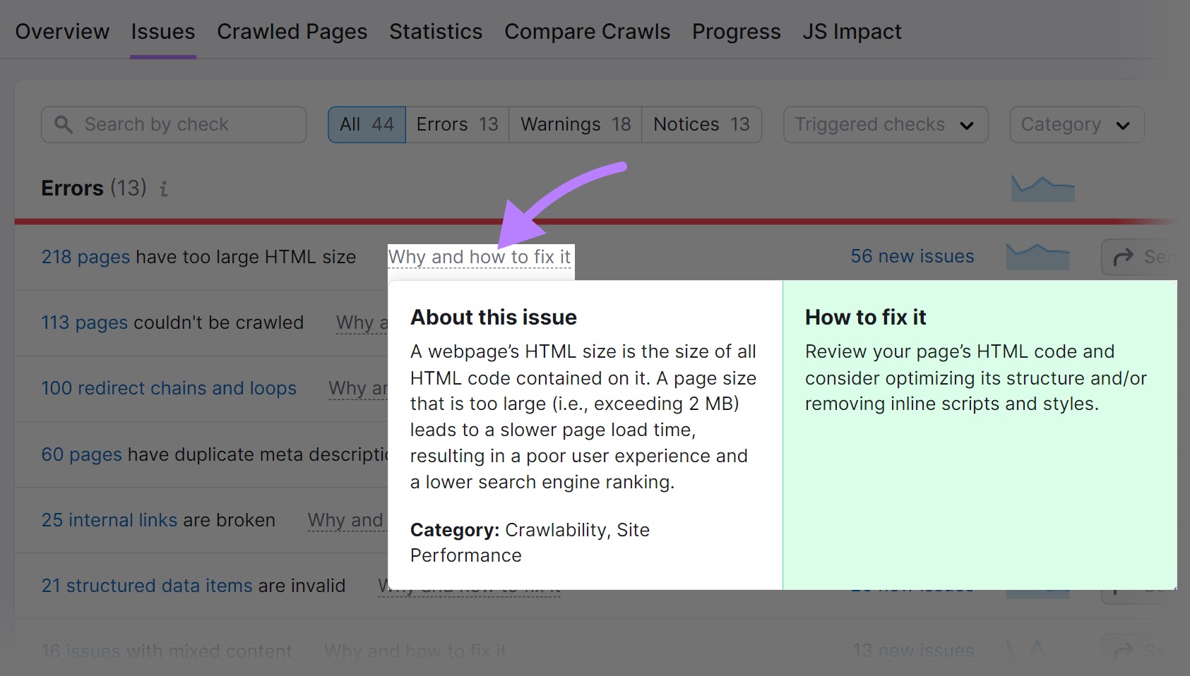
You can also use the “Category” filter drop-down to check for specific issues.
For example, you can select “Site Performance,” “Mobile SEO,” or “Indexability.” And fix these issues first.
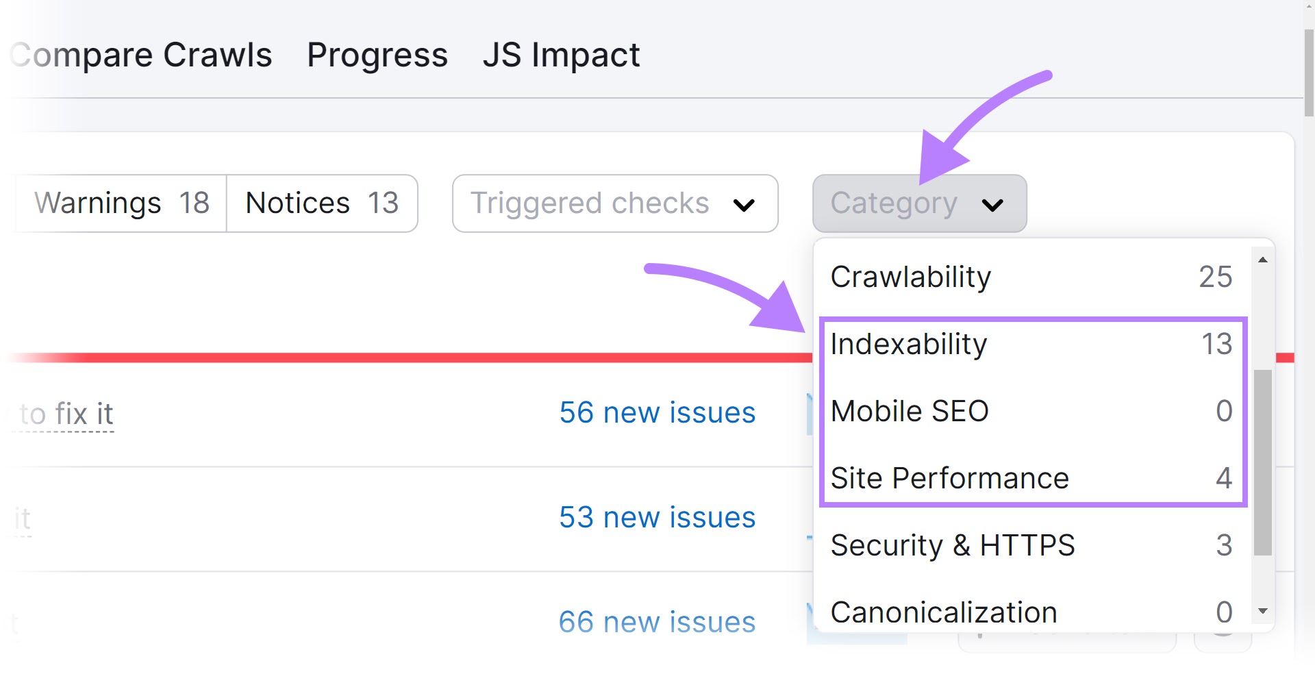
You should strive to fix as many errors, warnings, and notices as you can. And as soon as they pop up. Because they all affect your site’s performance.
Stay Informed About Page Experience and Future Developments
Google’s page experience update is a big deal.
It measures how real-world users perceive the quality of your webpages. And looks at factors like loading speed, visual stability, and interactivity (also called the Core Web Vitals).
But providing a good page experience also depends on other signals like ensuring mobile-friendliness, using secure HTTPS pages, and avoiding intrusive pop-ups or banners.
These signals have been part of Google’s ranking algorithm for a while, but they’re now more important than ever.
Which means:
Your site needs to be easy to use on mobile devices. With readable text, clickable buttons, and no unplayable content.
Both page experience and mobile-first indexing focus on improving the user experience on mobile devices.
Each requires you to pay attention to your site’s performance and usability on mobile devices.
And both can affect your rankings and traffic.
Further reading:
Stay On Top of Your Mobile Experience
Auditing your site once for mobile indexing issues isn’t enough. You need to continuously track and monitor its mobile performance.
So, make sure to schedule crawls to run automatically every week when setting up Site Audit.
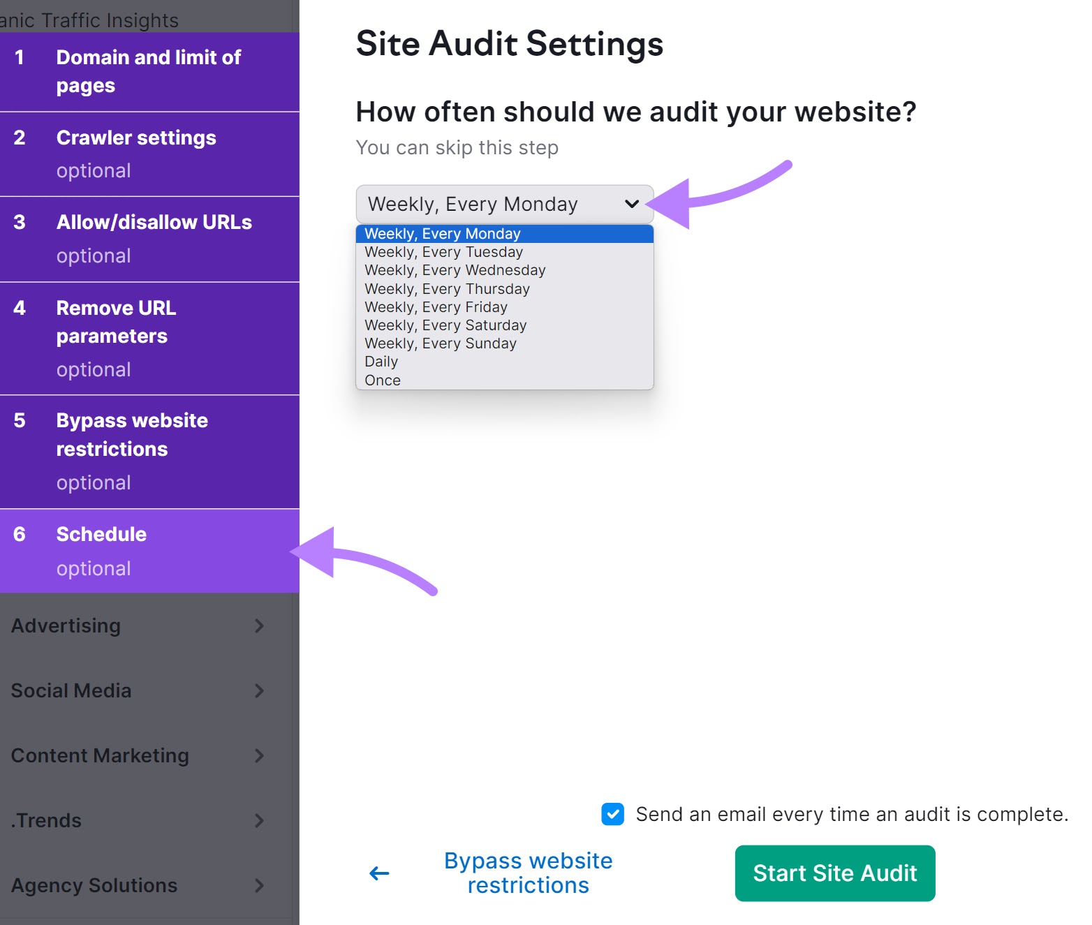
If you’ve already run an audit, open your project and schedule crawls by clicking on the gear icon and scrolling down to where it says “Schedule.”
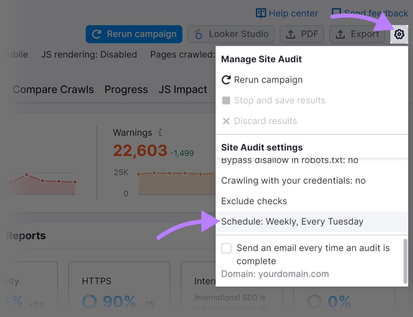
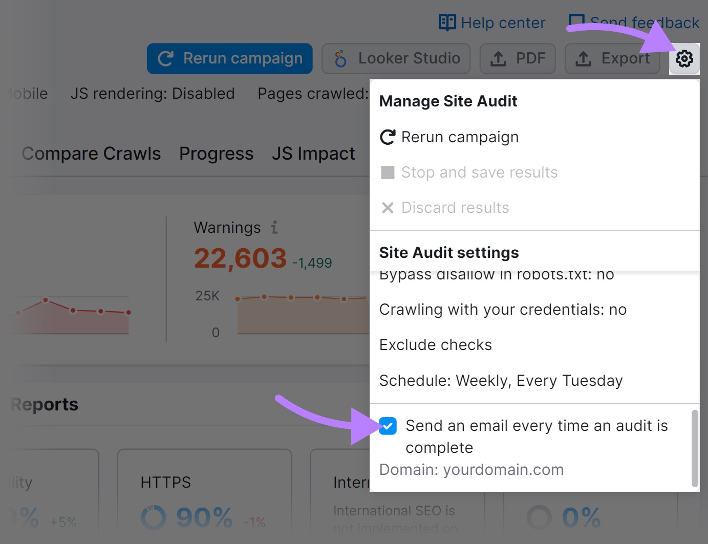
And check the box next to “Send an email every time an audit is complete.”
Then, head to the “Issues” tab. And fix them as they pop up.
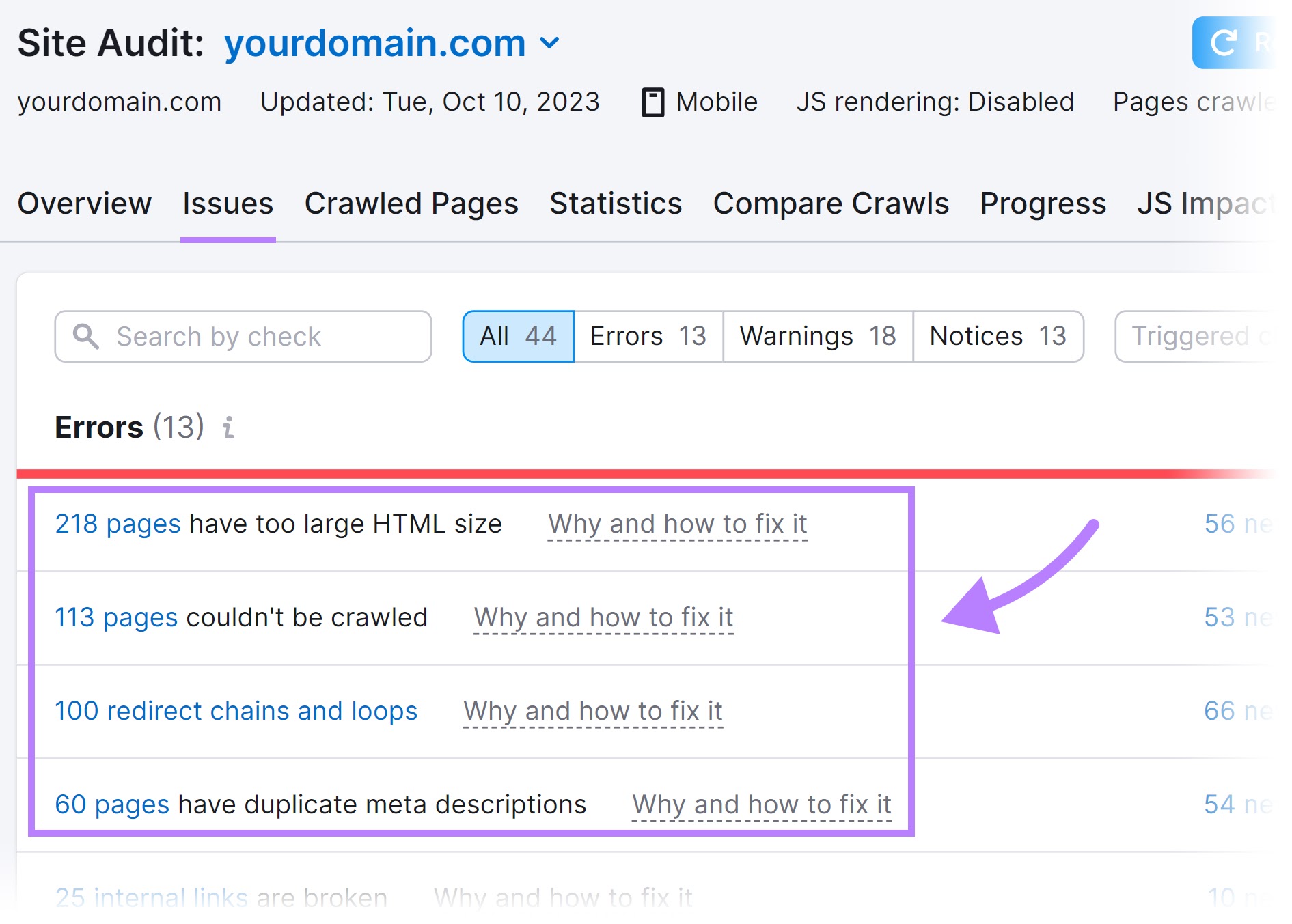
Address “Errors” first. Then, “Warnings” and “Notices.”
A workflow like this will help ensure your site’s SEO health stays strong. And supports higher rankings and traffic.
This post was updated in 2023. Excerpts from the original article by James Brockbank may remain.


