Streamlined ecommerce navigation is essential for a profitable online shop.
Why?
Because users will be more likely to convert if they can find the products and information they need.
But if your navigation is cluttered and clunky, users may leave. Or head to your competitor’s site.
Today, we’re diving into ecommerce navigation examples and best practices to help you design your shop’s menu with ease.
The Importance of User-Friendly Ecommerce Navigation
There are four key benefits to user-friendly navigation:
1. Better User Experience (UX)
Streamlined navigation improves the overall experience of your site.
People have specific goals when they visit your site. Such as learning more about your company or buying a product. Well-structured navigation helps people achieve whichever goals they have.
But if people can’t complete their goal, they’ll likely bounce (leave without visiting other pages or completing some other action on your site). And that negative experience can cost you.
In fact, 61% of consumers will shop with a competitor after only one bad experience, according to Zendesk.
Improving your site’s navigation will keep users clicking happily through your site.
2. Higher Conversion Rates
Every shopper needs different information before they make a purchase. Some may want to read your return policy. Others might want to find specific products.
Great navigation reduces friction and guides shoppers toward their purchase. A clear navigation system ensures that visitors can access the information they need to convert.
But it’s not just conversion rates that increase when people can find what they need; cart totals also rise.
The numbers are clear: 89% of shoppers say they’ll spend more money on their ecommerce purchases if they find what they need without contacting anyone, according to Zendesk.
To improve your ecommerce navigation, stay on top of site errors. Errors like broken pages or links make it harder for people to reach their destination and to find what they’re searching for.
To spot errors, use Semrush’s Site Audit tool. To start, enter your website domain and click “Start Audit.”

Then, configure the Site Audit settings. Our configuration guide walks you through the process if you get stuck.
Next, Semrush will audit your site, which can take up to a day for the full report.
When Site Audit completes your audit, scroll down to the “Crawled Pages” section (in the “Overview” tab). Click the number beside “Broken.”
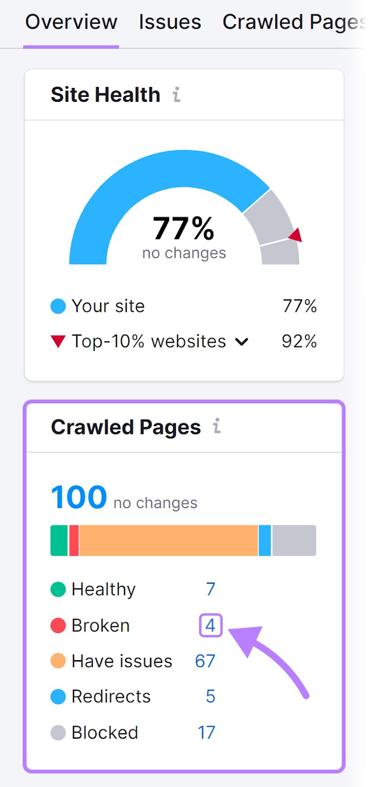
This shows you pages on your site with errors. Along with the error’s HTTP status code (a three-digit number, like 404, that tells you the issue with the page).
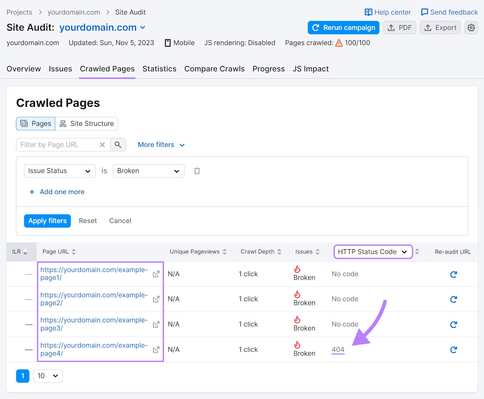
Go through and fix these pages so they no longer return an error. For example, you will want to fix redirect pages with 404 errors to a similar page. Then, your site will redirect users who click the original link to the new page.
Next, click the “Issues” tab and scroll until you see “# internal links are broken.”
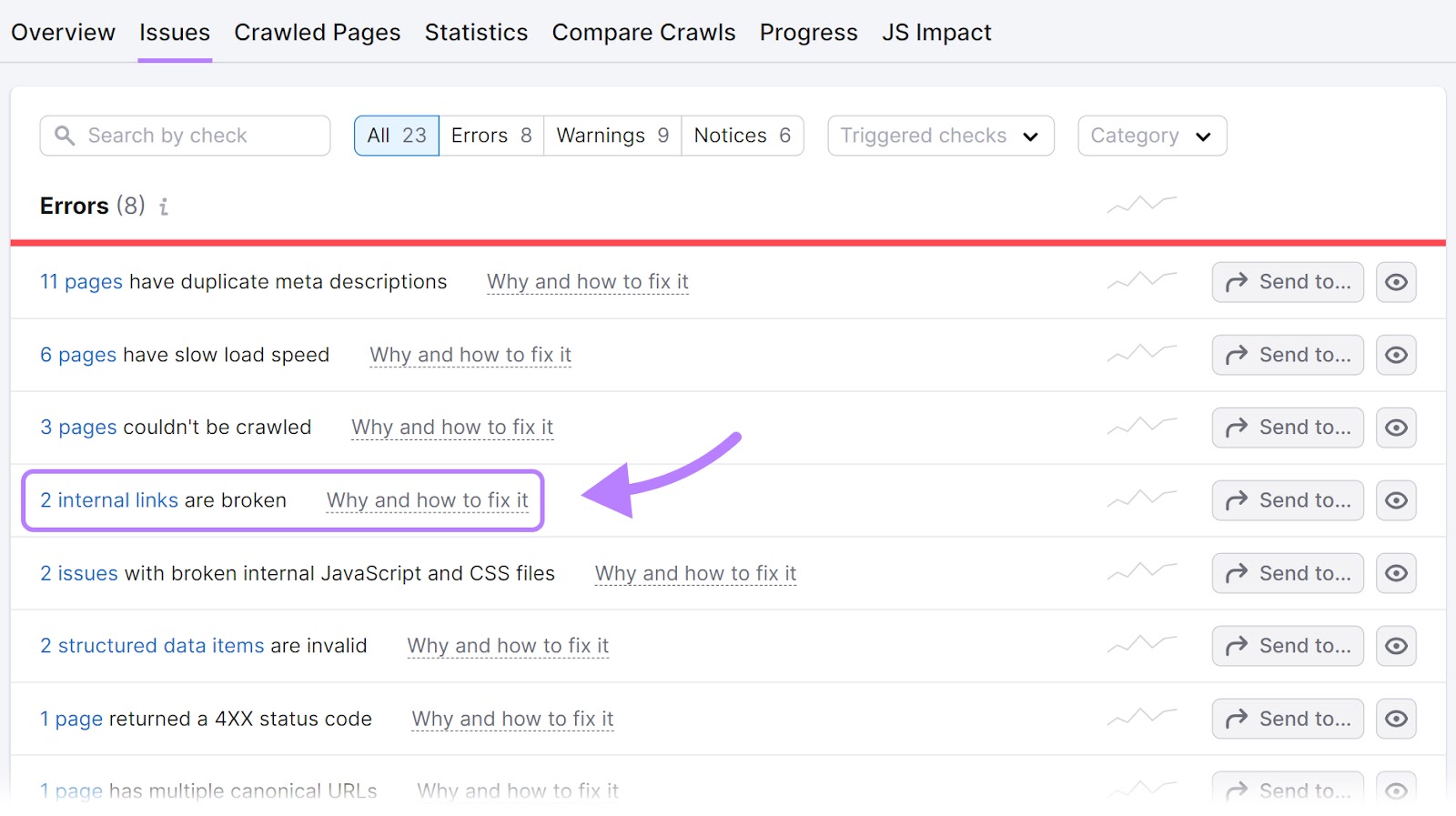
Click on the report to view your broken links (links that point to a page that doesn’t exist or can’t be found).
Fix these by adding a working link, deleting the link or fixing the broken page where it links.
Reviewing broken links and pages with errors ensures smooth site navigation for users.
3. Improved Search Engine Optimization
When your website is easy to navigate, search engine bots can crawl your site (discovering pages) and then include those pages in the search results. This can help your site get more traffic from search engines.
But first, you must make sure there aren’t issues preventing search engines from crawling your site. Otherwise, search engines may not place your site in the search results.
You can check for crawlability issues with Site Audit.
Here’s how.
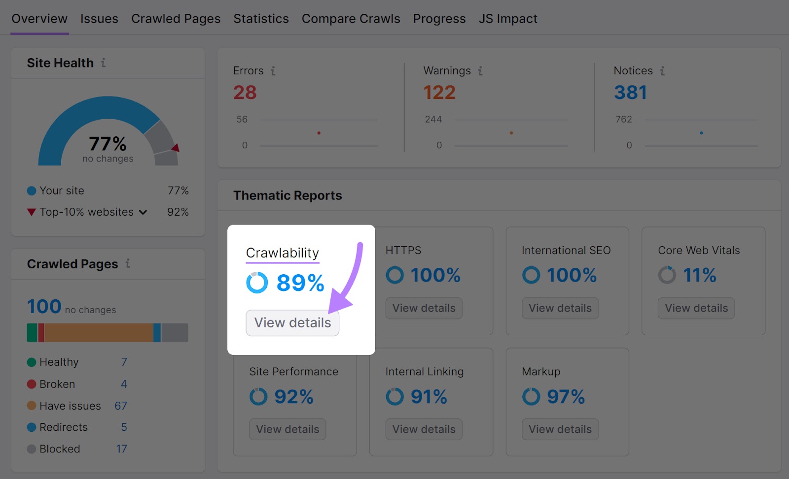
First, follow the steps outlined in the section above. Then, click into your Site Audit project and then head into the “Overview” tab. Look for “Crawlability” and click “View details.”
Pay attention to the “Crawl Budget Waste” report.
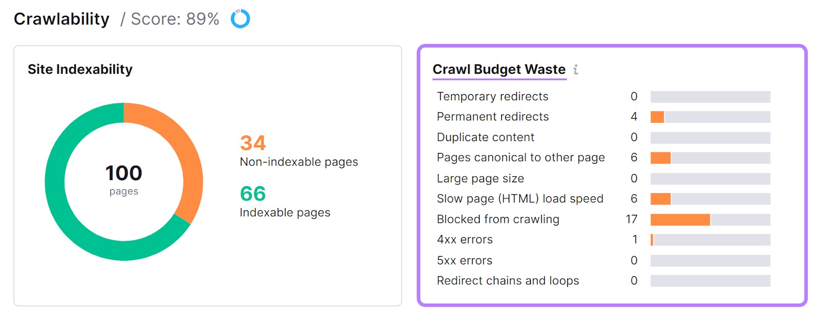
This report highlights which pages affect a search engine bot’s ability to crawl your site. Ideally, you want your crawl budget waste errors to be as low as possible.
Go through the list and fix the errors. You can click the orange bar to drill into each issue. And get a list of the affected pages.
Fixing these errors helps bots crawl and index your site more efficiently. Ultimately, you will have a better shot at ranking higher and getting more clicks from the search results.
4. Increased Accessibility
Clear site navigation lets everyone, regardless of abilities, use your site and shop your products.
For example:
- Clearly labeled links make it easier for those who use screen readers to understand the structure of your site
- Simple navigation helps those with cognitive differences find pages with ease
- Clean navigation lets people with mobility issues use the “tab” button to access specific links
And some countries legally require you to provide an accessible experience on your site.
13 Examples of the Best Ecommerce Navigation
Let’s look at some ecommerce navigation examples to inspire your shop’s design.
You’ll find drop-down menus at the top of a website. Hovering over a link expands the menu to reveal additional links.
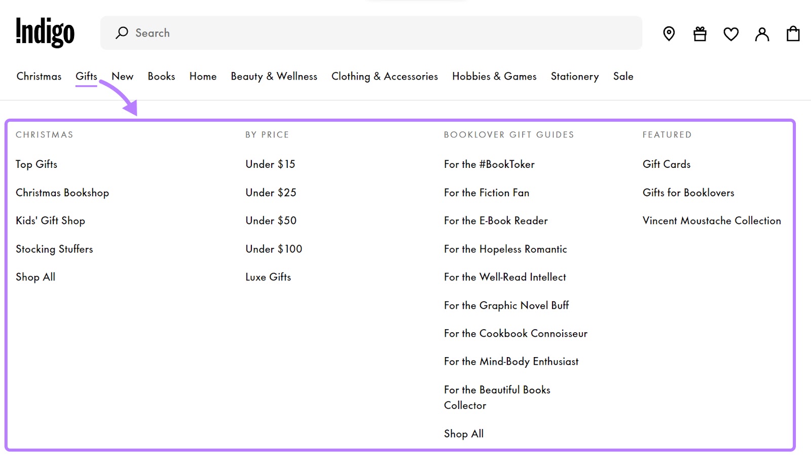
Book retailer Indigo has several high-level categories for their drop-down menu (below).
Each category expands into more subcategories when users hover over the link. For example, if you hover over “Gifts,” a submenu appears. This menu shows links for gifts by season, price, and different personas.
And Office Depot indicates the menu will “drop down” with arrows.
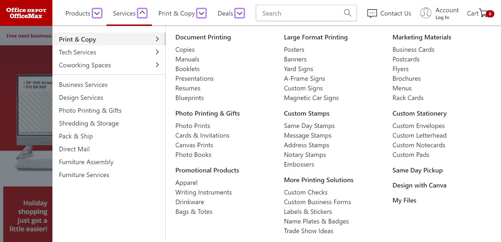
These arrows help users understand what happens if they hover their mouse over certain words. They can be useful if some of your navigation elements expand into a dropdown, and some don’t.
This way, users will know which links open a drop-down menu and which ones don’t. Otherwise, they might get confused and think your menu is broken if certain elements reveal a drop-down and others don’t.
Horizontal Navigation
Horizontal navigations are links arranged horizontally near the top of a website. Unlike drop-down navigation, nothing appears if a user hovers over a link.
Horizontal navigation can work for smaller ecommerce sites with few pages to list.
Here’s a simple horizontal menu from eyewear company Warby Parker.

Their two-tiered navigation guides people to important pages, like shopping carts, different product categories, and sunglasses and accessories.
And subscription box company Birchbox uses a single-layer navigation to list category pages.

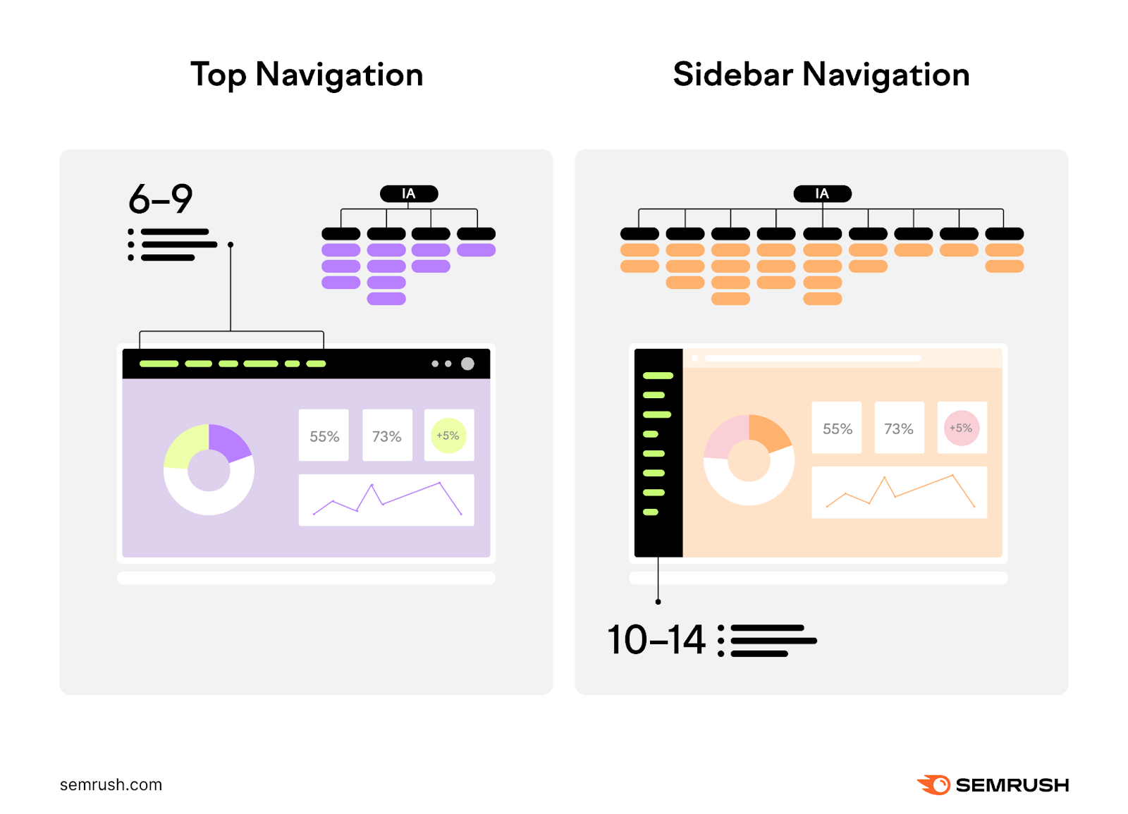
Sidebar navigation is ideal if you have numerous pages to include in your navigation.
Because sidebar navigations are compact, they often have more room for top-level links than a horizontal or drop-down menu.
Retail chain Kohl’s sells thousands of products. And they need to maximize their navigation menu to help people find the right product. So, they’ve opted for a sidebar menu.
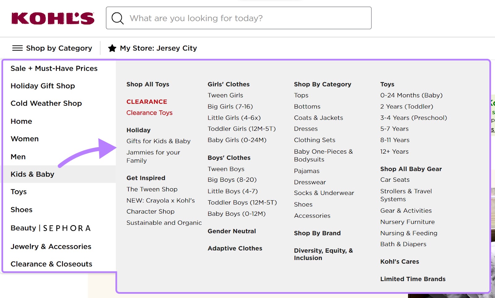
Their sidebar menu lets them fit a handful of product categories that open up into a larger menu.
They use the hamburger icon with text that reads “Shop by Category.” This way, users know where to click to find the menu.

Petco also sells thousands of products. They use a scrollable sidebar menu to list out different product categories that users might find useful.
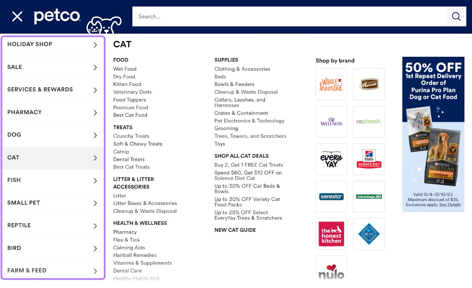
While they don’t use any text to identify the menu, they use a hamburger icon.

Most users are familiar with this icon. And know to click it to access a menu.
Your footer navigation should include helpful links that aren’t directly related to your primary products but can aid visitors in navigating your site and finding additional information.
It’s helpful for links to your social media accounts. Or your FAQ page.
These links often enhance the user experience, provide essential details, and establish credibility.
Clothing retailer Nordstrom has six columns of links to help users find contacts, learn about the company, and access account information.
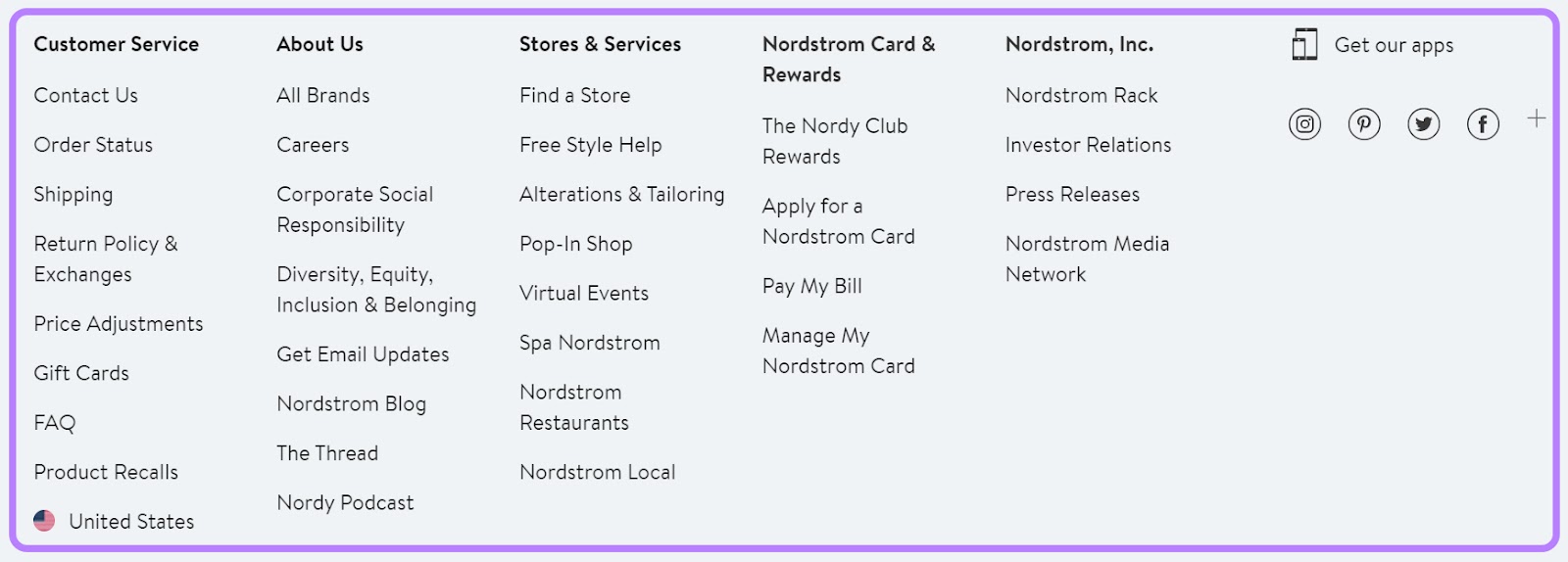
Their footer menu uses headings to group different links so users can find what they need.
Breadcrumb Navigation
Breadcrumb navigation is a secondary navigation system that shows users how they landed on a specific page.
For example, clothing company H&M lists breadcrumb navigation at the top of each product.
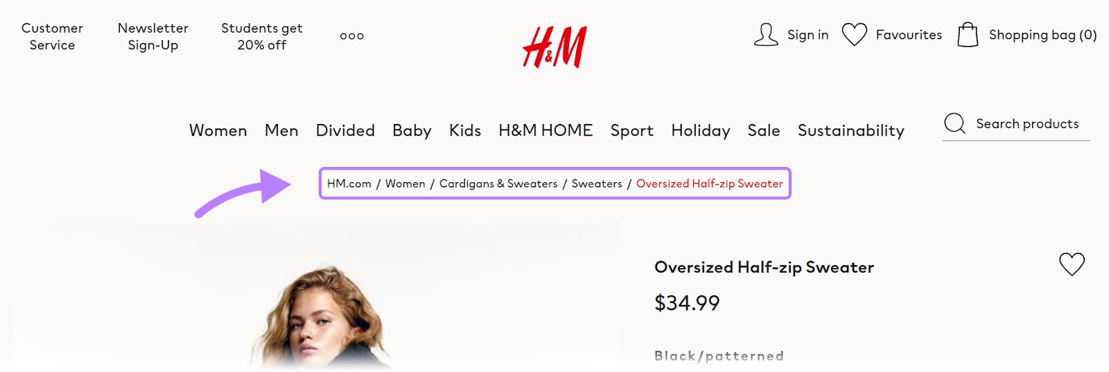
If users want to see more products, they can use the breadcrumb navigation to go back to previous pages or categories without starting over. It makes moving around the site easy and smooth.
Retailer Target also uses breadcrumb navigation. They tack a product number onto the final page.

This could help the user determine if they want to continue refining their search. Or browse through the number of products listed.
Faceted Navigation
Faceted navigation is a filtering system people use to tailor product pages.
Clothing retailer J.Crew adds a faceted navigation to the side of product category pages. Users can define things like fabric type and silhouette to filter products.
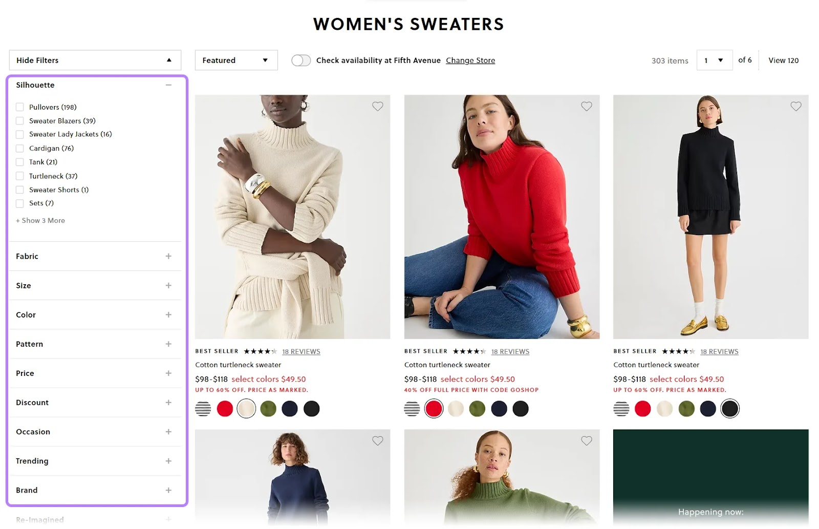
And shoe company Aldo also uses a faceted navigation that users can click to reveal:
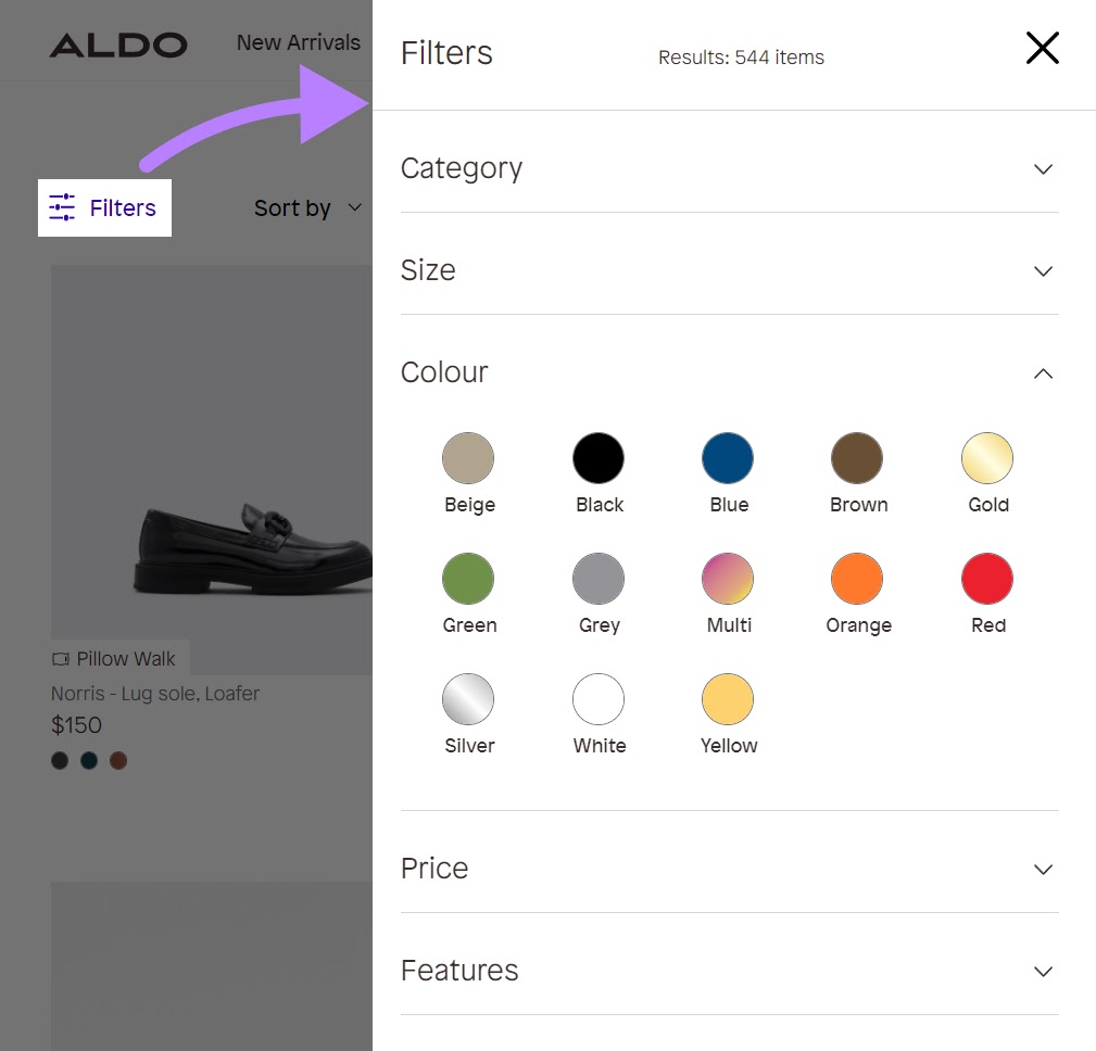
Shoppers can then sort through filters like category, size, color, price, and features. To find the products they want.
If you want a faceted menu but aren’t sure which criteria to use, start by viewing the faceted menus of your competition. Note which criteria they use.
Then, speak with customers to see if there are other criteria you should add (or remove) to make their searches earlier.
Search Navigation
Search navigation combines search functionality with browsing ability. These features help get users closer to the exact page they want.
Let’s look at this search navigation example from retailer Wayfair. Wayfair’s predictive search helps users find specific products when they start typing.
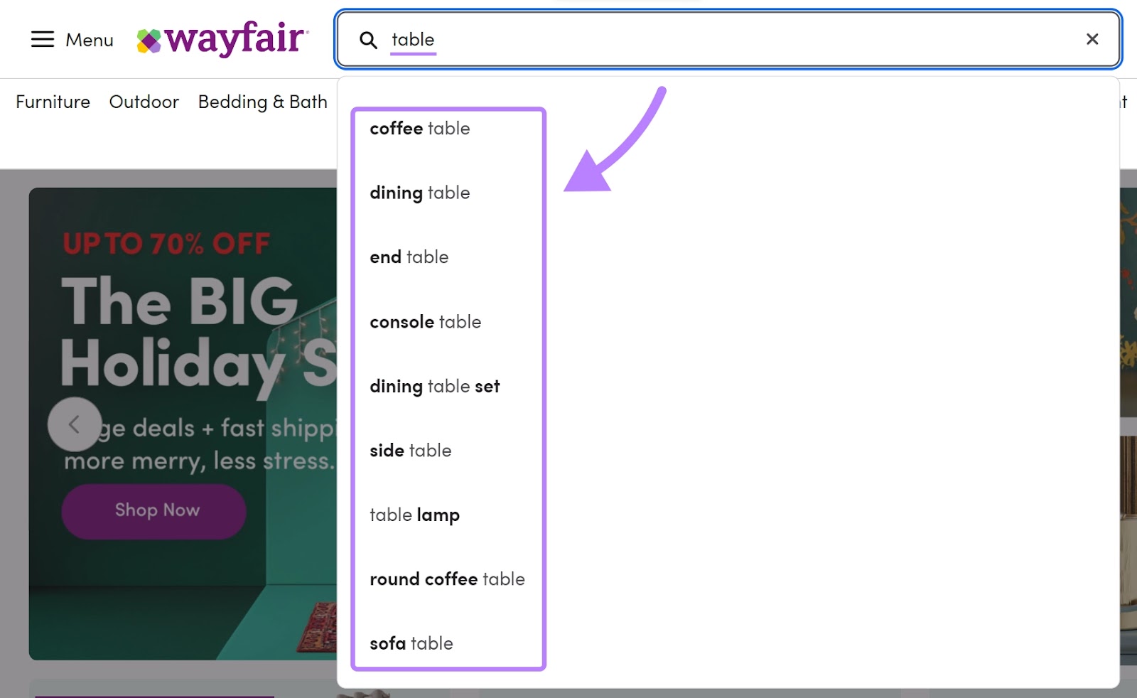
The suggested terms can help users narrow their search.
And shoe retailer Browns adds images to their search menu.
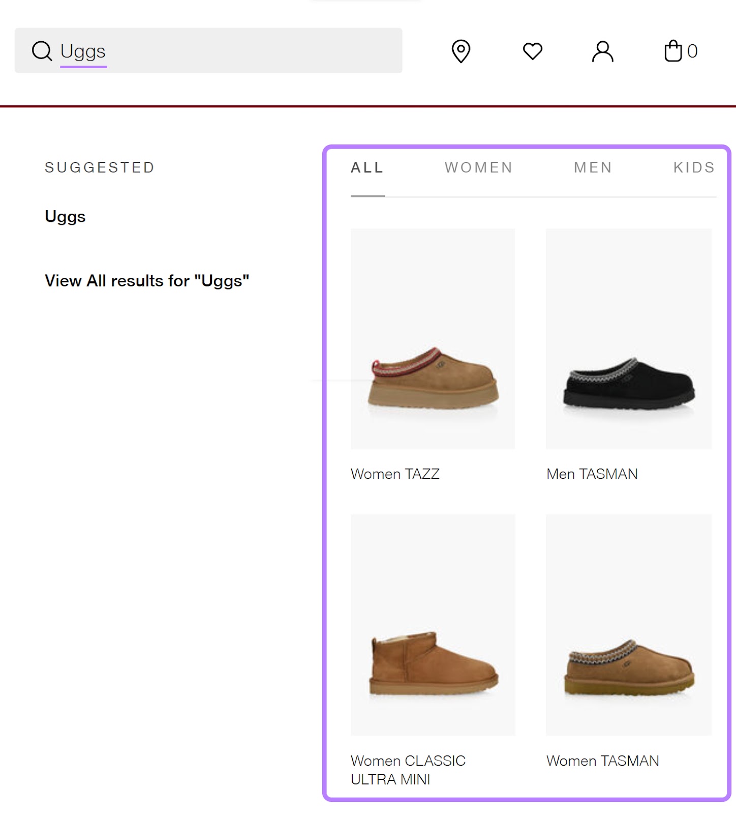
Search navigation with images can simplify the user’s journey. And improve the overall search experience.
Ecommerce Navigation Best Practices
After seeing all the different examples, you’re nearly ready to design (or revamp) your navigation. Here are some best practices to keep in mind.
Create a Logical Structure
A logical website structure (the way you organize and connect your webpages) lets users browse your site without hitting roadblocks.
And you can create a logical structure by identifying how people currently use your site.
To do this, use an analytics tool like Google Analytics (GA4).
GA4’s Path exploration report shows you the path users take to end up on certain pages.
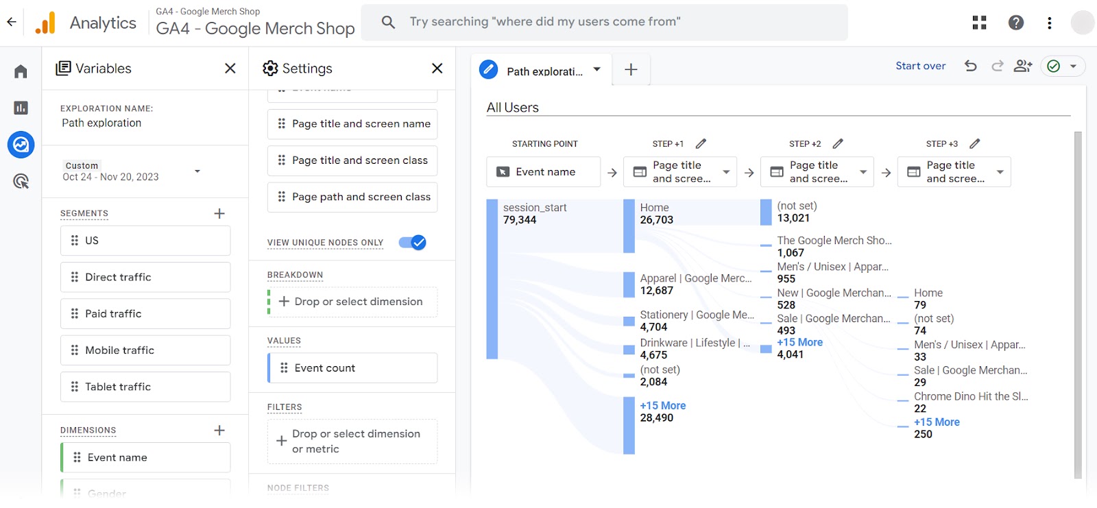
This user flow diagram identifies common paths on your site.
Given that these are the paths users are already taking, consider using this report to outline your navigation.
Include Prominent Access to Key Pages
Make sure key pages are easy to access by giving them prime real estate in your navigation menu. Like adding them to your top-level navigation (the first layer of navigation).
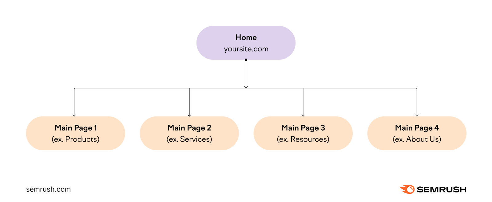
You can identify important pages by reviewing your analytics. Your key pages are likely the pages that receive the most traffic.
Other important pages you might want to highlight in your navigation include:
- A cart or checkout page
- An account login page
- Information on shipping, returns, or product deals
Keep Navigation Consistent
Maintain consistency in elements like placement and design. Consistent navigation makes it easy for people to explore your site, no matter which page they’re on.
For example, the drop-down menu for ice cream company Ben & Jerry’s remains consistent across all pages.

Users don’t need to sort through different menus depending on which page they land on. If they did, they might feel confused and leave the site.
Ensure Users Don’t Hit Roadblocks
You want to make sure users can navigate your site without running into broken pages or errors.
Use Semrush’s Site Audit tool to automatically check your site for errors.
Semrush sends weekly or daily reports based on your configuration. That way, you’ll know if something breaks (and can fix it right away).
Use Multiple Types of Navigations
You can also use multiple navigation types to help people find what they need.
For example, jewelry company Tiffany & Co combines a horizontal navigation with a drop-down navigation.
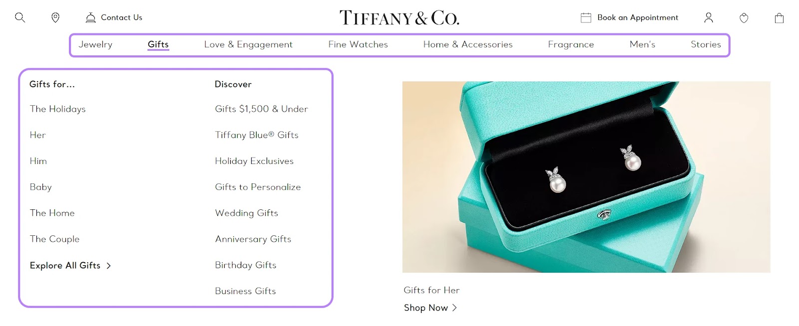
The horizontal navigation includes important links that don’t require additional context (like a drop-down menu might).
Regardless of how you combine your navigation, you should aim to have at minimum:
- A main navigation at the top
- Navigation in your footer
- Breadcrumb navigation for product pages
These navigation types tend to be standard. And users expect them across the sites they visit.
Make Navigation Mobile-Friendly
You don’t need to worry about losing sales when your menu looks great on all types of devices.
YouGov reports that 45% of consumers use their phones to shop every day. Tailoring your mobile menu helps you keep mobile users on your site.
To achieve mobile-friendly navigation, logically organize your menu items. They should also be easy to tap and read on a small screen.
Here’s how Kohl’s desktop menu looks compared to the mobile one:
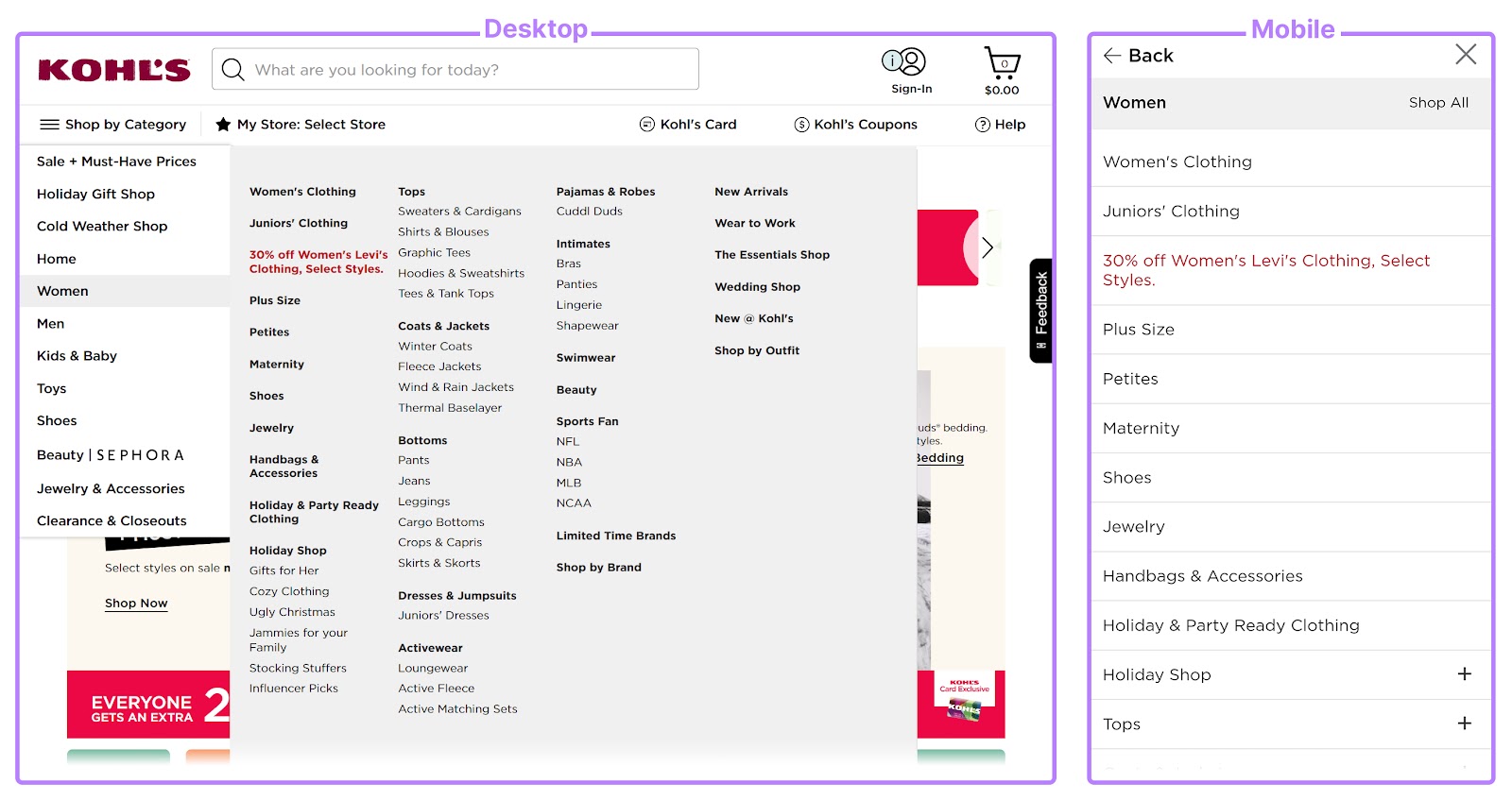
Both menus contain the same items. But the mobile one is scrollable. And the text is large and easy to click.
And Nordstrom takes the content from their footer menu and adds it to their scrollable mobile menu:

Both approaches ensure mobile devices can access the same pages as desktop users without any extra fuss.
Ready to Improve Your Site’s Navigation?
Improving your ecommerce’s navigation can result in higher sales, happier users, and better SEO.
Semrush tools let you spot errors affecting your navigation. So you don’t need to wonder if something isn’t working.
And you can try it for free. Today.
Sign up to improve your ecommerce site’s navigation.


