Just because your website ranks well on desktop search results doesn’t mean it’s the same for mobile search.
Desktop and mobile rankings can differ due to factors like the user experience (UX), the searcher’s location, and page loading speed. So, it’s important to see how your site performs on both types of devices.
Mobile rank tracking involves monitoring and analyzing your website’s position in mobile searches.
Here’s why it matters and how to do it right:
Why Track Mobile Rankings?
Mobile rank tracking shows you how well your content performs for mobile searches—a key source of website traffic.
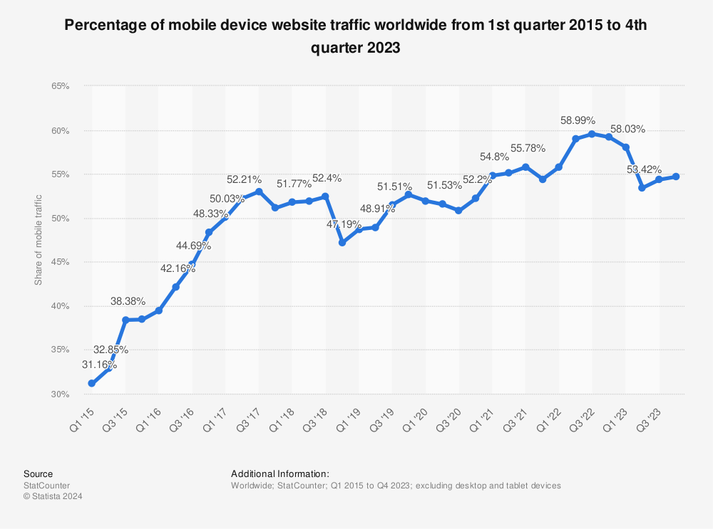
Case in point: according to Statista research, over half of all global website traffic in Q4 2023 came from smartphones alone. And 76% of surveyed adults in the United States use their phones to buy products.

Tracking your mobile rankings also lets you identify potential ways to rank for Featured Snippets. Which get 35.1% of all clicks for searches.

Additionally, Google switched to mobile-first indexing in 2023. Meaning it now uses your site’s mobile version to crawl, index, and rank pages.
So, if your website doesn’t look good on smartphones, it may not rank well in mobile search results. In the worst-case scenario, it might not appear on search engine results pages (SERPs) at all.
The result?
You lose out on traffic and potential revenue.
Further reading: Google’s Mobile SERP: Everything You Need to Know
How Mobile and Desktop Rankings Differ
Google collects your IP address, browser data, and other user data. And uses device identifiers to see whether you’re browsing the web from your phone, tablet, or desktop computer.
Why?
So it can serve up more relevant search results. Ones that account for different searches and behaviors on mobile vs. desktop devices.
This includes:
Shorter content: Someone might read a five-page article on a desktop computer. But not on small-screen smartphones.
More visual content: Visual content is easier to consume on smaller screens than text.
In fact, our study on SERPs, traffic, and trends found that mobile users saw 12.5 times more images and three times more videos in organic (unpaid) search results than desktop users.
More localized results: Google’s John Muellernotes that a user’s location influences mobile search results. This is because mobile users are often on the go. And look for products and services close to them, like “coffee shop near Stanford Street.”
Further reading: Website Ranking 101: How to Check & Improve Your Positions
How to Track Google Mobile Rankings
Instead of trying to manually monitor individual mobile rankings on your phone, use a rank-tracking tool.
These platforms make it easy to track your mobile rankings for specific keywords.
To get the most out of your mobile SEO rank tracker, look for one that:
- Offers filtering features like location, search engine, language, and device type
- Monitors your ranking performance in real-time
- Provides historical data, like keyword ranking performance over the past 24 months
- Integrates with Google Analytics and Google Search Console
- Exports data in multiple formats (e.g., PDF, CSV)
- Gives mobile keyword suggestions
- Predicts future mobile ranking trends
- Generates detailed ranking reports
- Notifies you about changes in keyword positions
- Can show you competitors’ mobile rankings
For example, our Position Tracking tool analyzes Google mobile rankings for target keywords across multiple locations in real time. And lets you specify the location down to the city and neighborhood level.
Use Semrush’s Position Tracking Tool
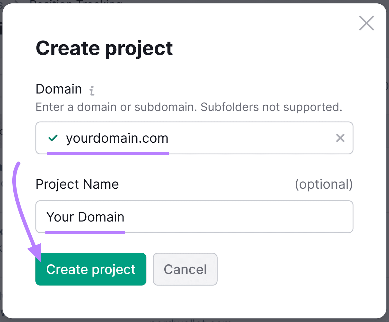
Enter your domain name (website address) into the designated field. You can also choose a project name.
Then, click “Create project.“
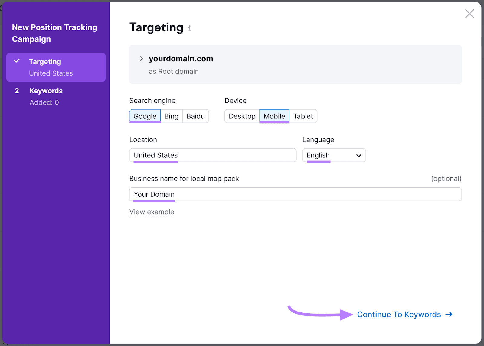
A pop-up window will appear. Select your preferred search engine, device type (choose “Mobile“), target country, and language. If you have a business name, you can add that in, too. Click “Continue to Keywords.”
Enter your target keywords into the designated box. Or import them from Google Analytics, a TXT or CSV file, or another campaign.
If you don’t have a list of keywords, select “Semrush suggestions” and let the tool choose them for you.
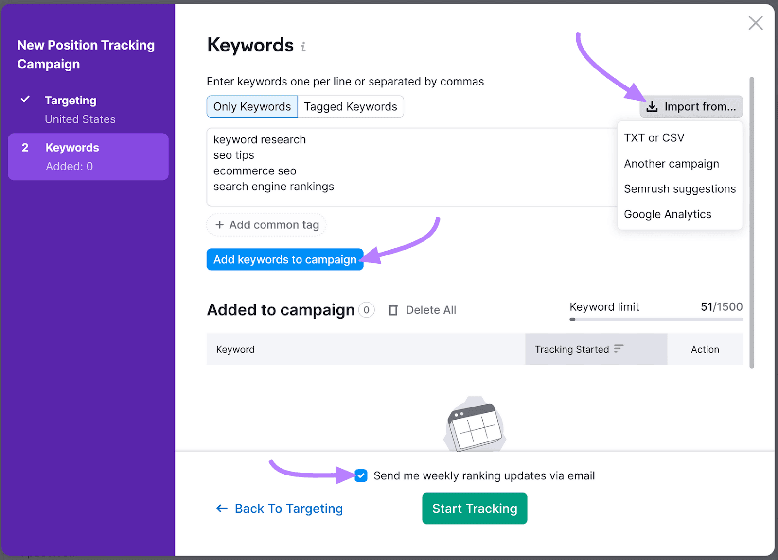
Click “Add keywords to campaign” > “Start Tracking.” And if you’d like to receive weekly ranking updates through email, check the box to the left of the text.
The mobile SEO rank tracker will analyze your site and target keywords. This process takes a few minutes, but some insights (e.g., the estimated traffic) will be available within 24 hours.
When it’s done analyzing, you’ll see a summary dashboard that includes your website’s visibility in mobile search results, rankings distribution, keyword data, and more.
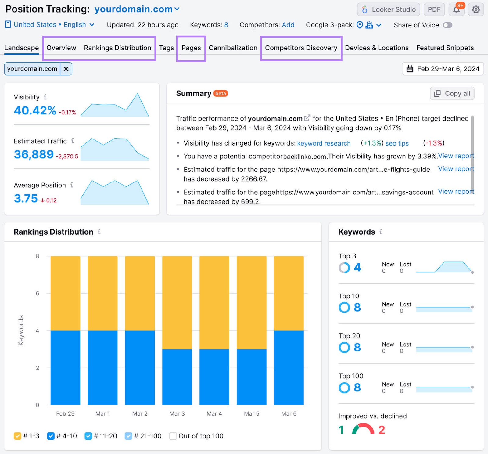
After you review the summary, use the following tabs to dig deeper:
- Overview: See your website’s progress in Google’s top 100 for target keywords. Toggle between “Share of Voice,” “Visibility” “Est. Traffic,” and “Avg. Position”
- Rankings Distribution: See where you stand in different ranking brackets. Like the top three and top 10 results.
- Pages: See which keywords different landing pages rank for
- Competitors Discovery: Compare your mobile rankings to your competition. Learn their positions in Google’s top three, top five, top 10, top 20, top 50, and top 100 results.
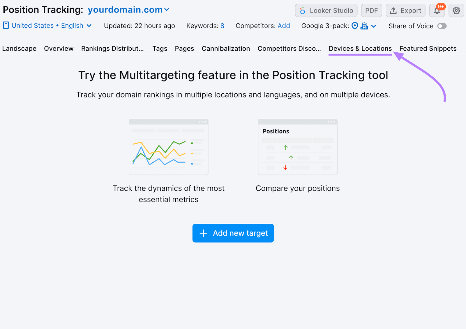
And if you ever want to add new locations or devices to your campaign, just click the “Devices & Locations” tab.
Further reading: Search Engine Ranking: How to Use Semrush to Track Keywords and Positions
Mobile SEO Tips for Better Rankings
Now that you know your current rankings, how do you improve them?
Here are some strategies to make your site more mobile-friendly:
Improve Mobile User Experience (UX)
User experience encompasses the processes needed to improve a website, product, or service to better meet consumers’ needs. It can positively impact brand perception.
UX is a confirmed ranking signal and, therefore, can influence a website’s search engine rankings.
Good UX design translates to a usable, accessible, enjoyable, and useful website. Not only does it solve a problem, but it’s also simple to understand and keeps users happy.
Use a Responsive Design
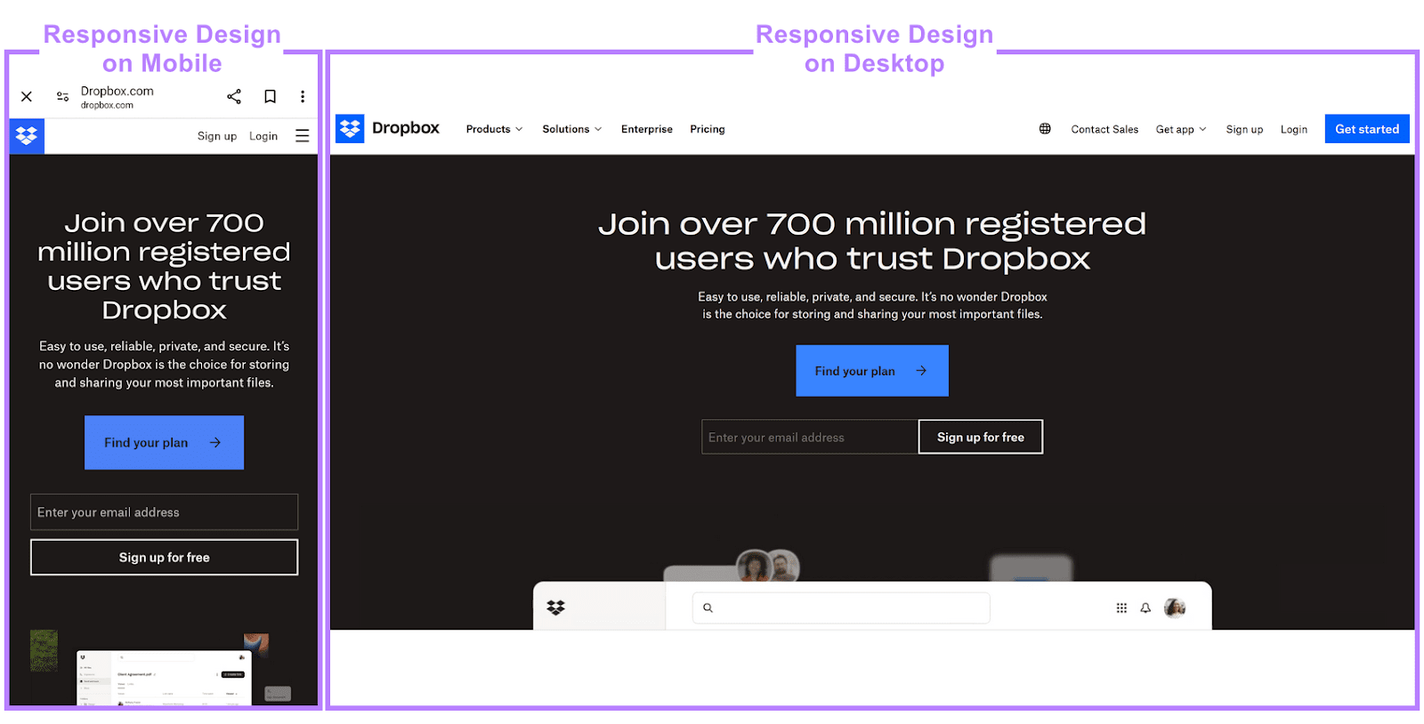
A responsive design automatically adjusts your website to the user’s device layout—whether on desktop computers, smartphones, or tablets. It lets users navigate your site more easily.
Use a responsive template or hire a web developer to build a custom responsive site for your business.
Avoid Pop-ups
Pop-ups can negatively impact UX. And prevent search engines from understanding your content.
Google recommends avoiding intrusive pop-ups and dialogue boxes unless they’re absolutely necessary. For example, adding a pop-up permission box for tracking cookies.
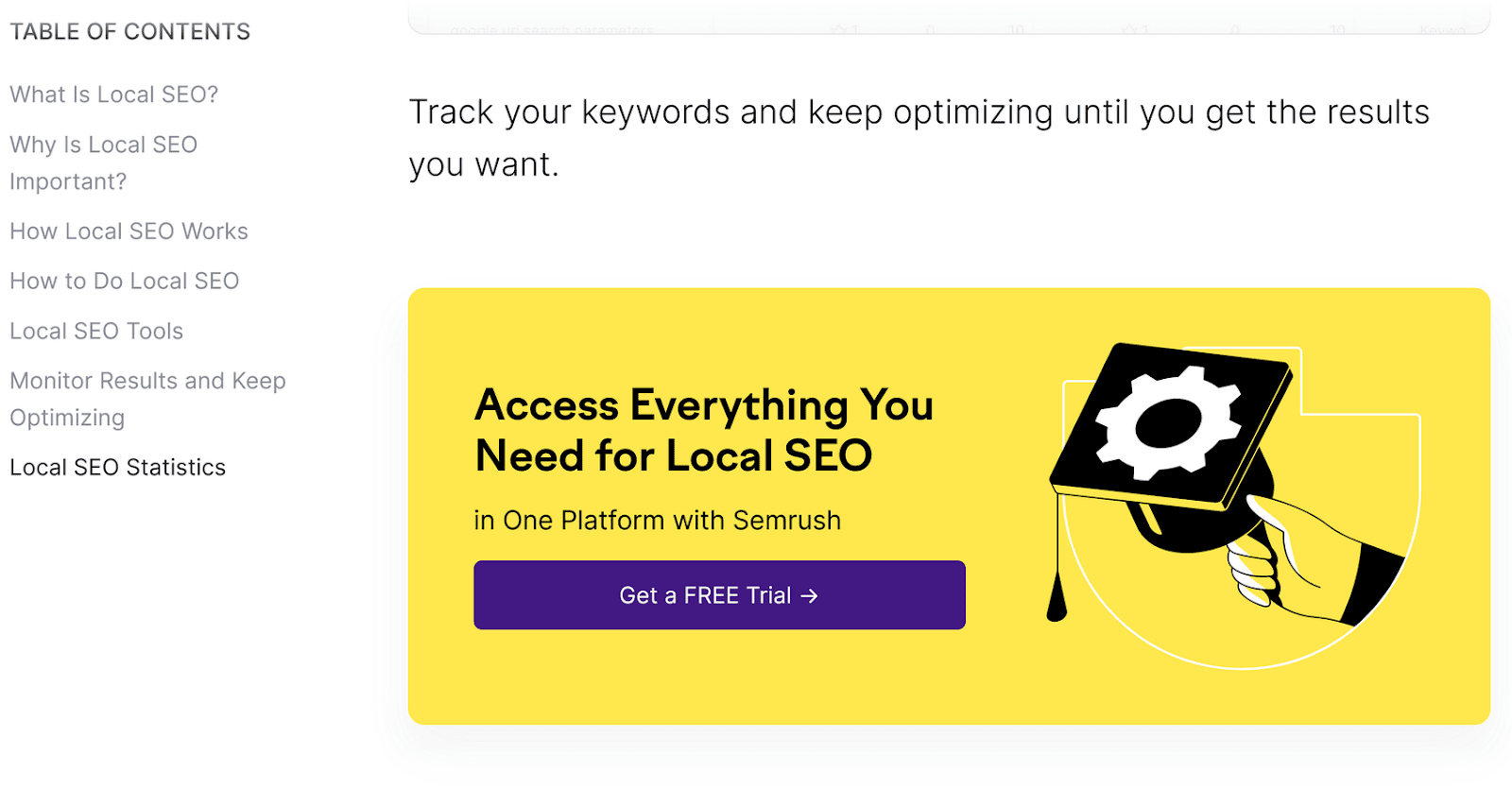
Use banners to improve UX.
For example, to avoid a frustrating reading experience, we use banner ads to promote relevant Semrush tools on our blog:
Redesign Your CTA Buttons
Mobile devices have small screens. Which makes it hard for users to see your call-to-action (CTA) buttons.
For mobile, use larger CTA buttons (around 44Х44 pixels) than on your desktop website.
Place CTAs in a prominent location and use contrasting colors, 3-D effects, and white space to make them stand out.
For example, Netflix placed a large, red CTA button on its homepage that stands out on the dark background. It’s one of the first things you see when visiting the website:

Use a simple, readable font like Open Sans or Montserrat. And space out your links on the page so users can easily click on them.
Further reading: 30 Attention-Grabbing Call to Action Examples
Use Structured Data as Part of Your Mobile SEO Strategy
Schema markup, or structured data, is a standardized code format that helps search engines understand your content. And changes the way web pages appear up on SERPs.
For instance, this IMDB result’s structured data displays a star rating and votes to users. Along with links to an episode list, the series cast and crew, specific cast members, and the show’s trailer.

Schema markup may improve your visibility in search results and increase organic traffic.
According to Google, Rotten Tomatoes got 25% higher click-through rates after adding structured data to 100,000 pages. Other brands saw boosts in website traffic, engagement, or session duration thanks to it.
If you use WordPress, install a plugin like Schema Pro or WP SEO Structured Data Schema to add this feature to your site.
If you use a different content management system, see our guide on schema markup and how to implement it. We’ll show you the exact steps you need to take to generate and add the markup to a web page.
Create a Mobile-First Content Strategy
Write and optimize your content with mobile users in mind to improve their experience on your site. Here are some tips to help you out:
- Conduct mobile keyword research, paying extra attention to shorter keywords, location-based keywords, and conversational keywords (for voice search)
- Keep title tags under 60 characters
- Craft mobile-friendly meta descriptions by keeping them under 105 characters
- Use short sentences and paragraphs for better readability
- Leverage visual content rather than text to convey complex information
- Choose a single-column layout to make your content more scannable
- Keep your forms short and eliminate any unnecessary fields.
Important: Don’t forget to preview your content on different mobile devices before hitting “Publish.” And check how it looks on different browsers, such as Google Chrome, Opera Mobile, Firefox for Android, and Samsung Internet.
Further reading: The Art of Content Optimization: The Complete 2024 Guide
Leverage Mobile Analytics
A mobile rank tracker is ideal for monitoring keyword positions in SERPs. But you might need additional data to improve your overall SEO efforts and recognize where you fall short.
For deeper insights, use mobile analytics tools like Semrush’s Domain Overview or Google Analytics.
They track your SEO performance on both desktop and mobile devices. So you can learn more about your target customers, how they use your website, and their preferred content.
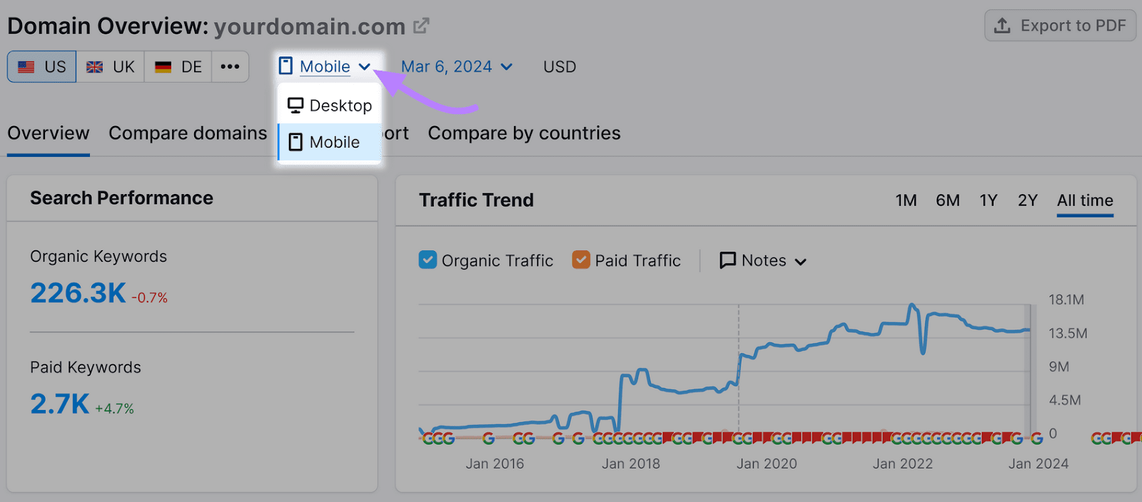
Domain Overview lets you track your domain performance over time, showing your:
- Paid and organic (unpaid) traffic
- Main competitors
- Top-performing keywords
- Research subdomains, subfolders, or page URLs
Google Analytics focuses more on user behavior.
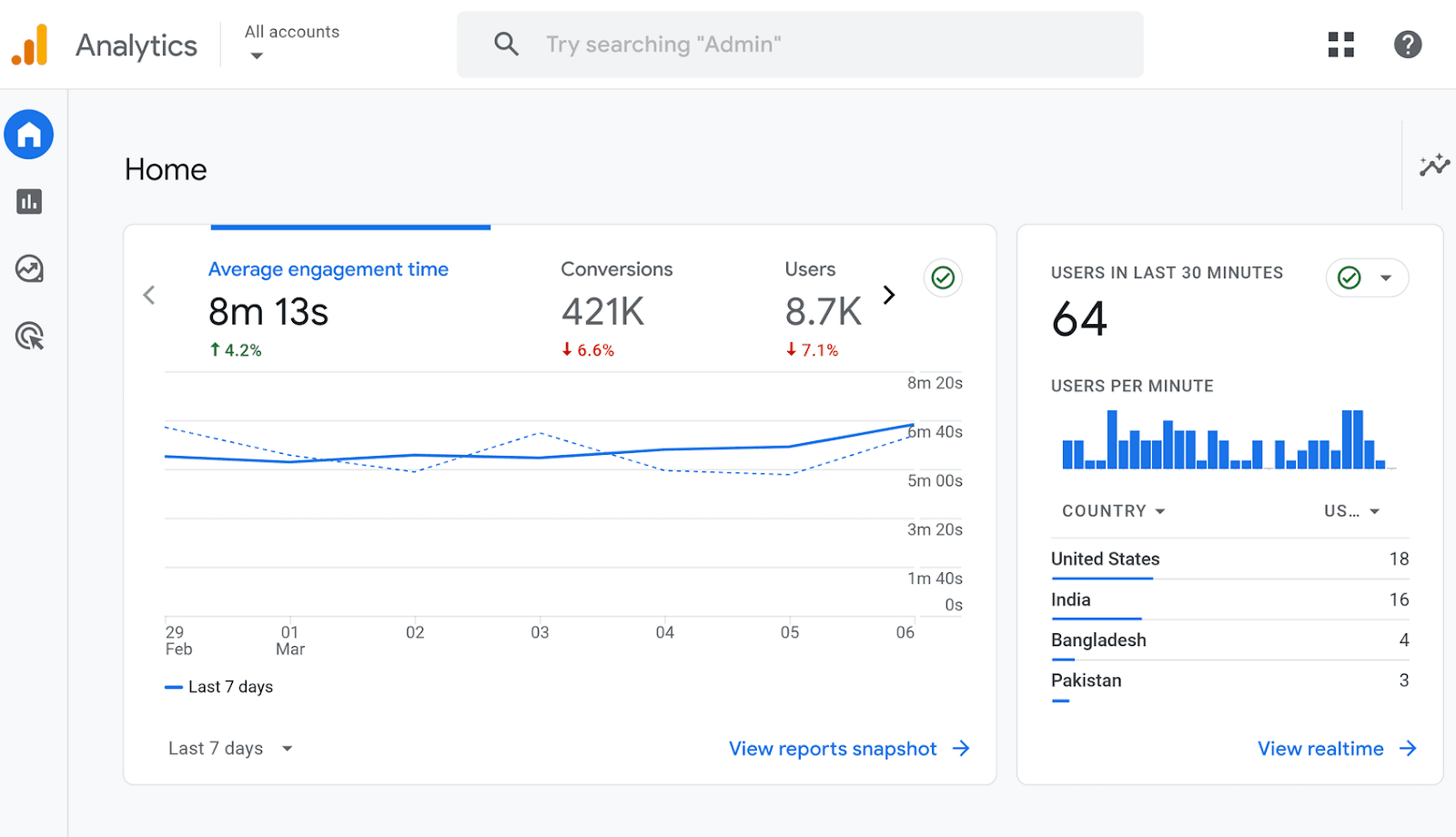
In addition to traffic data, it shows:
- Average engagement time
- Conversions
- Audience demographics, such as location, age, and gender
With these insights, you can refine your marketing and SEO efforts to reach more customers. Plus, you’ll see how you compare to your competitors and identify areas for improvement.
Optimize Your Images and Videos
Large images and videos can slow down your website, affecting the user experience. That’s why it’s crucial to optimize them for mobile devices.
According to a 2023 ToolTester report, the average page load time on mobile devices is 8.6 seconds.
Here’s what you can do to help your pages load in that time—or even faster:
- Use a plugin like Imagify, ShortPixel, or TinyPNG to compress and optimize images for faster-loading pages.
- Display your images in WebP format so they take up less space and load faster. WebP images are 26% smaller than PNGs and up to 34% smaller than JPEGs. Use a free tool like CloudConvert, Pixelied, or TinyIMG to convert PNG, JPG, and JPEG files to WebP.
- Enable lazy loading with Optimole, Smush, or a3 Lazy Load. These WordPress plugins can speed up your site by loading images only when they are about to be shown to the user, rather than loading all images at once. You can implement lazy loading for videos, too.
- Since most people hold their phones vertically, shoot vertical videos for your mobile site to enhance the user experience. They also take up more screen space on mobile devices than horizontal videos, which help to grab viewers’ attention.
- Per Sharethrough, 75% of consumers keep their phones on mute even when watching video content. Add captions, subtitles, and visual cues to your videos so people can watch them without sound.
This can improve their experience on your site and make your content more accessible to users of all abilities. Although accessibility isn’t a ranking factor, it contributes to good UX and, consequently, can help with SEO.
Further reading: Video SEO: How to Get Your Videos to Rank
Mobile Rank Tracking Is Easy with Semrush
Optimizing your website for mobile devices requires a strategic approach.
First, use Position Tracking to find out your current rankings and determine potential improvements. Then, check on your competitors to understand your position and how to outperform them.
Based on these insights, decide on the next steps. For example, you may need to improve page load speed or redesign your CTA buttons for higher click-through rates.
We can help you with mobile rank tracking and more, from keyword research to web analytics.
Use the Domain Overview to gain further insights into your site’s health, analyze your core web vitals with the Site Audit tool, and discover trending search terms with the Keyword Magic Tool.
Sign up for a free Semrush account to get started.


![How To Drive More Conversions With Fewer Clicks [MozCon 2025 Speaker Series] How To Drive More Conversions With Fewer Clicks [MozCon 2025 Speaker Series]](https://moz.com/images/blog/Blog-OG-images/Mozcon2025_Speaker-OGimage_1600x900_RebeccaJackson_London.png?w=1200&h=630&q=82&auto=format&fit=clip&dm=1750097490&s=d957426623f77c03dec4a2520d5e9844)